Why the Groucho Club is the best place to break the flower rules

Back in the olden days, when we first created Hybrid, we were slightly frowned upon by the worldly wise and highly respected floristas of London as we liked to ‘mix it up a bit’.

Hybrid by name and Hybrid by nature, our name was our mantra and we lived by the idea of mixing flowers that wouldn’t have been introduced to each other under normal circumstances. Traditionally, the unspoken rule for floral arrangements was that the flowers had to sit together in  harmony and originate from similar part of the world.

Rebel without a cause

But hey! We were young, we were wild and we wanted to be a bit naughty so we decided to break the rules. And we think this cavalier and non-conventional experimentation with flowers paid off, as our creations looked lovely (even if we do say so ourselves) and earned us the honour of creating beautiful floral designs for events set within every imaginable type of venue across London.

Our daring creations included introducing an archetypal English flower, for example the bluebell, to something overtly tropical such as the flame-like petals of gloriosa lilies. We would put a nude coloured bloom with an acid yellow floret because, wait for it: We. Just. Didn’t. Care! If they looked good together, we would pair them.

Of course, the term Hybrid these days is banded about freely. The idea of creating something new by blending different ingredients is widely celebrated. A quick look on Instagram (#floralstylist, #ihavethisthingwithflowers) proves my point. Today’s florists don’t care that chrysanthemums have a reputation as being tacky petrol station flowers or that ferns remind most people of the 1970’s, they’re blending orchids with roses, palm leaves with delphiniums. Focussing on colour, texture and shape, rather than provenance and seeing what amazing new vibe can be created (even if it means placing spikey candy-pink blooms with dried turquoise painted leaves).

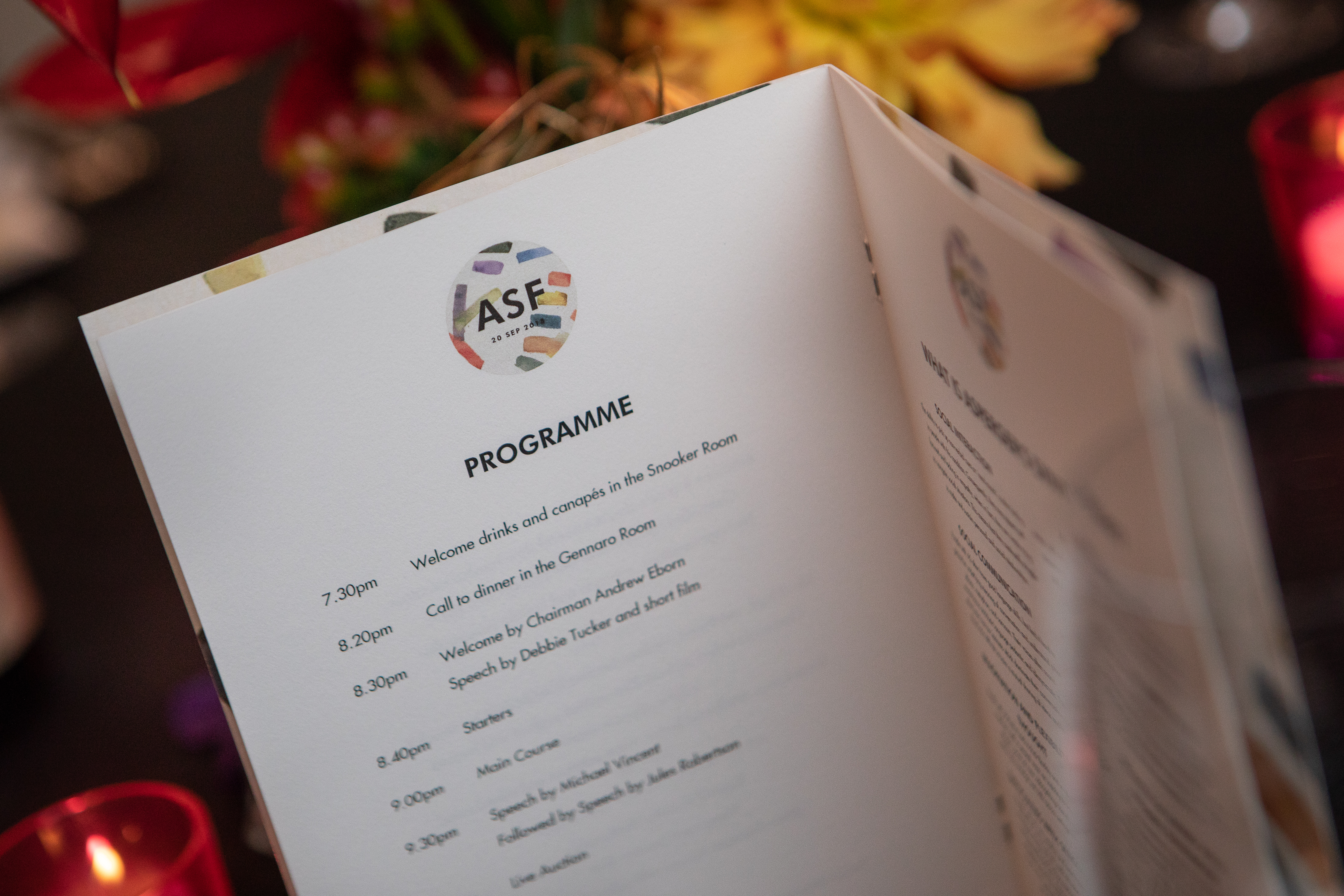
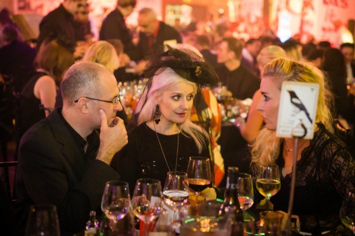
So when event planner Dani Pittorino came to us about a fund raiser dinner for the Asperger’s Syndrome Foundation she was organising at The Groucho club, we were delighted to say the least. We thought what better a location to unleash the rebellious Hybrid spirit than at this iconic private members club.

The Groucho Club is legendary. Created in the 1980s by a group of like-minded individuals who were fed up at being excluded by more traditional men-only member’s clubs. It has always enjoyed an exclusive member’s list; anyone can apply to join provided you’re nominated by 2 existing members (come to think if it, I’m still waiting for my nominations… anyone?). Often described using words like bohemian, rebellious, maverick, Groucho Club members don’t conform. There are some great stories about the shenanigans that have taken place there. Check this link out for more information.

The good news is, you don’t have to be a member of The Groucho Club to hold an event here. The venue can accommodate anything from private dinners to parties for up to three hundred guests.

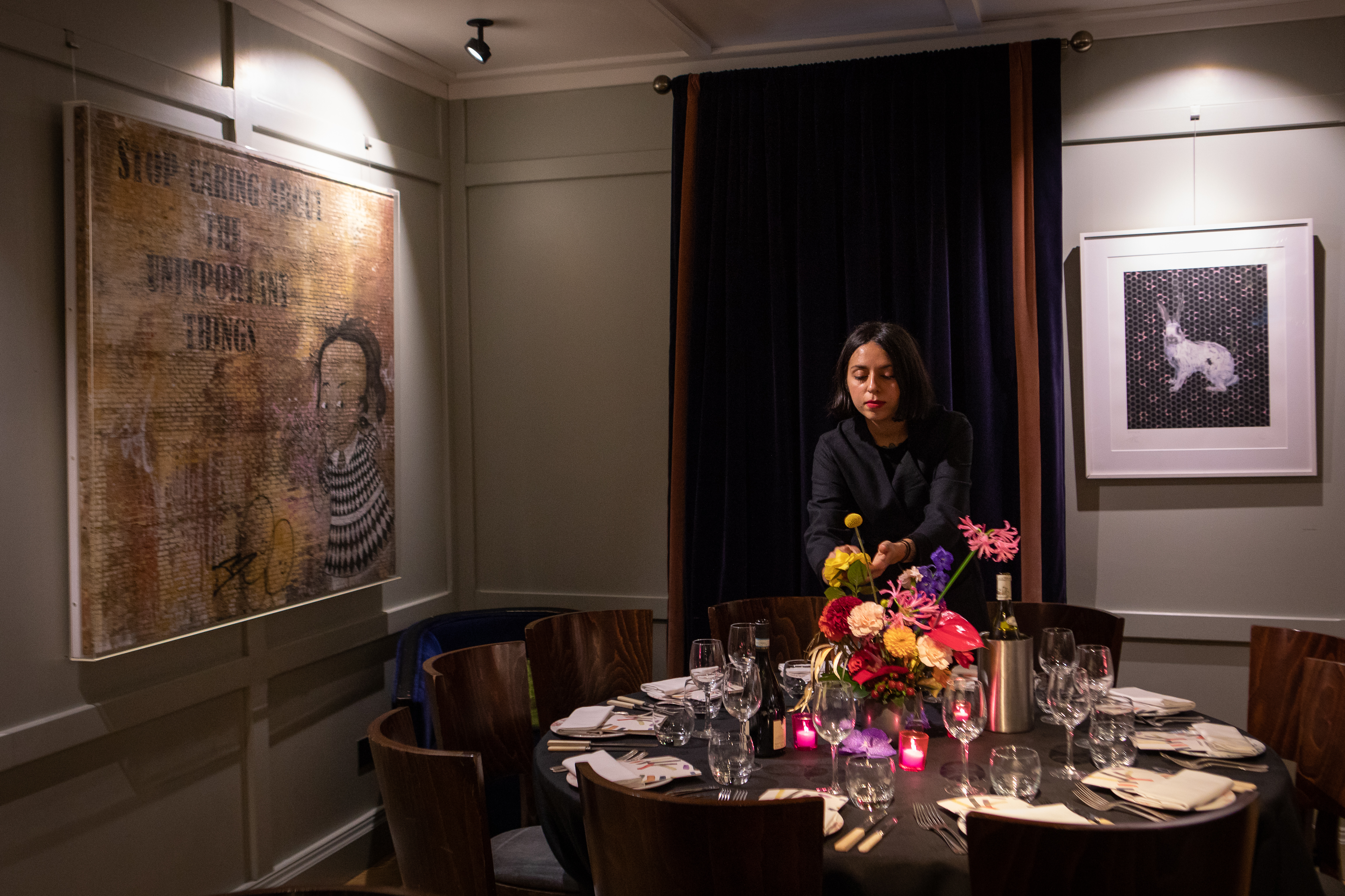
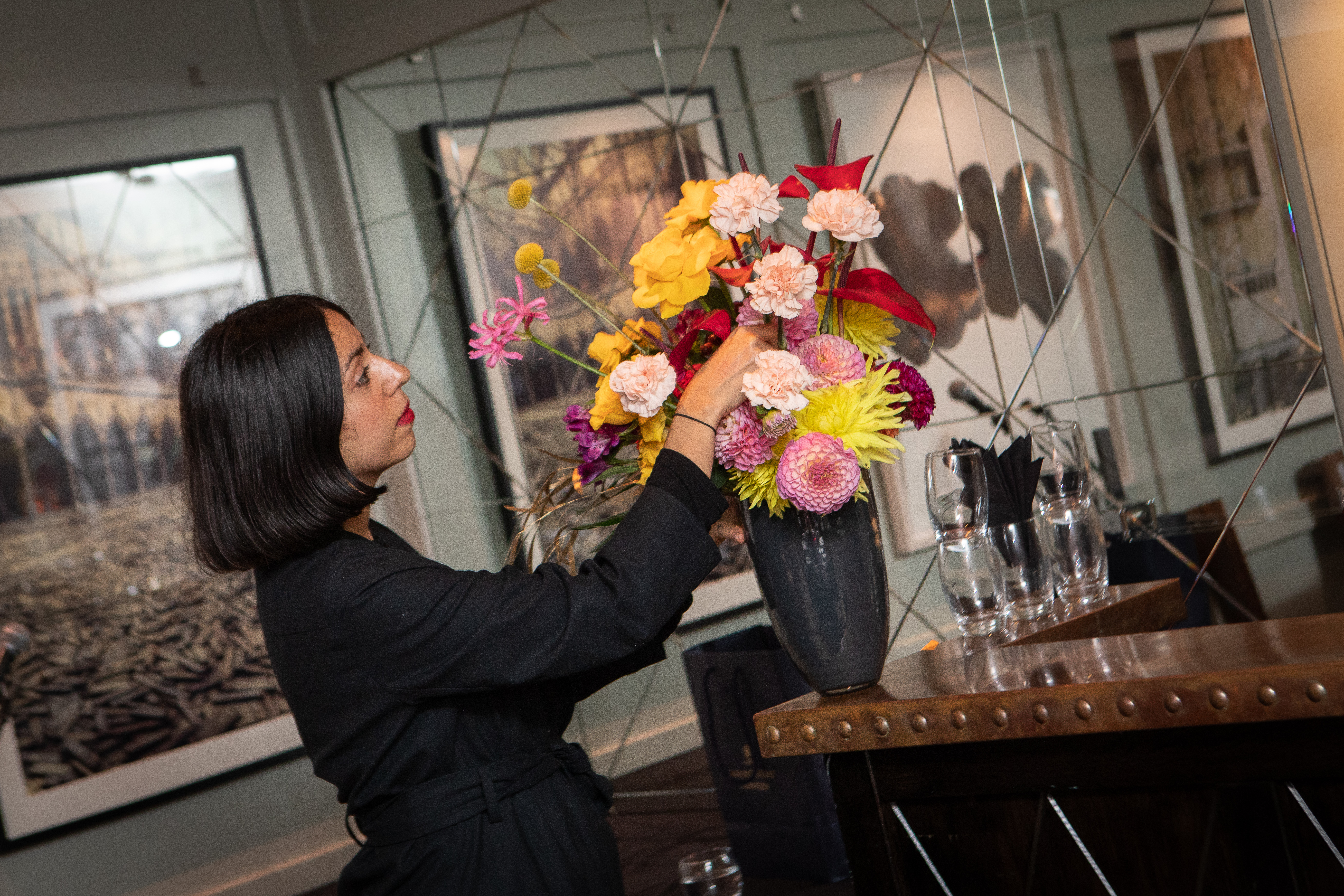
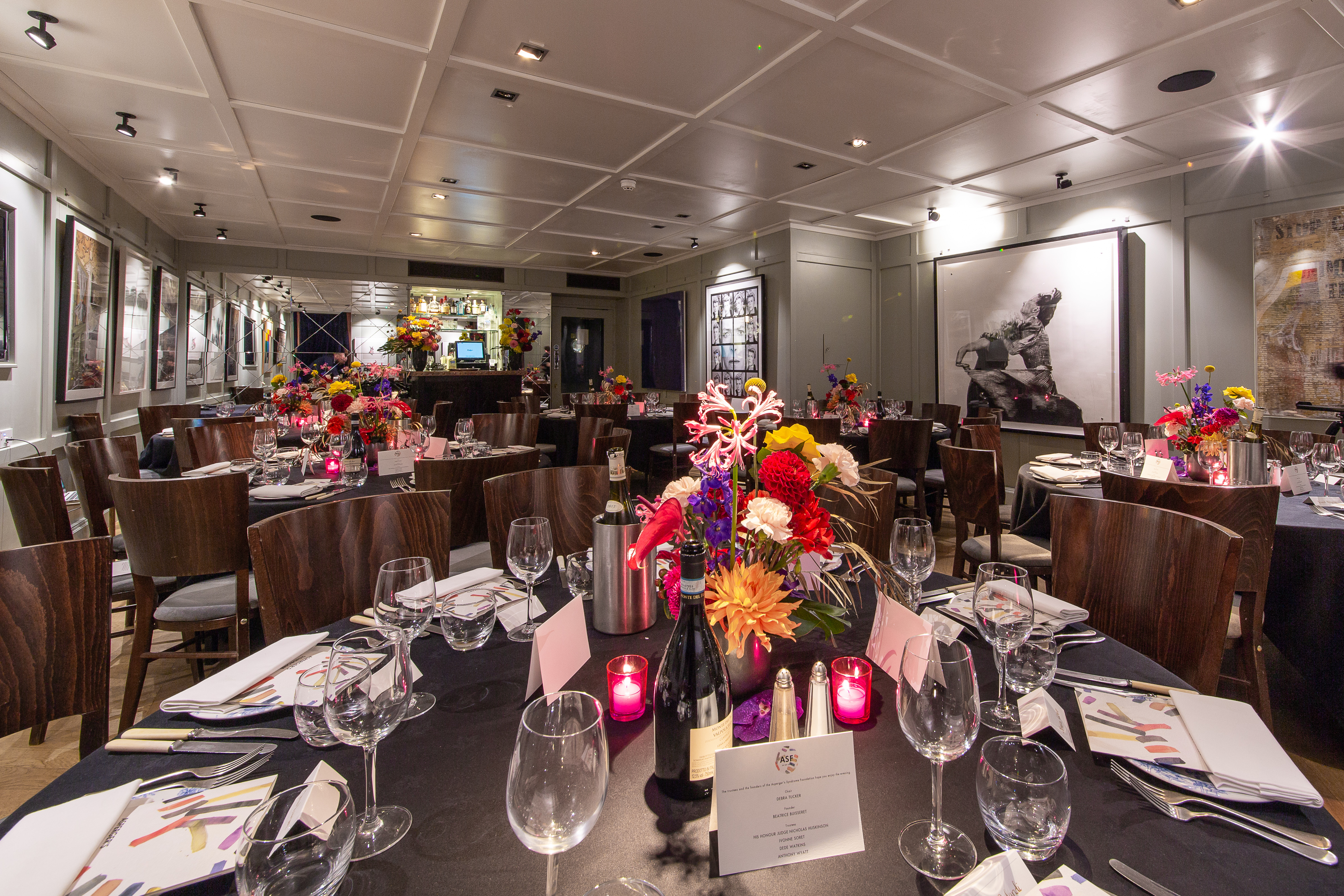
Dani gave us carte blanche to create floral arrangements that she simply wanted to ‘look gorgeous’ for the dinner which was to be held in the stunning Snooker and Gennarro rooms. Our immediate thought was to design something that would celebrate the setting and utilise the beautiful mix of flowers available in late summer… we then progressed to thinking;

why not go back to our roots and use all our favourites in a true Hybrid-floral mashup?

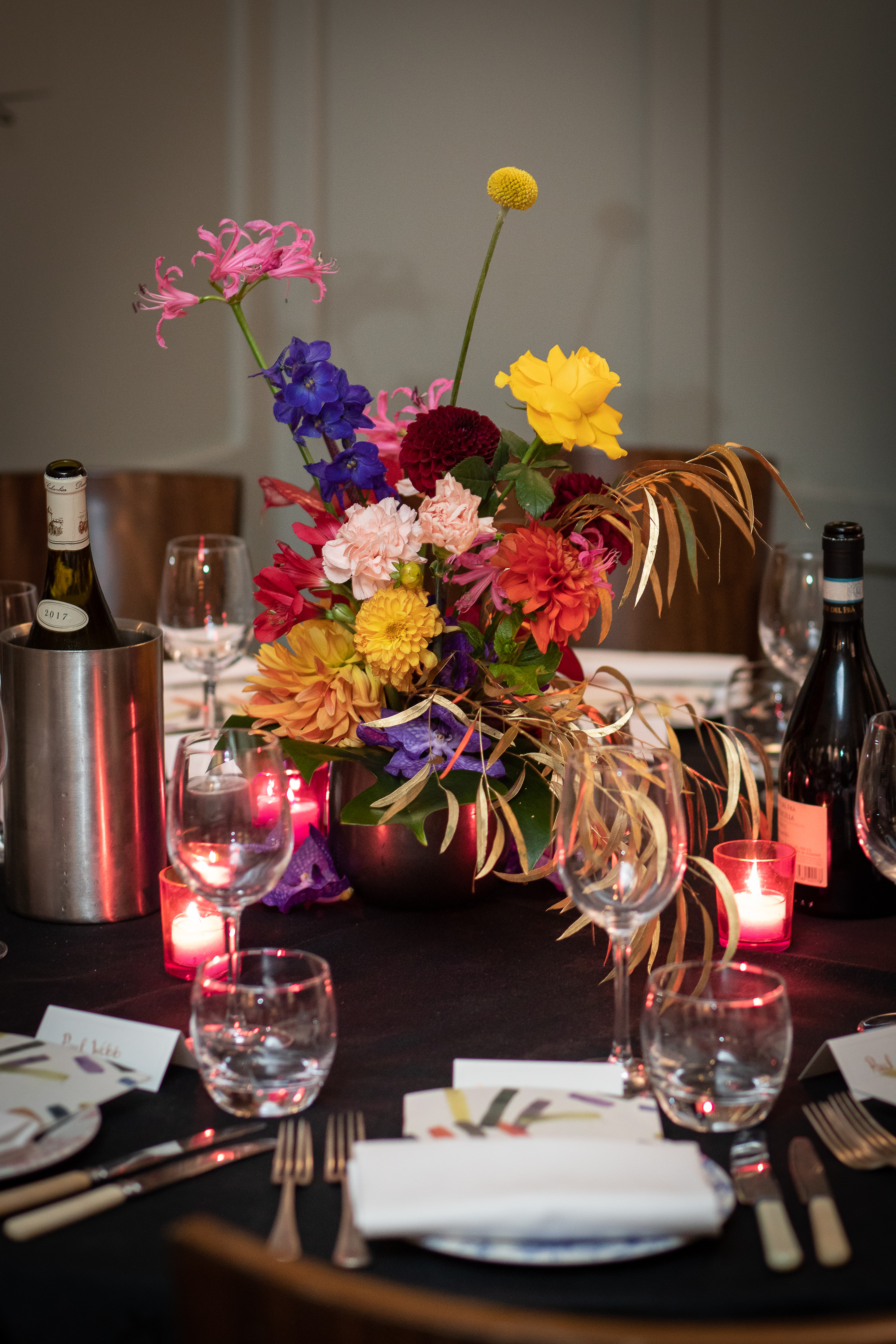
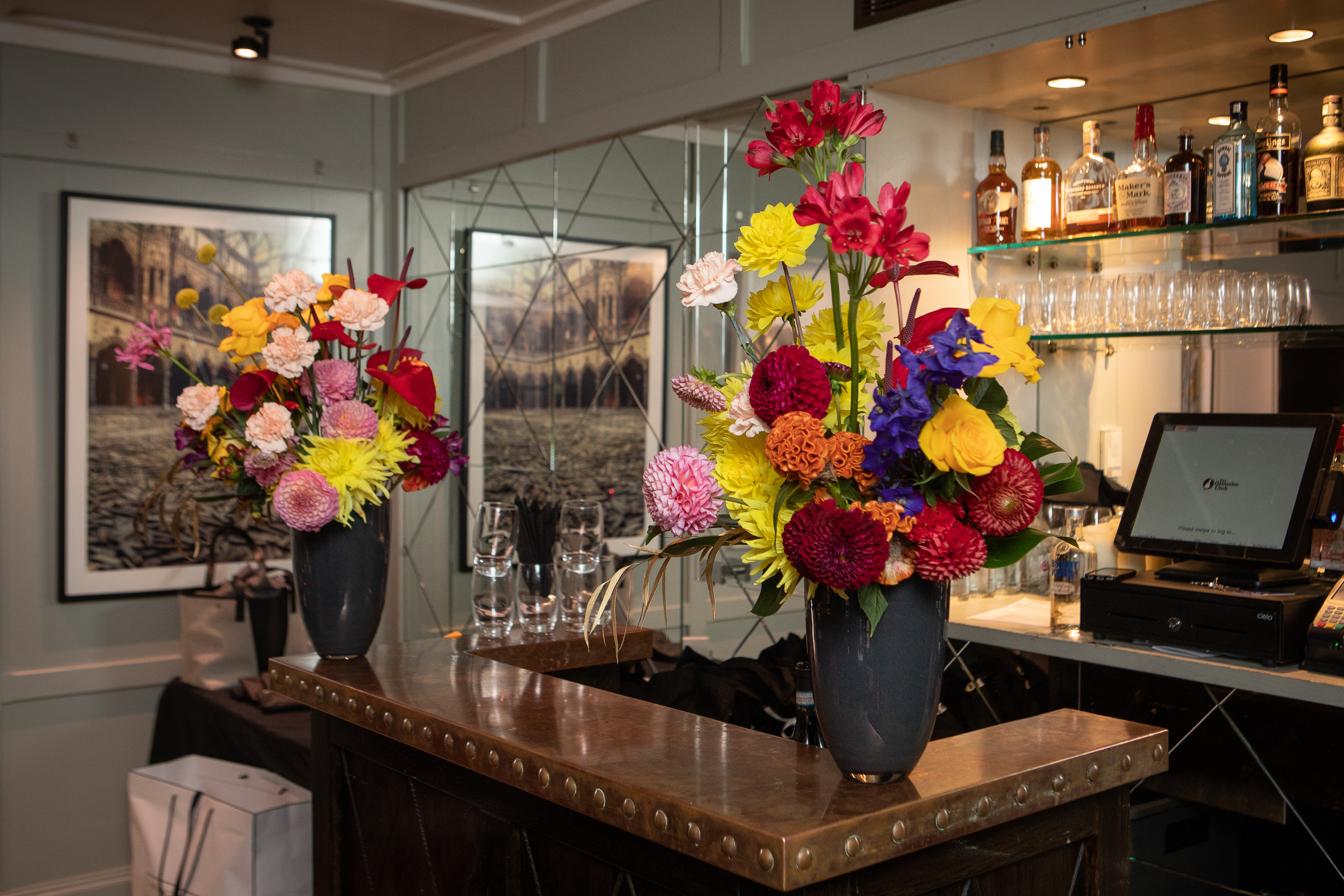
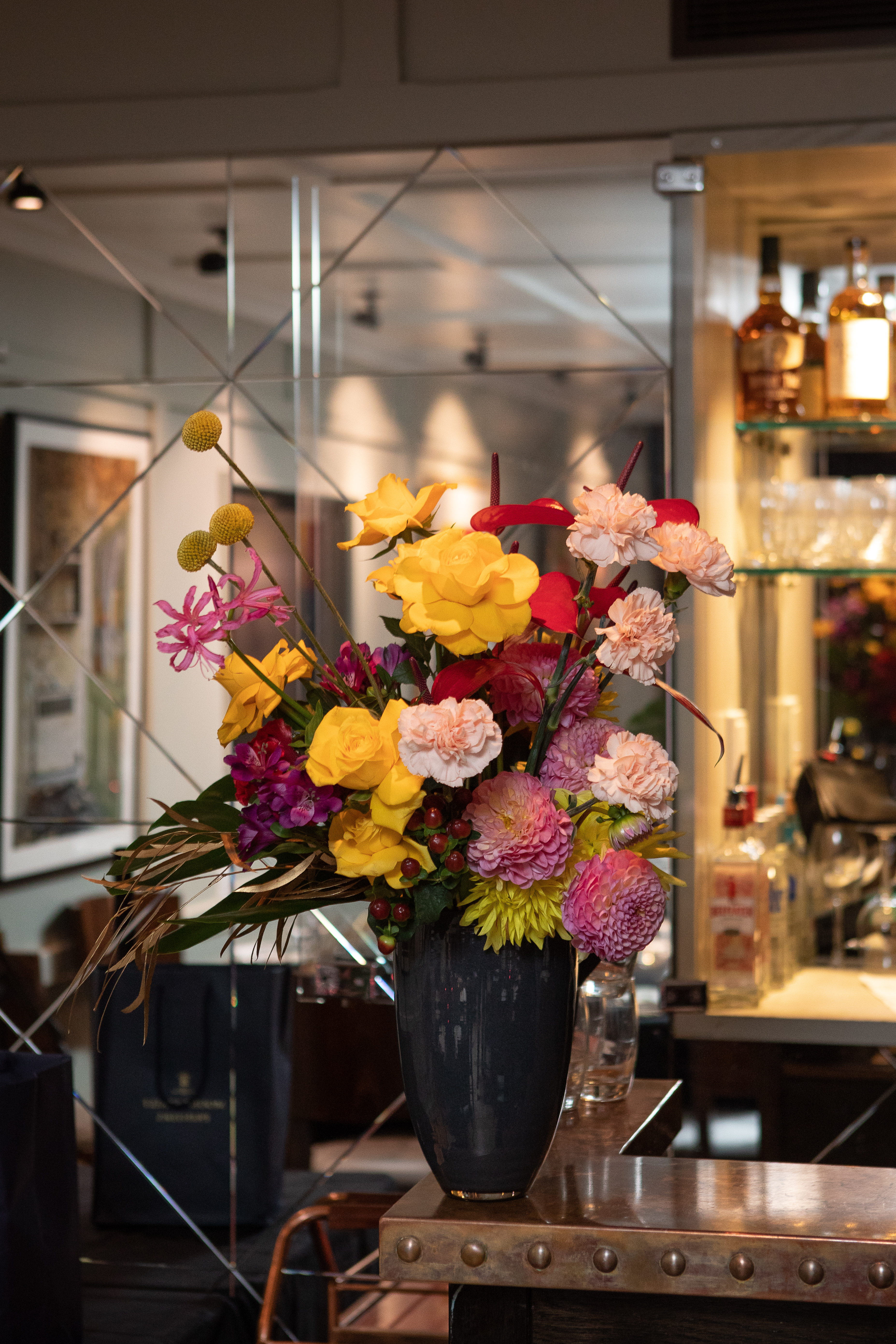
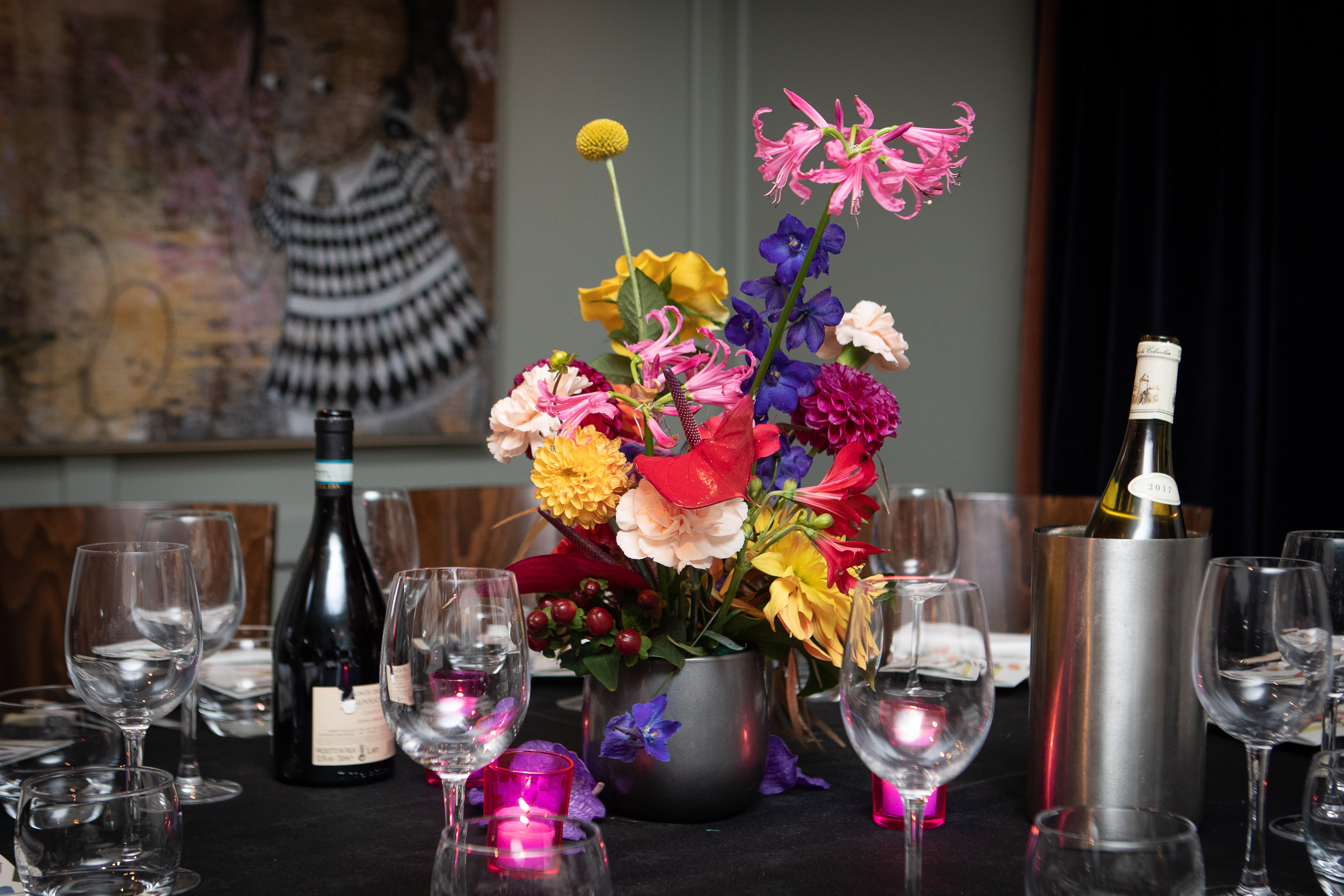
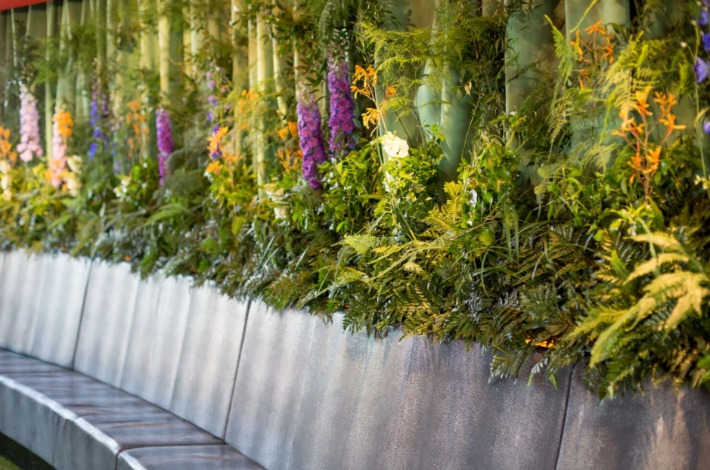
Our flower list was extensive but each flower on it was vital; we simply couldn’t do without each and every one. We selected simple but shapely black and dark grey vases so as not to detract from the vibrancy of the flowers and the surrounding artwork (did we mention the art-work on display at the Groucho Club? It is impressive! The Genarro Room alone has works such as iconic image ‘David’s Eyes’ by Tony McGee, ‘Things I Think About When I Think Of You’ by Mark Mothersbaugh and ‘Q is for Quarters’ by Sir Peter Blake.)

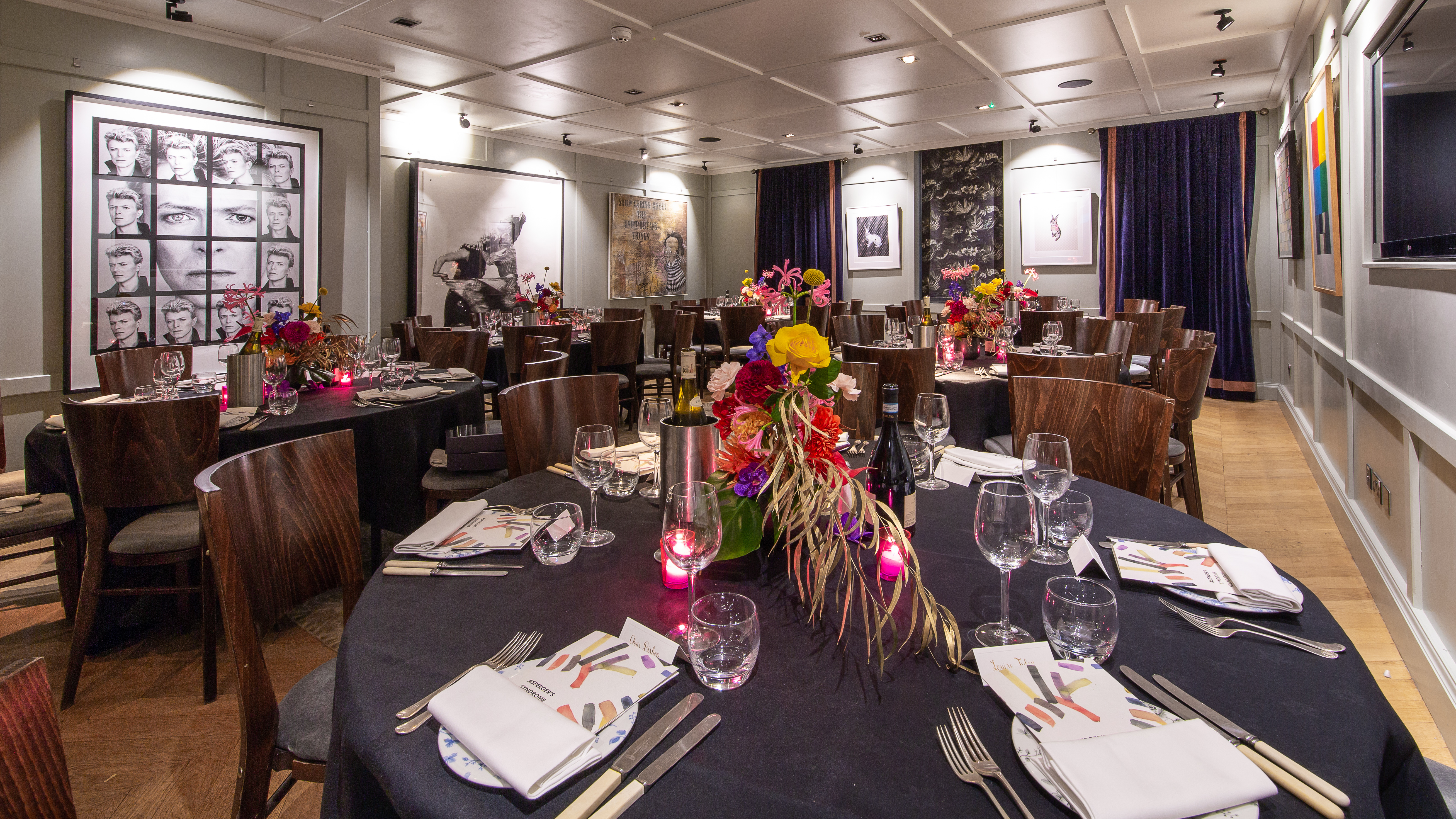
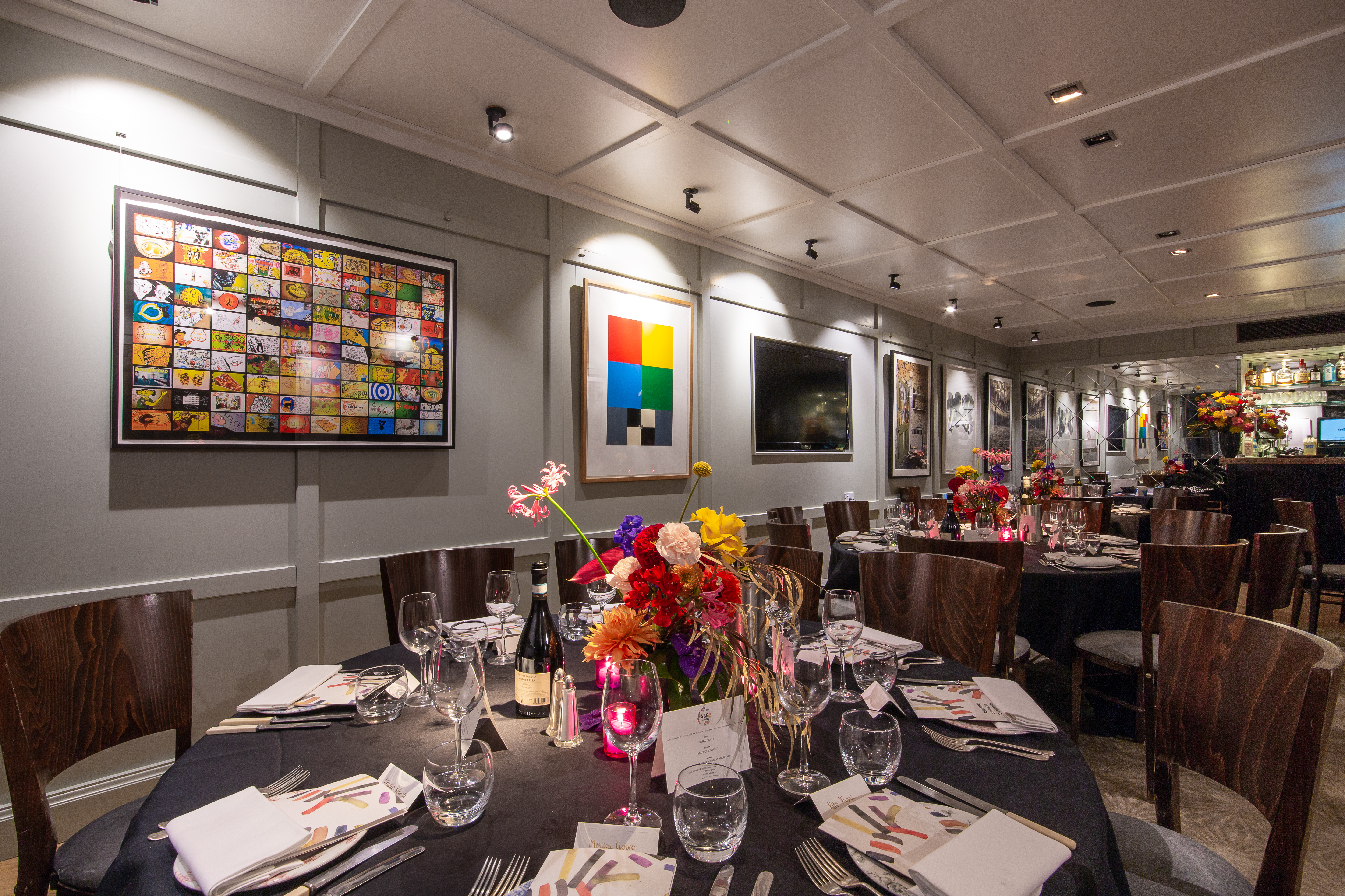
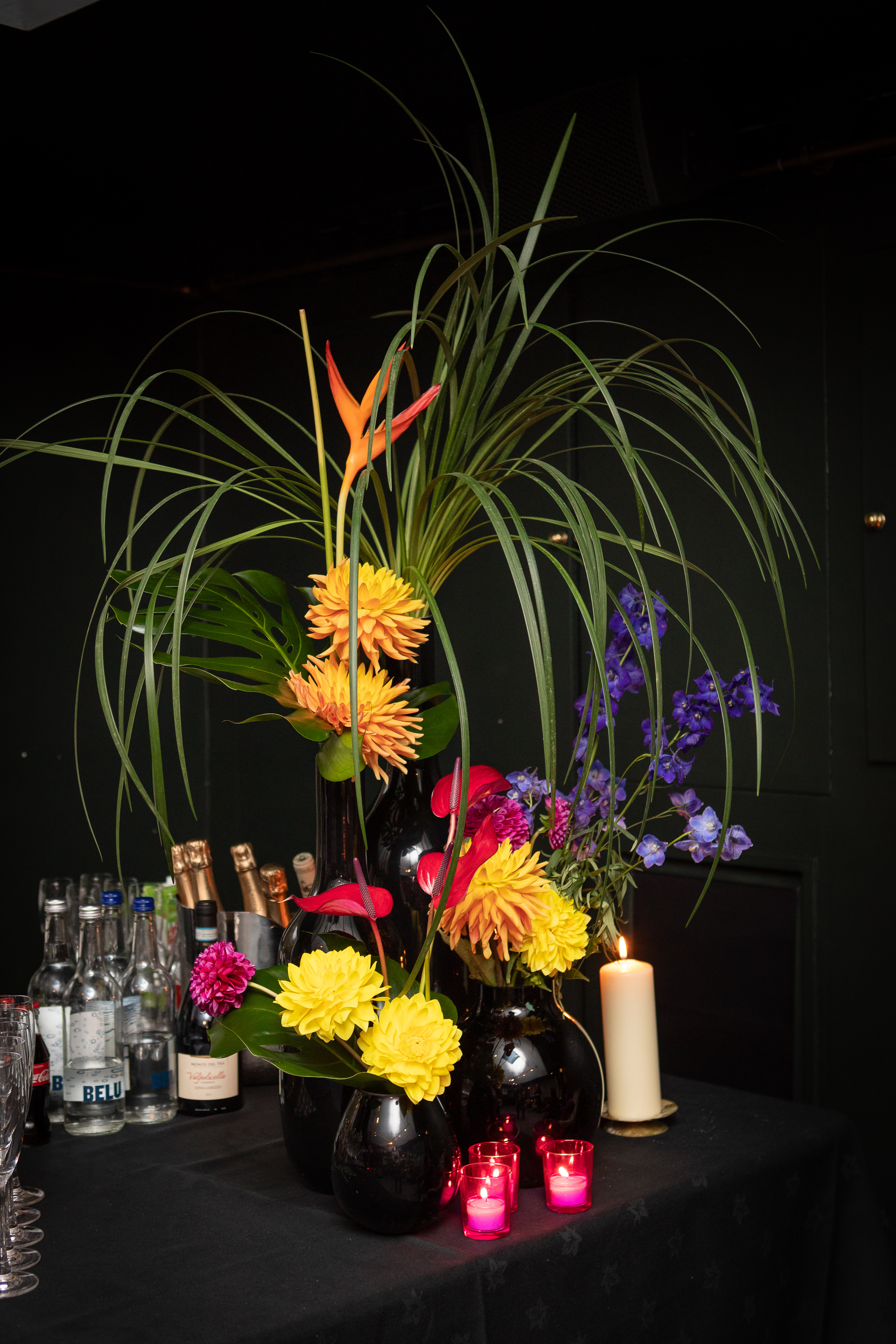
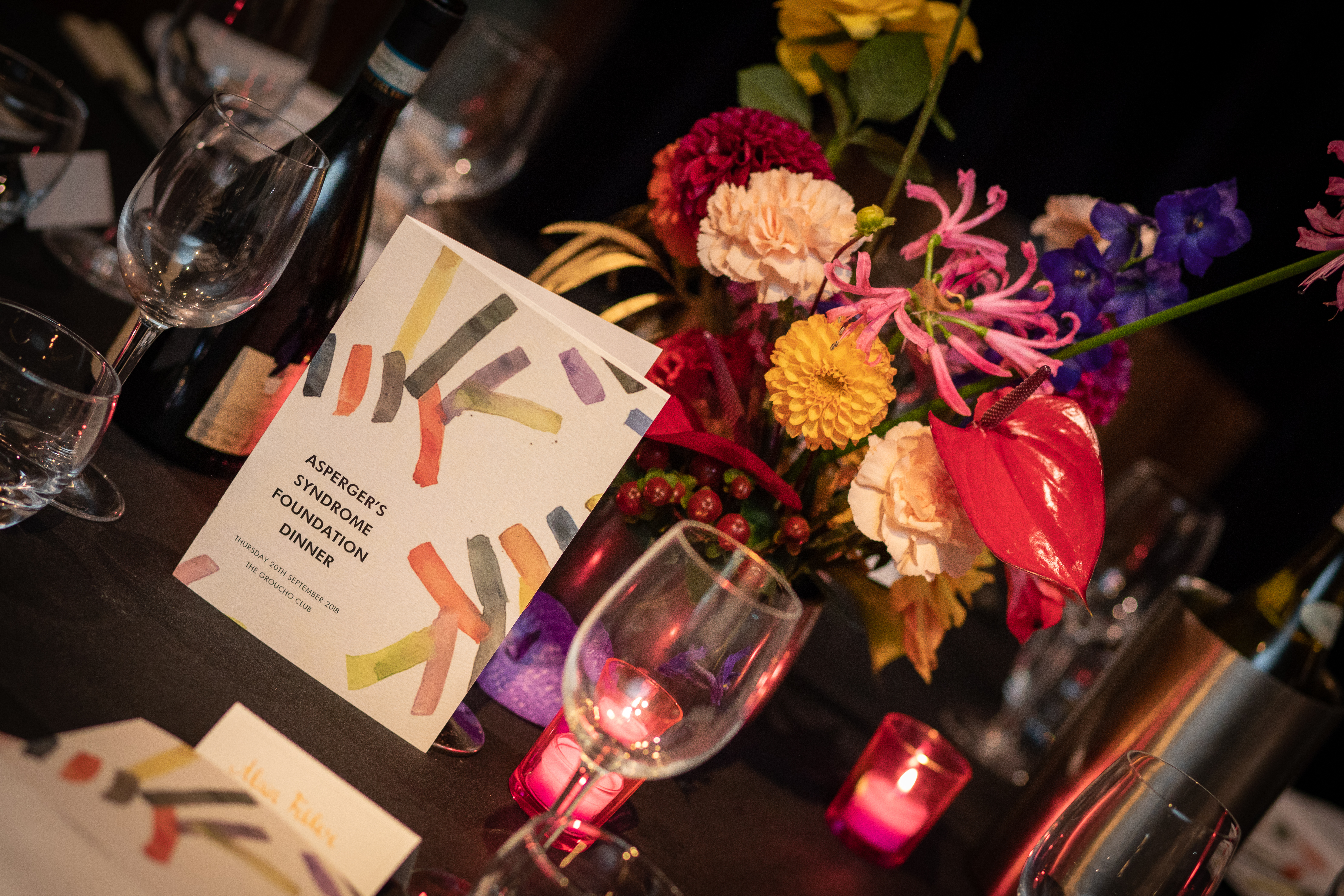
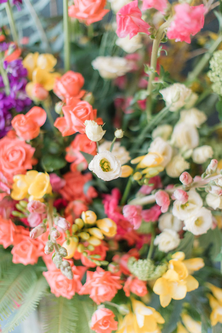
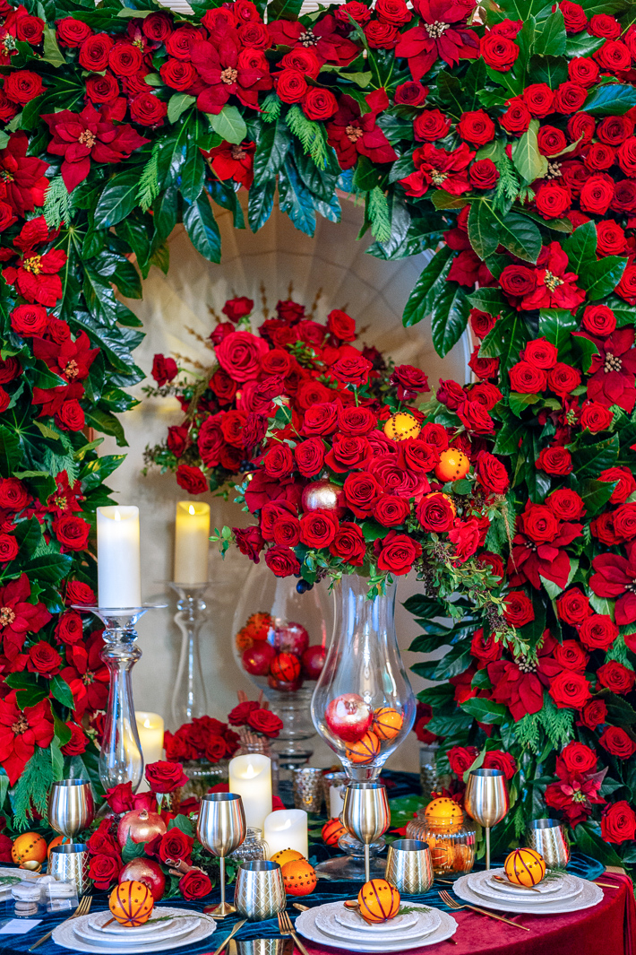
We wanted British-grown dahlia in a rainbow of colours and sizes to be the glossy stars of our designs and combined them with beautiful elegant trumpets of vividly pink coloured nerines. Thrown in were glossy red leaf-shaped anthurium flowers, long with shiny red hypericum berries. Quirky canary yellow roses and fun balls of craspedia flowers made the designs sing, and fluffy textured peach carnations and velvety burnt orange celosia anchored the creations. Cobalt blue delphinium and purple vanda orchids provided the contrasting element and highlights of gold painted eucalyptus… a bit of curiosity. Finally, flowing grasses and opal heliconia flowers gave the shape and structure and added to the overall impact to the taller designs.

The night was a huge success, raising in excess of £40,000 for Asperger’s Syndrome Foundation. We are so pleased that our non-conformist floral designs added such a splash of colour to this fabulous event and couldn’t help feeling a satisfied that in eschewing conventional floral design, we’d created something eye-catching and interesting. In fact, a bit like the Groucho Club itself, we think that some things just work better when there’s a combination of thoughtful rebellion and mischievous defiance.

I was so excited to be able to collaborate with Hybrid at The Groucho Club for the Asperger’s Syndrome Foundation dinner. Caroline and her fabulous team did a perfect job working in this quirky and bright venue. Their vivid florals added even more vibrancy to the rooms, drawing on the unique art featured on the walls. We couldn’t have asked for more, or for better partners. Thank you so much!

With thanks to Promise Photography for amazing images of the night.
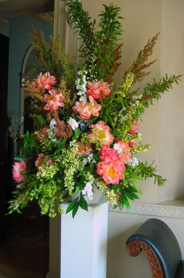
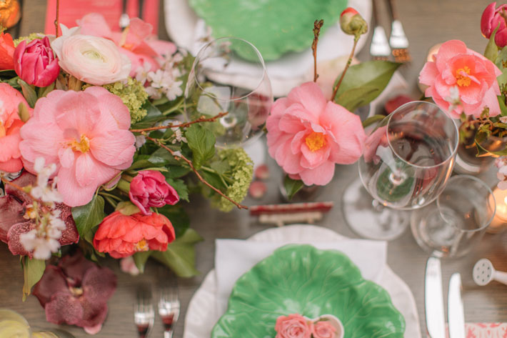
 

Our top 3 flowers in Pantone’s Colour of the Year 2019 – Living Coral

As floral designers we get rather excited each year when Pantone release their Colour of the Year however, we much prefer it if the colour is what we at Hybrid consider to be a ‘floral’ colour! For us, a ‘floral’ colour must be the colour of at least five naturally occurring, truly beautiful flowers.

This year’s Pantone Colour of the Year ‘Living Coral’, and last year’s ‘Ultra Violet’, were colourful music to our floral ears (but we have to admit we did have a bit of trouble with turquoise one particular year!).

Here are two little known facts about Living Coral that we really wouldn’t expect you to know:  firstly, it is our Caroline’s all-time favourite colour, referred to in our studio as ‘Caroline’s colour’ and secondly, it is definitely not our Alan’s fave!

Perhaps Alan’s aversion to coral has something to do with the ambiguous nature of the colour, sitting, as it does, somewhere between pink and orange which, for Alan, just doesn’t quite work. Despite being a very natural colour found in things such as well… living coral and flamingos for example it is always greeted with a sense of wonder and bewilderment; just how can nature produce something so vibrant, intense and downright bizarre!? And this is where I suspect his dislike of the colour may lie… for you see there is a commonly held misconception amongst Alan’s friends that he loves flamingos. Indeed, he has amassed quite a collection of kitsch representations of the leggy coral-coloured bird over the years.  But we can now reveal, for the avoidance of any doubt, that our Alan is not a fan of them at all (sorry to break it to you, Alan’s pals!).

For the majority of us at Hybrid Living Coral is a glorious colour, full of warmth and fun, perfect for both spring and summer florals.  We can clearly see it becoming ‘A Thing’ in the floral world this year quite simply because coral coloured flower varieties are utterly beautiful, versatile and unique.  A coral coloured sweet pea for example or even a flamingo coloured tulip will always be held aloft and admired by the florists in our studio. 

According to our good friend Karen Haller, a leading international authority in the field of applied colour psychology:

Coral is a hue that is a beautiful mix of orange and pink. You’ll be familiar with other variations with names such as apricot, peach and salmon where the orange is quite soft, almost pastel with the addition of soft warm pink. Looking at the psychology of this colour it’s a mix of orange’s fun, playful side and the soft pink’s nurturing side – when it comes to romantic colours, this is quite a sensual hue.

Living Coral looks fabulous with bold blue, pink and purple colours for a rich jewel-like palette, and it looks amazingly fresh with lime green.  And if you really want to push the boat out, why not combine coral with butter yellows and lilac tones and for a more eccentric colour scheme (in a good way of course!)?

In the same way that last year we incorporated intense violet coloured hydrangeas and anemones into party designs, and in doing so developed a renewed appreciation for Ultra Violet, we will continue to immerse ourselves in Living Coral as the year progresses and maybe even convert our Alan! We cannot wait to create even more giant vase designs full of yellow, lilac and coral coloured blooms for the ultimate bonkers party-style and we know exactly who we are going to ask to make them!

Here are our top 3 Living Coral Coloured flowers:

1. Camellia: 

Coral coloured camellias start out an intensely orangey pink and provide a much needed hit of vibrant colour in the months of February and March. They then open and turn a more faded apricot colour which looks beautiful against their glossy green leaves. 

2. Peonies:

In a similar way to Camellia, the Coral Charm peony is an outstanding variety which starts it’s colour as an intense, almost luminescent, pink and as it opens, turns into a very pale coloured peach.  It’s an absolute marvel of a flower and looks lovely with frothy acid-green Alchemilla Mollis.

3. Roses:

Coral coloured roses just sing with colour.  Whether it is the tight spiraled versions or the more open garden-style roses, these can look utterly vibrant in any party design and look amazing placed next to nearly any other vibrantly coloured summer flower. 

We are already making predictions for next year’s Pantone colour and keeping our fingers crossed it is another floral one that will match some of our all time favourite blooms. 

Christmas styling … why you don’t need to throw loads of flowers at it!

In case you’ve not noticed, soon it will be Christmas; that most wonderful time of the year! A time to relax, be merry, deck the halls! With social media awash with images of the perfect Christmas, from opulent flower walls to entire buildings covered in decoration, you may be forgiven for thinking that to create a Wow, you must GO BIG!

Of course, insta-images of 12 foot high Christmas trees swamped in bows, candles and glitz create a real impact, but, as a rule, at Hybrid we abide by the “less is more” adage; we believe that the essence of Christmas can still be captured using a few, well chosen, beautifully styled flowers rather than a tonne of sparkly birch trees. 

For our designs at this year’s London Christmas Party Show we were asked to create a design within an alcove at the largest Livery Hall in London, Plaisterers’ Hall, which backs on to the remains of the original Roman London Wall. In this unique venue, we wanted to create a lush Christmas atmosphere without going too over the top; we wanted the warmth, the magic and the feel of Christmas but didn’t want to chuck glitter at everything.

The essence of Christmas style:

To achieve this, we decided to go back to basics and asked ourselves what is the essence of Christmas? What are the most Christmassy colours, scents, textures around, and which little touches can we add to our design to make people feel the magic of Christmas?

We challenged ourselves to create a timeless design that would be in-keeping with a Christmas scene from when the original Plaisterers’ Hall, was built back in 1556, as well as combining the essence and spirit of a contemporary 2018 Christmas. Our solution: a colour scheme of red, amber, gold and emerald green mixed with velvety textures and lots of shiny things.

And so we set about creating a bit of an optical illusion within our curved alcove.  Appearing as if a rounded table was set into the wall (when really it was half a table making the most of the deep curved alcove behind) we filled the space with lots of Christmassy details.  We used two different textured velvet cloths sourced from our friends at Borovick Fabrics in Soho and a beautiful lace edged chargers.  We used brushed gold cutlery, tumblers and goblets and added beautiful, rich, warm coloured fruits like pomegranates, oranges and grapes.

And of course, no Christmas table would be complete without a scattering of cinnamon sticks and candlelight.  Our key flowers were scarlet coloured roses, opened to perfection, combined with traditional poinsettia flowers and glossy green foliages.

Bearing in mind our “less is more” philosophy, the next question we asked ourselves was quantity: we knew these lovely festive details would speak for themselves but what if – What If – we went BIG, just this once? We ‘ummed’ and ‘ahhed’ for all of 5 minutes before deciding that whilst a smattering of Christmas details would hit the festive spot perfectly well, should we not throw caution to the wind and really indulge in the joy of Christmas?

And with that, we were off! We ordered ourselves not one, but two types of velvet red rose, ‘Red Naomi’ and ‘Freedom’ which we set amidst the shiniest, deepest green aralia leaves we could find, contrasted with touches of Cupressus foliage and combined with the most beautiful faux silk poinsettias. There was no holding back as we sprayed pomegranates gold and studded the oranges with different patterns of cloves, finished off with a red ribbon.  And what Christmas table isn’t complete without a full-on floral arch full of red flowers and winter foliage completely surrounding the festive setting?!

Looking back, we feel a little giddy! Those glass-urns, the goblets, That Arch! All adorned, stuffed, embellished with hundreds of breathtakingly beautiful roses. Was our flirtation with opulence worth it? Well! We think it might have been, especially as we won the award for Best Stand was as voted by the visitors (a delightful surprise).

Our top tips for creating the look:

But truly and honestly, we feel that the same effect can been created with a lot less, our ideas for decorating your own Christmas party without breaking the bank are below:

  1. Red

Use red, sparingly, in the same way as a movie star may use a dash of scarlet lipstick, to create a hint of glamour and colour without drenching the senses. To do this, you must find the most vivid red flowers you can afford, but here, less is definitely more, don’t get too many: roses or poinsettia plants are perfect (you can cut poinsettia flowers and place in vases of water for a more delicate look).

  1. Green

Combine with green shiny and textured foliage.  Deep green glossy leaves, such as evergreen camellia, laurel or aralia leaves from a garden are perfect, and combine these with common or garden stems of conifer (yes, we said conifer!) or, if you are bit posh, stems of rosemary.

  1. Gold

Add a touch of Gold: buy yourself a can of gold spray paint and spray pots, tumblers, little vases or candleholders deep, rich opulent gold (pears also look gorgeous touched, but not completely covered, with gold).

  1. Orange(s)

And last but never least, our most favourite Christmas decoration of all time will always be clove studded oranges.  They. Are. A. Must. Easy to create and heavenly to smell.

Image courtesy of the great guys at Splento 

Just what is it with florists and green flowers?

We have come to the conclusion, based on years in the industry and having observed, chatted to and worked with many brilliant experts, that for 9 out of 10 florists, the colour of flower we most like working with is actually green. Not luxurious red, or impertinent pink, or even vibrant yellow, but green! Now, I love my profession, but even I find that a little odd!

Why, when there is so much range in the different variety of flower and a whole rainbow spectrum of colours, do florists get so excited over green flowers? One theory (based on no empirical evidence I must add) is that our green obsession stems (excuse the pun) from the perception that green flowers are special, rare, unique.

Image taken in the Chapter Rooms, St Paul’s Cathedral

They don’t conform to the idea that flowers must stand out and shout in order to be seen. Green florals can be subtle, shy even; they won’t jump out and hit you in the way that say clashing pink and yellow would.  And we don’t expect them to be the first flowers a client would choose, especially if looking to create a vibrant party design. But to us they are the most elegant flowers of them all.

To a seasoned florist who has seen-them-all, green provides are more calming atmosphere and something a bit different.  More so than white, green can be thought of as the most neutral of all colours in a florist’s palette.  Green hued blooms challenge the observer to see and notice the fascinating detail of a flower: its shape, form, texture and pattern.

We asked our good friend and colour mentor Karen Haller, a colour psychologist, to shed some light on what it is that people have about green:

So why are we are humans drawn to green? There’s a few things going on. It’s the colour that we most attribute to nature. Often, we have green in our lives to reconnect us back to the feeling of being in nature. It’s restful and gives a sense of peace. Like being in a lush green forest.

It is also one of the most sophisticated palettes you can work with. If you don’t want to clash with an interior, or if you wish to create an soft and natural creations, then stunning floral designs in shades of green will help you achieve this.   To add a hint of another colour, whilst still retaining the green theme as the star of the show, opt for cool hues such as blues, greys or whites.

But be quick! Summer time is the perfect season to do this!

Here are a few of our favourite greens:

Papaver – these poppy seed heads provide the loveliest rounded shapes in green hues, from grey to blue to jade;

Green Tricks – the fluffiest dianthus ever and perfect for adding a unique texture;

Hypericum – such pretty glossy berries which provide amazing detail amongst other, fluffier green flowers;

Phalaenposis orchid – the freshest palest greens appear in the faces of one of the toughest varieties of ‘Moth’ orchid.

Hydrangea – one of the largest green flowers available, these provide the perfect element to designs and are probably the most delicate looking of all hydrangeas;

Anthurium – the darling flower of the moment our favourite pale green anthurium is known as ‘Marysia’.

Molucella – this is the most amazingly tall lime-green flower which can be used to provide impact, also known as ‘Bells of Ireland’;

Gladioli – natural and fresh, when all of the pale green florets open on these long stems, the look is always clean and fresh;

And what do you partner with all of these beautiful green floral varieties?  More greenery of course!  In fact, when it comes to foliage, nearly all florists have a rather unhealthy obsession with leaves.  Of course the choice of greenery out there in our green and pleasant land is vast but the impact you can make with foliage is immense.  But that is for another time.

Easter floral styling with four understated spring stars

When we were asked the other day to put together a few Spring floral collections to echo the essence of Easter 2018 we set about creating something that combined innocence, awe and wonder with a sense of new beginning. We wanted flowers that would excite and combine childhood fun and brightly wrapped eggs with something more delicate and subtle.

So far, this year has been besieged by cold weather and I’m sure we’re not alone in feeling that Spring is long overdue. We wanted our floral designs to hint at the arrival of Spring and thought what better way than putting these gorgeous, often overlooked, paler coloured flowers centre stage.

The understated floral stars

For us, the colours associated with Springtime and Easter are a mix of yellow, white, blue and pink. For this shoot, we wanted to focus on quirkier versions of these traditional shades.  The stars of our show were undoubtedly a cast of cute faced, butter yellow primroses; the pure white, lime flecked bells of the snowflake flower; the glowing blue rounded pods of muscari and the flamingo pink, tutu-petalled ranunculus. However, the show would not be complete without a luscious backdrop of vivid woodland ferns which were given a helping hand by a few super hardy chrysanthemum, rose and orchid flowers.

The styling details

The wonderful lodge style details of our venue, Amber Lakes such as the antler and horn inspired dining chairs and mirror frames added perfectly to the feel of the shoot.  Combining these with our own bark covered props and containers plus the most stunning branches of magnolia created the perfect setting to display the unsung heroes of the spring floral world. Add a few hanging glass globes, touches of moss-bound kokedama and succulent heads and we were in our venue styling element!

The treats

We are delighted with our enchanted Easter extravaganza however, for me the overwhelming memory associated with this shoot, is the wonderful scent of chocolate.  Chocolate mixed with fresh earth and woody foliage; chocolate mixed with delicate blue grape hyacinths and lemony primula; chocolate mixed with the delicately scented snow flake flowers.

Working on a shoot with stylist and event planner Daniella Pittorino is always an absolute pleasure and she commented on the day:

Always going above and beyond, Hybrid beautifully styled the venue… bringing the egg hunt to the table, they even tucked Easter eggs into the wonderful centrepiece!

And we didn’t eat one! This amazing Monannie cake complete with hand made Easter bunny ears on the other hand…… well that’s another story!

All images courtesy of Pearl and Pear

The two flowers that make a florist’s life worth living over the winter months: Part One

A while back, as a welcome break from short, dark, drizzly autumn days the team at Hybrid were given a special treat in the form of an evening at the stunning Royal Observatory Greenwich, where we were lucky enough to be taking part in a venue showcase. We were greeted with the perfect autumnal evening and a magical, starry atmosphere in a truly amazing setting.

It was one of those happy, sociable nights that just fly by and we were so delighted simply to be there, amongst such inspiring people and industry experts (although I suspect the canapes, which tasted sublime, and free-flowing drinks from Party Ingredients contributed!). We found ourselves immersed in conversation with other guests, discussing the merits of London over New York, the trials and tribulations of event photography and loft living in Wapping.  However, the one discussion that really got me thinking was about, wait for it…. flowers!  Specifically:

Which flowers capture the very essence of winter?

We all know that, nowadays, you can get your hands on practically any form of fresh produce, regardless of season. That makes our lives as florists easier and gives us far more creative choice with design. There are nearly as many different varieties of rose available in January as there are in June and you can easily buy dianthus or hydrangeas in your local co-op in March! Nevertheless, I felt the need to dig deeper. Maybe it’s the purist in me. That or the maniacal new-age hipster in search of the perfect sour dough starter. For me, the quandary I wanted to solve was:

Which flowers would completely mess with a florist’s life if they weren’t readily available during winter?

After much thought and more than a little pestering of our Contract and Event Designers from me, the Hybrid consensus of opinion was thus:

There are only two truly magical, wintry varieties that qualify: the cymbidium orchid and the amaryllis.

In this blog I’ll be looking at the cymbidium, a wonderful, fascinating and infinitely adaptable orchid that we never tire of due to its amazing versatility and variety. Hybrid have the privilege of working with some amazing cymbidium suppliers in Holland and their knowledge of this plant is second to none.

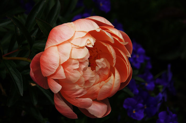
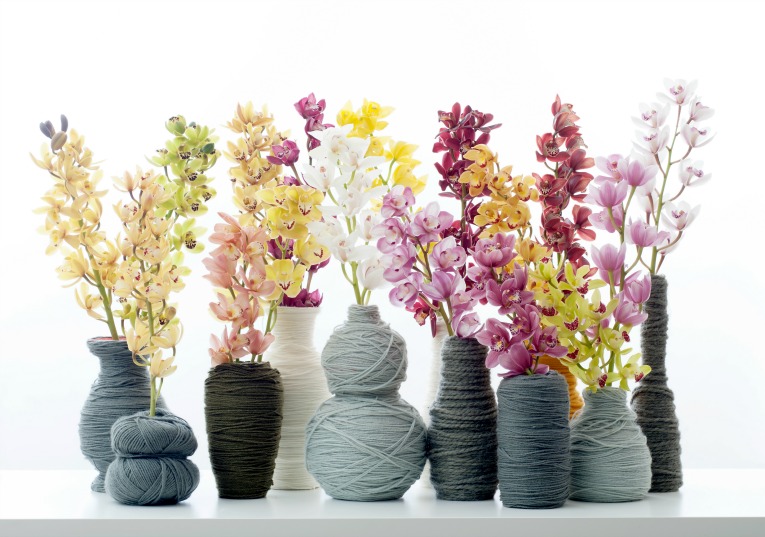
Sandra, husband Leo and team have been growing cymbidiums for eighteen years.  They produce some of the highest quality orchids under the brand of Cy More Flavour. Their obsession with the variety knows no bounds.

The longer you work with them the more you love them. When you look at any variety closely you’ll find out that every one of them have beautiful details.

The cymbidium plant originates from Asia and each variety flowers once per year, but we wanted to know why they are a winter flower:

Originally, it is thought of as an autumn/winter product because that’s the time that most of the varieties bloom from origin. It depends on the genes of the variety to which month that is, but a variety that blooms in November from origin is not suitable to bloom in April or May.

The sheer variety of cymbidium is vast, each with unique patterning and colour tones. The name Cy More Flavour reflects the idea: ‘See More Colour’. The food mentioned in the flower’s name represents its colour, with coconut for white, cherry for red and caramel for the brown and oranges.

Andrea Dutton

All these colours give us the most amazing palettes to work with. At Christmas time the green and red tones are very popular, and in autumn the copper and brown colored varieties perfectly represent the season.  And for a winter wedding white is wonderful.

It can be used in so many different styles, in classic arrangements as well as contemporary and every style in between.

Hybrid have used these magnificent flowers in all manner of ways, for example:

  • Showcasing their tall towering stems in event pedestal designs
  • Creating wide fanned shaped designs for tall table centres in hotel ballrooms
  • Submerging the whole stems in clear cylinder vases for weekly corporate reception designs
  • Arranging individual stems into clusters of modern vases to fill luxury, contemporary spaces
  • Hanging them upside down from ceilings and arches at parties and weddings
  • Using the individual heads in vials of water amongst bouquets

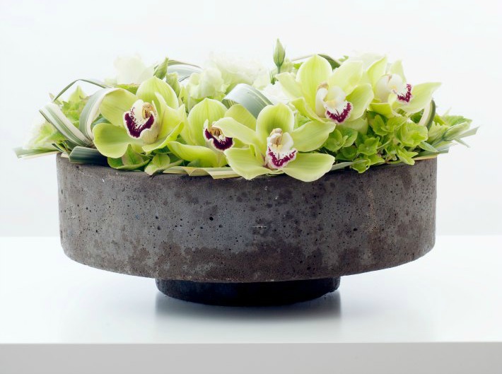
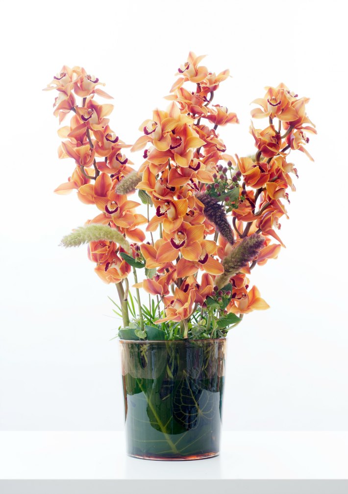
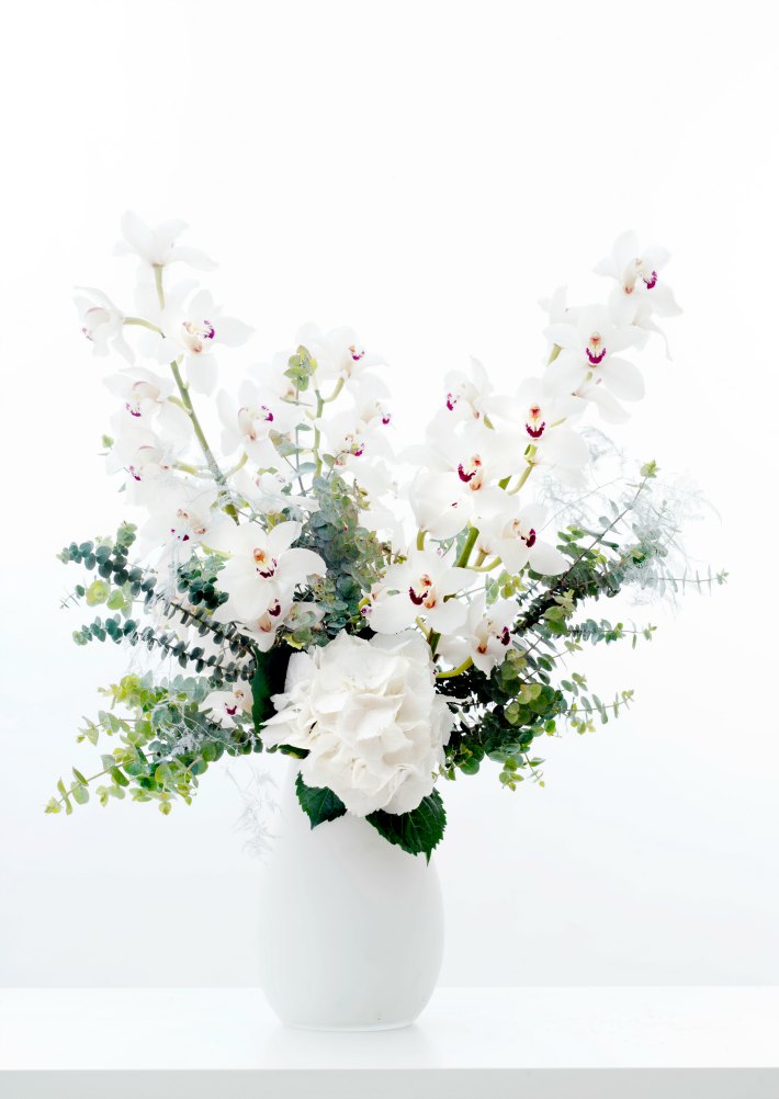
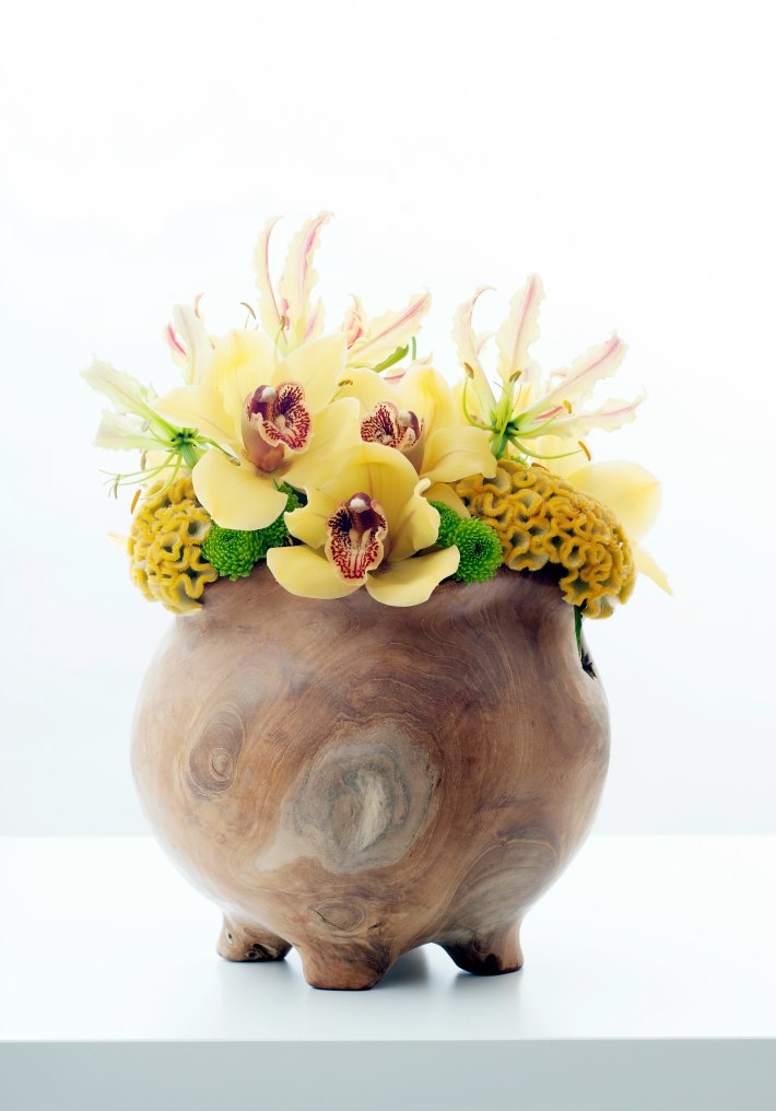
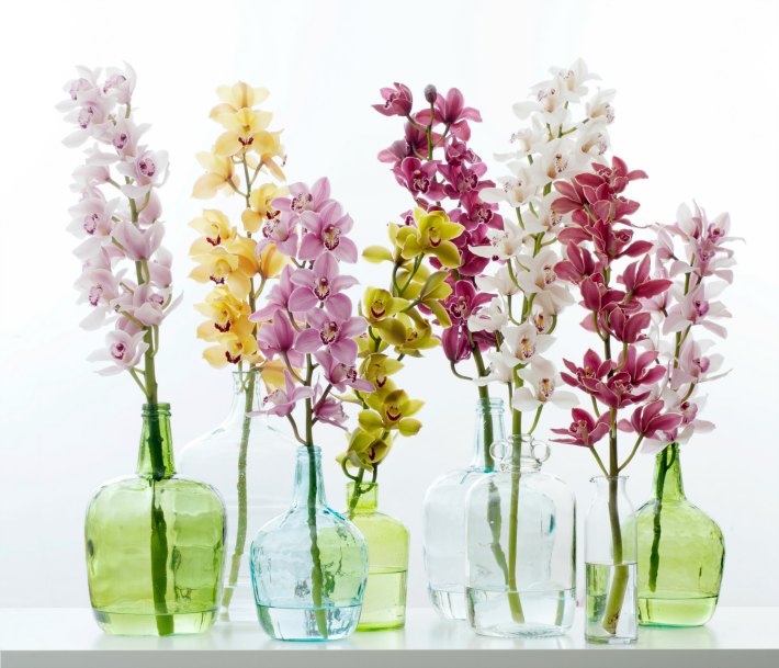
The possibilities really are endless!

Growing a Cymbidium is not mean feat and creating such a beautiful plant can’t be rushed, in all, it takes seven to eight years from the moment of cross pollination to harvest! First, the grower selects two features of individual plants that they would like to incorporate in a new one. Pollen is transferred and it takes around 9 months for germination. 400 ‘cotyledon’ can be created from one seed but, incredibly, after three years, only 3 or 4 plants will make it through Cy More’s selection criteria. It then takes another three years before the flowers first bloom. And to think that we get impatient having to wait for them just over the summer months!

Cy More Flavour

I asked Cy More which variety was their favourite, Sandra told me:

The variety “Madelon” is a beautiful deep red and named after our daughter. I think George Harrison “Flying High”, a gorgeous red variety with nicely shaped flowers, could be the new classic.

I asked Sandra which florists, in her opinion, did the flowers the most justice:

There are so many florists from all over the world who create wonderful arrangements with cymbidium. The Norwegian master-florist, and former world champion, Stein Are Hansen, is a real cymbidium lover who designs wonderful arrangements. Mark Pampling, an Australian based floral designer, often works with cymbidium in a very fresh and contemporary style.

Cy More’s recommendations:

  • The orchid is the symbol of pure friendship so they make perfect gifts.
  • Never throw away the lower heads of orchids on a stem, use them in a tiny vase in fresh tepid water.
  • Look after cymbidium by cutting 1 cm off the end of the stem and repeat this every five days.
  • Never use cut flower food and do not put the cymbidium stem into direct sunlight.
  • Avoid touching the stigma as this will accidentally distribute the pollen and the lip from the cymbidium flower will turn red earlier.

Andrea Dutton

All images, unless otherwise stated, are generously supplied by Orchids-Info 

How to scare your guests witless: the ultimate Halloween party

There is only one time in the whole year when you are allowed to completely freak out your clients so you might as well do it properly! And where better to scare your guests witless than at one of the most inspired events venues in the City of London?

Guests who are lucky enough to be invited to a Brewery showcase event should drop everything and jump at the chance to attend because the experience will undoubtedly stay with you forever.  Those who were brave enough to accept their Halloween party invitation at The Brewery last October did so at their own peril.

Now as you know from previous posts, we are strong advocates of amazing events industry talent who come together to create stunning events and totally immersive experiences. Having worked with the Brewery for a number of years, we always eagerly anticipate their upcoming events which continue to impress us with their unique themes and amazing attention to detail.

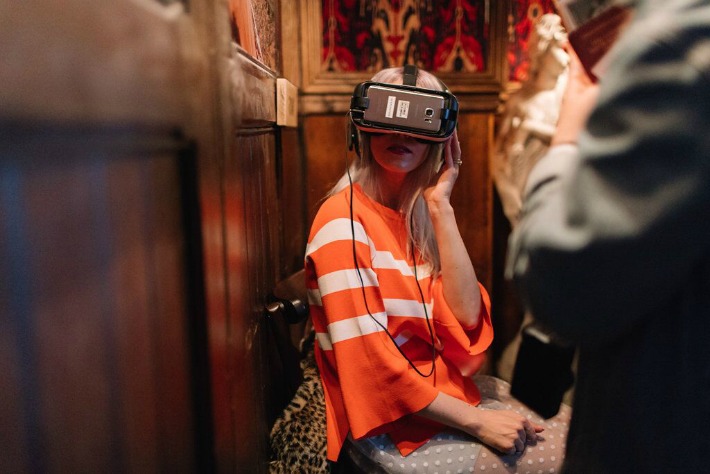
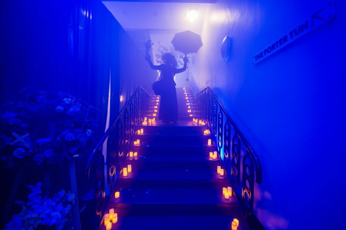
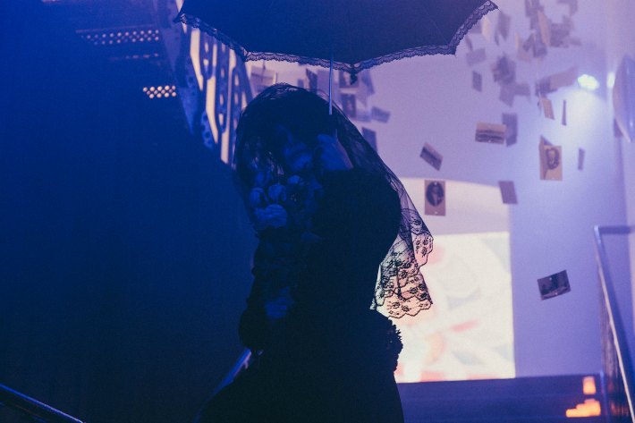
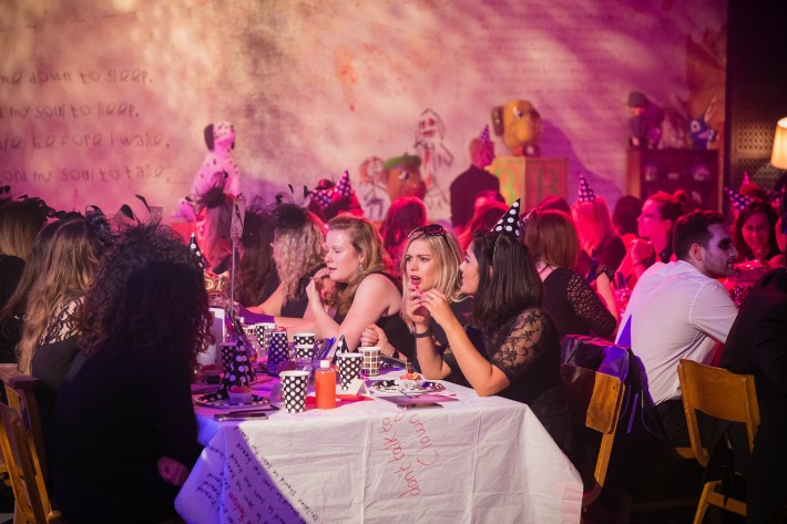
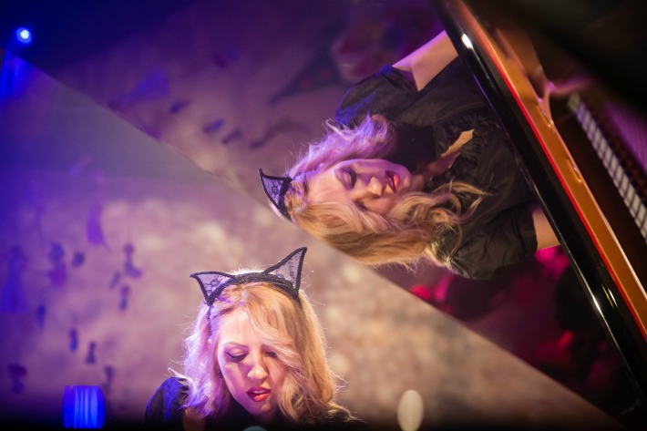
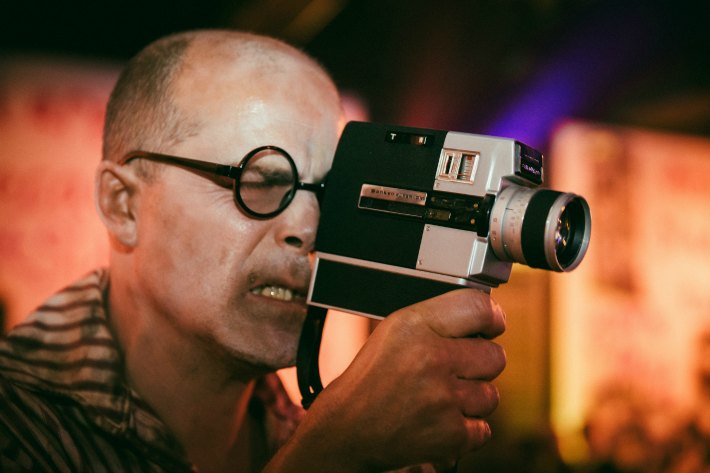
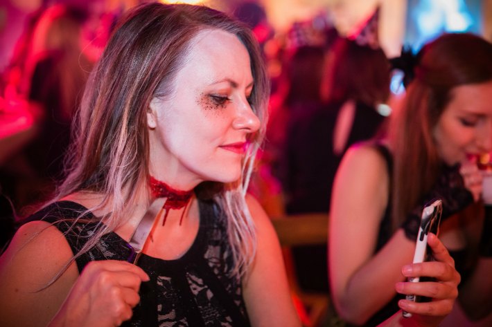
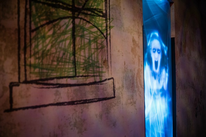
However, we had no idea on that fateful afternoon last October that we would become totally immersed in the downright scary world of House Macabre whilst we were setting up our ‘creepy old lady boudoir’ themed florals.  And that was even before the sun went down and the actors came out!
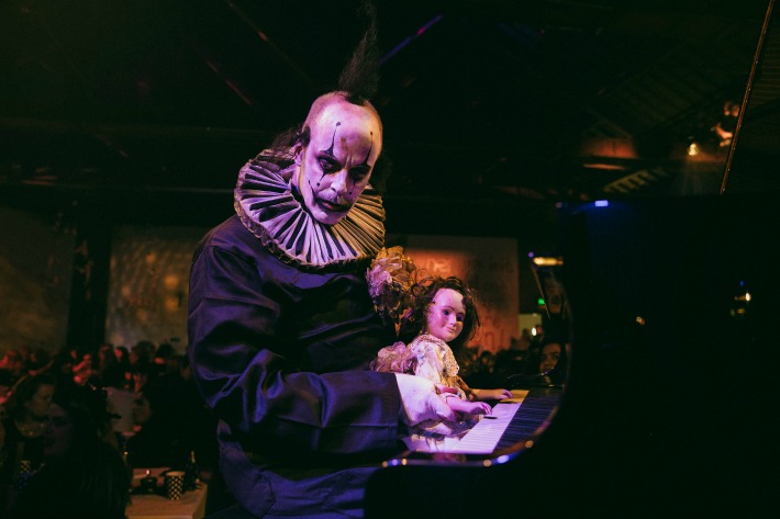
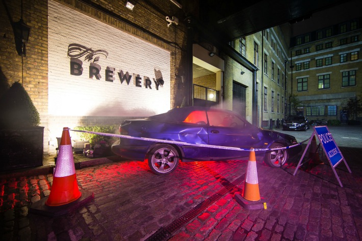
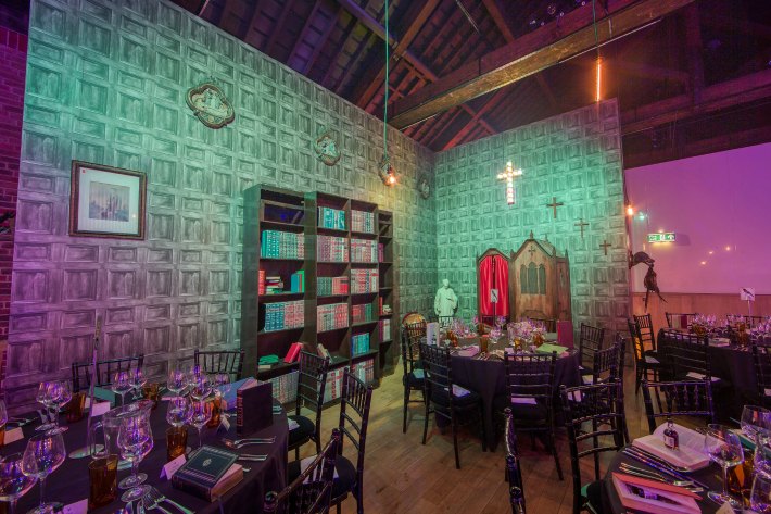
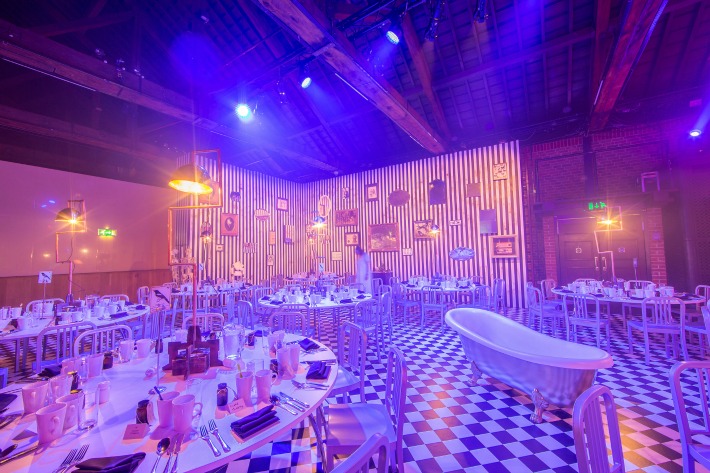
Reminiscing on the theme behind their spellbinding Halloween event, the team at the Brewery conveyed how;

As a Halloween event it was designed to provide a fun but unsettling environment that explores our deepest fears. The showcase had to be nothing like the guests had ever experienced before.  It had to be completely immersive and create a long lasting impression of a standard way beyond expectation levels.

To bring this sensationally scary showcase to life a wealth of frightful features were designed and created, including:

The deathly invitation

The Brewery team are masters of suspense and in the weeks preceding the event itself a standalone ‘House Macabre’ brand and identity were created. Guests were sent a ‘Death’ tarot card in branded stationary, a dedicated countdown clock micro-site was launched, and death certificate invitations were designed to intrigue and excite all who dared to attend.

First on the scene

On the day of the event itself guests were held outside and presented with cards displaying their table number. This simple yet significant finishing touch enabled the Brewery team to create an eerie ambience that would not be disrupted by complicated table plans. Moreover, a list of rules and warnings were displayed upon arrival to heighten guest anticipation and further immerse them within the haunting world of ‘House Macabre’.

In order to reach their entrance guests had to walk through the scene of a car crash. The Brewery team paid close attention to detail; sourcing the materials for this chaotic car crash scene from a scrap yard and having them specifically transported in for the event. The Brewery team have an excellent eye for detail and explained to us that;

The car crash complete with police man was made to simulate the guest’s death. This then led them through to the scene of their funeral when a wailing mourner led them up the stairs, through smoke and hundreds of old family photos hung from the ceiling, loud videos playing, strobe lighting and self-help audio playing all designed to create a disorientating experience.

Drinks in purgatory

To bring the immersive world of ‘House Macabre’ to life, an entire new space was constructed on the Porter Tun balcony using a temporary ceiling and walls. This area was specifically designed to recreate ‘Purgatory’, with the Brewery team highlighting to us how;

This space was designed to be ‘purgatory’ a tired old waiting room with bored receptionists interacting with guests.

In keeping with the non-traditional nature of their drinks reception area, no drinks were actually served by the Brewery team. Instead, guests had to search nearby cupboards for elusive beers and retrieve cocktails from water coolers.

When dinner was due to be served an actor arrived and announced the fate of the guests. The sense of suspense was heightened even further when guests were led towards their ‘fate’ through a secret hidden door. Upon entering ‘Purgatory’ each guest was presented with a Guide To The Afterlife within which the Brewery team had included;

A welcome to the afterlife, a questionnaire to establish which route their afterlife will take, the menu and details about the venue.

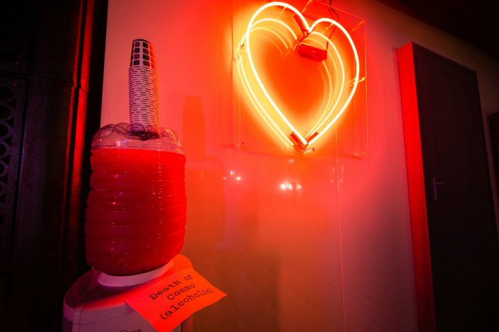
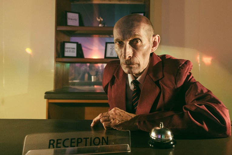
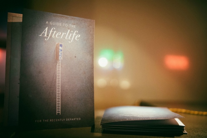
Welcome to the afterlife

The weird and wonderful world of ‘House Macabre’ was created by transforming The Porter Tun room into four separate dining spaces. Each of these eerie entertaining areas was intended to reflect a different room in the ‘House Macabre’ so they had been meticulously designed with distinctly different set builds, style influences and a key character actor hosting the guests.

The attention to detail extended to the table settings; with each space offering different crockery. In fact, the Nursery guests were eating off paper plates! The Bathroom, complete with its freaky contents, was another particularly frightening feature. Irrespective of the room in which they resided, each guest received a gift. From books with the pages cut out and small bottles of gin inside in the Library, to a box with a severed edible finger in the Bedroom, no guest was left empty-handed!

The Bedroom was our home for the afternoon.  We were tasked with creating old and decayed boudoir-style table centres that would look as if they had been abandoned in the centre of each guest table. It is not often that we have to wait for our flowers to die before we can use them but it’s fair to say that this was a one-of-a-kind experience.  October is the perfect time for muted colours, old dusty looking grasses combined with dried seed heads, and beige coloured blown open roses so with these style influences in mind we were able to create some beautifully decayed looking designs that were set onto old black doilies and covered in cobwebs.

The Brewery’s unforgettable ‘House Macabre’ event demonstrates how a powerful event theme can transform an ordinary space into an entirely new world. Immersive actors had been provided with scripts to help them interact with guests and fulfil their ghoulish roles. Unscripted extras were present to invoke unease and suspense. A live pianist provided haunting background music from a raised round stage in the centre of the room by playing macabre versions of popular songs.

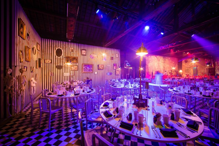
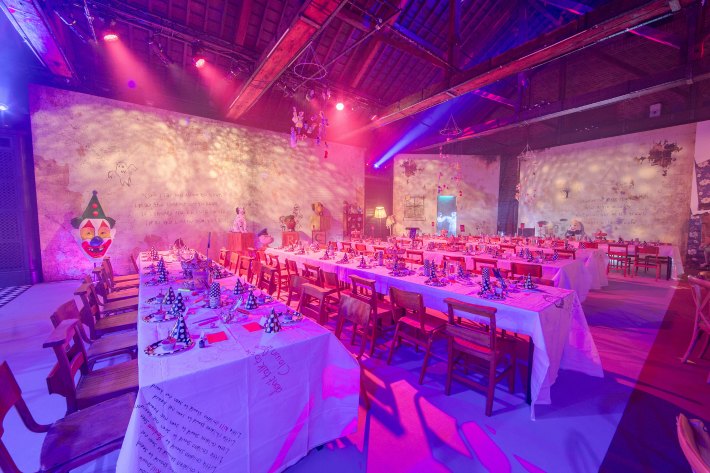
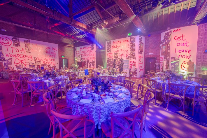
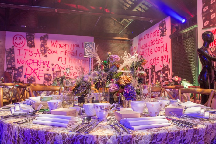
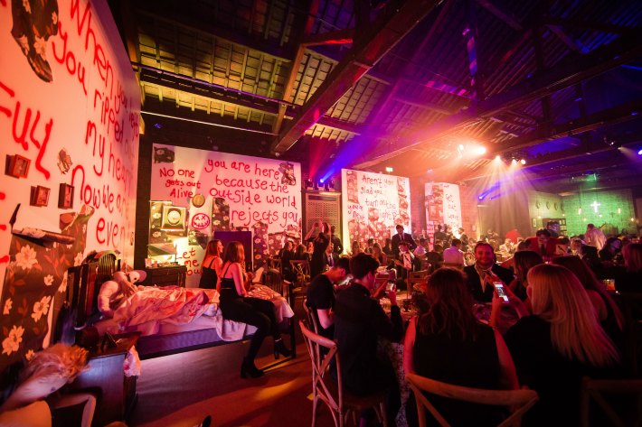
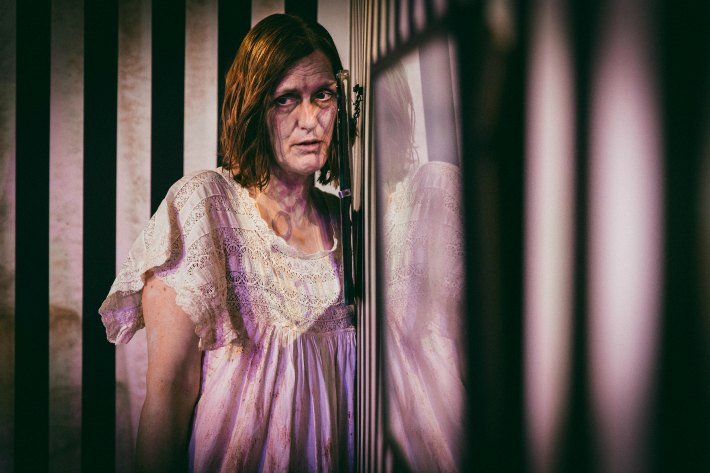
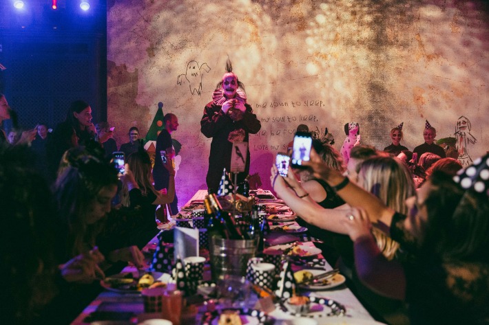
All of these freaky finishing touches, combined with the space’s lighting, catering, floral event designs and set decorations, truly transformed the Porter Tun room into the ‘House Macabre’ and provided all who attended with an eerie experience that we will never forget!

With thanks to the phenomenal team at The Brewery.  Images courtesy of The Brewery.

The journey, the detail, and the interaction: how Sarah Kay creates “other worlds”

There is something to be said about being the last to arrive at the party.  Alright, alright we don’t mean the actual party (we get up far too early for that), we are talking about the wonderful world of event planning.

We florists, the providers of the finishing touches, often find ourselves presented with unique themes and impressive event briefs around which to create bespoke floral designs. It really does mean that no two events are ever the same.  In the last few months alone we have created floral arrangements to accompany all manner of amazing themes including Vintage Circuses, Luxury Summers, Tiki Bars, Secret Gardens and Maritime Wonders but to name a few!

Now of course it goes without saying that choosing the right floral design can be absolutely key to creating impressive event. But in order to make these occasions truly immersive it calls for a crack team of events professionals from catering, entertainment and lighting to scent and virtual reality providers . All of these industry experts have one mission in mind; to come together and create an experience for the guests that will resonate far beyond the event itself.

Ask the expert

Sarah Kay is one of the most inspired, energetic and knowledgeable experts on the UK events scene. Through her company, The Edit, Sarah organizes and consults on a broad spectrum of amazing events which transport her clients’ guests to exciting new worlds.  Ever eager to gain some exclusive insights from an industry expert, we decided to ask Sarah to some key questions on how to create an amazing corporate event. Enjoy!

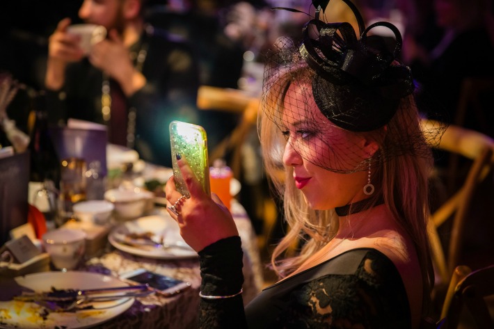
What do you love most about your job?

What I love about events is that it’s creating another world for the day or evening. Guests step into a space and they’re transported – worries are forgotten and it’s all about having a good time, socialising and enjoying the moment.

Does an event always have to have a theme?

Themes certainly help to create ‘worlds’. Nowadays everything feels so fast paced and serious that a really fun theme that creates something so removed from your day to day life is hugely appealing and has maximum impact. But a ‘theme’ doesn’t mean ‘themed’. For example, we recently provided conference styling for a bank where the brief was black and white with the conversations of the day adding the colour. We added ideas that encouraged audience participation and created fun moments such as black and white balloons that were popped to reveal colourful confetti. It was about adding a fun touch without detracting from the concept of the day.

How do you create an engaging corporate event?

When you think about the journey, the detail and how guests will interact with the space. Just having huge props isn’t enough for people to feel that they’re in another place or world. It’s all about thinking how your guests will respond, what will make them smile, what would they Instagram and how will they walk away feeling. It’s more than a look, it’s a concept and should run through every element of the event from the invite through to the food, the entertainment and the atmosphere. We’ve even introduced event scents before as they evoke such powerful memories – that really helps to immerse people.

What are the three key aspects that you cannot neglect when working to a theme?

Detail, food and the journey. We design an event so that people walk in and think ‘wow’ but then as the event continues they notice the detail again and again. People remember the atmosphere and the detail. The food is something most events have and it’s missing a trick to not incorporate this into the theme. It’s such a small cost to do so therefore we think it’s essential to consider.

What has been your favourite corporate event?

My favourite event is definitely the festival theme we did at Sushi Samba with Story. It was such a fun brief and we totally transformed the space. Guests arrived and were given a lanyard with a stage schedule, wristbands and a phone charger. The journey saw them taking in four different bars, all styled to a theme, the main space which has been covered in grass, and if they were lucky enough to discover it, a secret garden (with Hybrid’s designs!) complete with liquid nitrogen cocktails and ice creams. The theme was so much fun and we really ran with it, creating a totally unexpected space at the top of a skyscraper.

Any predictions for future events themes?

I think immersive events will continue to be popular, so any theme or world but just totally all consuming, very theatrical and full on. People are exposed to so many stimulants that event themes have had to keep up and the immersive concept overtakes to create impact.

I also think natural. As the world becomes more digital people crave nostalgia, nature and relaxed atmospheres so I think we’ll see lots more of this.

Having said that technology is huge especially virtual reality which is definitely one of the event buzz words of the moment.

Any pearls of wisdom for the corporate events planner?

Always consider what you are trying to achieve. What are your goals? How do you want your guests to feel before the event, during and after? Thinking about the guest journey and experience as this really helps you plan. Also find the best suppliers as they help you create the best events – I couldn’t do it without them!

With thanks to Story for the Festival Event at SushiSamba images and The Edit for all other images.