Our top 3 images from our floral portfolio (and why they probably won’t be the ones you think!)

If someone were to tell you about an amazing company they had just discovered, where would you turn to first to find out more about them? We would hazard a guess that your first port of call would be their website or Instagram feed. In this image led, digital age both social media and websites are vital for getting a company’s message out there, and both require a fair amount of maintenance to ensure they accurately reflect the brand.

Relating this to our own, much nurtured website, we wondered which really is the most effective medium, our socials or our website, for generating the most enquiries. We asked the wonderful Abigail, from You and Me Collective, who said:

… We are hearing more and more that are clients are getting enquiries directly through their social channels, almost entirely missing the step between social and website….Websites and social channels are open 24/7 so how they look and feel is essential. I would never say you don’t need a website because this is the treasure trove of information where you sell yourself to a customer, a high quality engaging social channel is key alongside it.

You see, not so long ago we finished updating the Hybrid website with images of our most recent work. We must come clean and say that this process was possibly the most arduous task ever! We found it so hard to see the ‘flowers for the trees’ (so to speak) as we have thousands of gorgeous pictures of our work, and with the exception of a few of our absolute favourites it was nigh on impossible to whittle this vast number down. This resulted in hours spent scratching our heads over which images to choose.

We turned to our friends at Christchurch Creative for their advice. Sarah Worswick, Director said:

When choosing images for your website, quality is key. Make sure every image is sharp and reflects your brand identity. Use strong visuals to hook-in your site visitor, choose images which feature ‘real’ people too. Don’t forget to name every image you use. This way, you can optimise each shot you upload, as search engines can easily index them. Add in the alt text to describe what the image is showing, which will aid search engines, too.

After we had finally chosen the lucky few pictures and uploaded them and the whole process got us thinking: Can you really convey a message and the passion you have for your work in just one image? Are you able to look at a photograph of your own work objectively and if you are, should you only post pictures that will receive the most ‘likes’?

Abigail told us:

I get asked this all the time! Instagram and Facebook especially are to be seen as a portfolio… if you look at photographers, they’ll often post a detail shot (ring, flowers, table setting), then a couple shot, then a full party shot showing a 360 reveal of the party. Carousel posts and stories are always a fabulous way to show off – carousels allow you to post up to 10 pictures so you can really showcase the full gallery. Stories are a great ‘look’ into behind the scenes, what you’re doing as a team, the creative process and the event.

What we took from this is that you should only show images that represent you, your values and, most important of all, showcase your work. If you really want your audience to get more of a feel of that image and why it is so important to you then by all means elaborate on it in the comments part of your Instagram feed. And if you really want to give that image further meaning and authenticity then of course you must write a blog on it!

So, without further ado, here they are: our 3 most favourite images and beneath each is our reason why they just had to be featured on our website.

No 1:
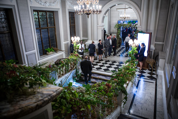
This is the entrance to the Grand Hall at The Grand Connaught Rooms in central London, who knows how many times we have walked up and down this staircase in the last 16 years.

In fact, this is where it all started for Hybrid. We’ve done Christmases, weddings ceremonies, award evenings and installed flowers in this building, every week, since 2004. The event shown in this image, the launch party for DeVere, was our most favourite ever. The theme was the great British outdoors, so we covered this stunning marble stair-case with beautiful lush British grown greenery and flowers. We were so lucky to work alongside the supremely talented Chelsea Flower Show sculptor, Emma Stothard who included her amazing woven animal sculptures throughout the party.

No 2:
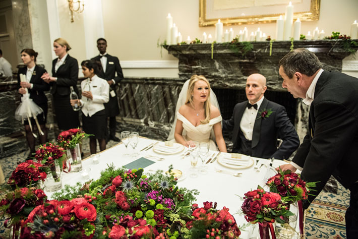
We adore this perfectly candid shot of Sophie’s wedding at the Landmark Hotel. For us it conveys a true ‘behind the scenes at London hotel wedding’ feel with our beautiful couple nervously preparing their speeches with the Master of Ceremony, surrounded by bridal party flowers, candlelight and waiting staff. The romantic early spring flowers were divine and the burgundy ranunculus were just perfect.

This image shows not just our clients, but also the staff of the hotel. For a wedding florist it is impossible to look back on an event and not remember the huge effort everyone who works at the venue puts in before the guests arrive. The professionalism and five-star service shown by all staff, and the wonderful excitement and anticipation that you can’t help but feel.

Ps. Here’s a little peak at Sophie’s beautiful bouquet and stunning dress detail too!

No 3:
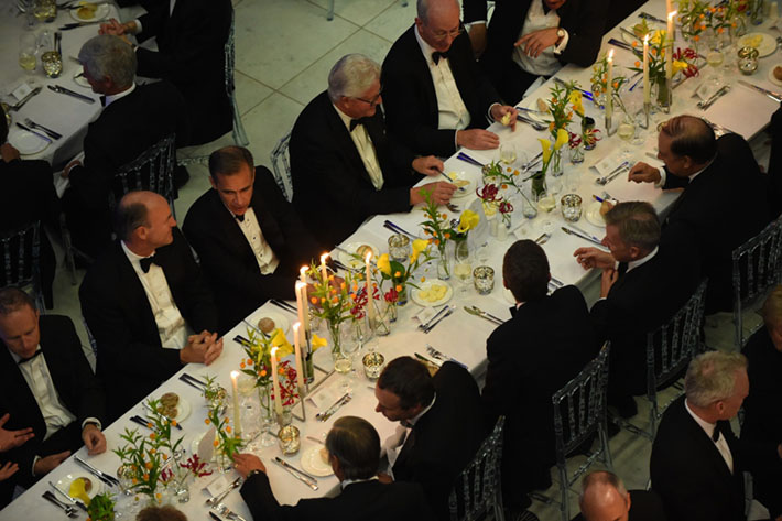
We have such fond memories of this tablescape: it is such a simple design and this is precisely why we love it so much. It shows that less can be more, and a beautiful selection of elegant flowers in just the right colour theme can create a huge impression. We wanted to use flowers which would glow in a modern, clean way, flattering the stunning concrete surrounds of the ‘structural expressionist’ building that is the Lloyd’s Building in the City of London.

We loved working with the acid yellow of these callas which we set against the pale orange bell-like blooms of a very special flower called Sandersonia and combined both with deepest pink Gloriosa lilies. This is one of our most favourite combinations of fresh flowers and to top it off we were able to use our treasured classic brushed steel Conran candlesticks to complete the contemporary look. For us, this image serves as a reminder to create floral designs that in harmony with the venue and appeal to the type of guest sitting at the table (in this instance, one the guests was City of London legend, Mark Carney! We LOVE him!).

And so now we would love to know, does knowing more about the stories behind our top three images change your perception of us?
How to style a wedding the perfectly imperfect way

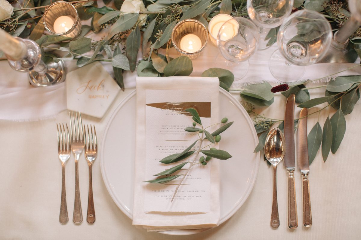
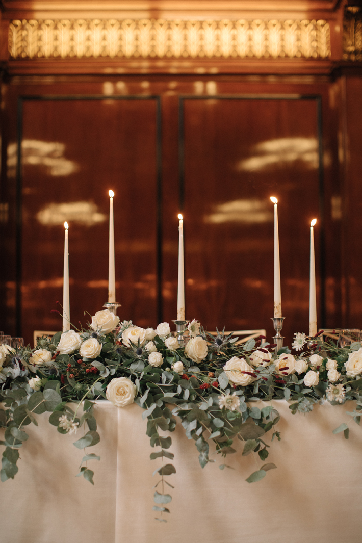
There is a school of thought which argues that Western ideals of beauty are based in symmetry and perfection, whilst in the East, aesthetic value can be found in the damaged or imperfect.  For this particular wedding day, we were asked to create florals for our perfectly named couple Emily and Emile, who wanted beauty conveyed in an utterly imperfect way!

Not only did our clients eschew typically ‘perfect’ flowers, they were also into the aesthetic of broken things. To clarify, Emily and Emile are great admirers of the ancient and very beautiful Japanese art of Kintsugi.

The inspiration:

Kintsugi, which literally means ‘golden joinery’, is the art of repairing broken pottery with lacquer which has been mixed with powdered gold, silver or platinum. Dating back to the 15th Century, it has evolved into an art form by which utterly unique and beautiful objects are created from once broken pieces.

In promoting repair as an intrinsic part of an object’s history, Kintsugi has become a metaphor and philosophy for life: for some it demonstrates human resilience and how we as people develop from negative experiences, taking the best from them and owning them, which in turn makes each of us who we are.

The brief:

And with this in mind, our challenge; should we choose to accept it, was to piece together a very relaxed look, with simple, unassuming flowers but in a very careful, impeccable way.  We would need to incorporate wild, rambling natural foliage into very formal and historic London buildings: St John’s Church in Notting Hill and Merchant Taylors Hall in the City.  Our clients wanted us to make everything look effortless and unaffected, whilst at the same time paying every attention to detail.

No problem, we accept!

We briefed the team that the look was to be disordered, but that we need to be meticulous about how we created it! We agreed to avoid using typical ‘flower-shop’ flowers –so no dahlia, tightly spiralled roses or trendy succulents – and turned our eye to using branches, foliage and simple, elegant flowers that could hold their own without shouting ‘everyone look at me!”. Through the usage of symbolic thistles and olive, our floral designs were to look very natural and gratifying.

The details:

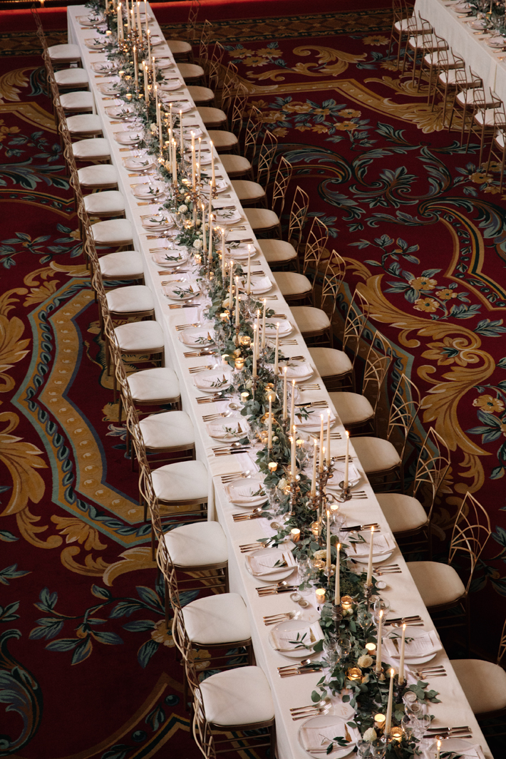
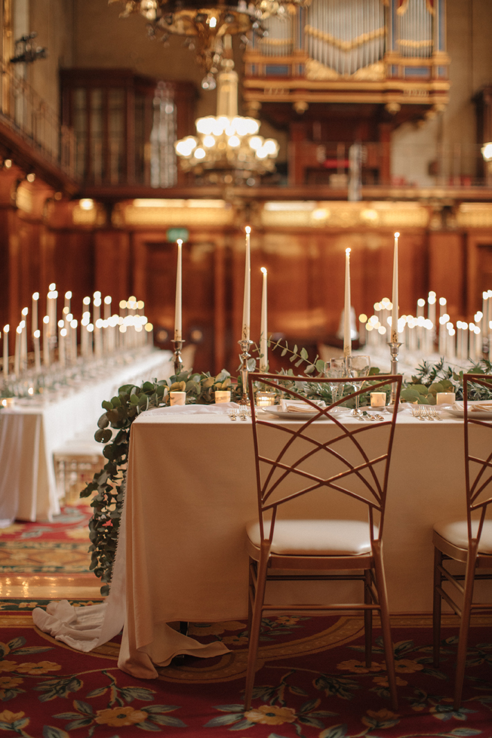
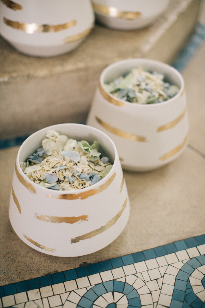
September is the perfect time of year for wild looking late summer flowers.  Using a floral palette of white, along with touches of red and blue to complement the venue interiors, we incorporated masses of stunning eucalyptus with lots, and lots, of candlelight.

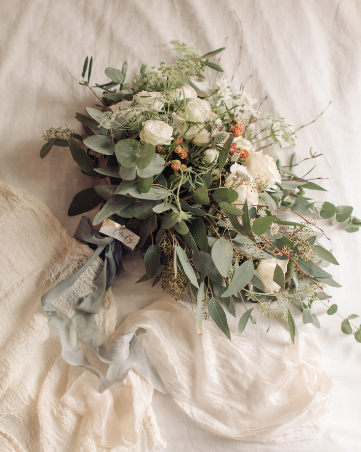
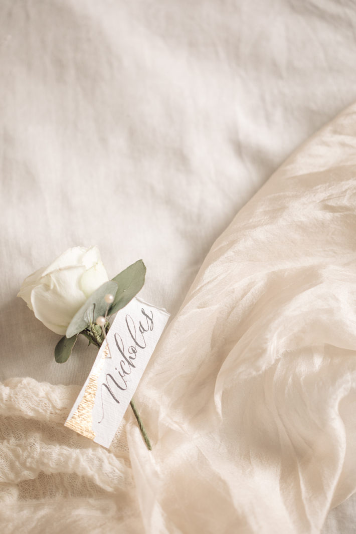
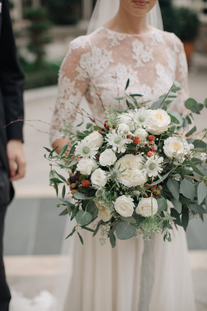
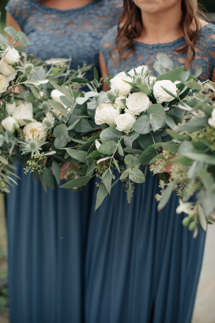
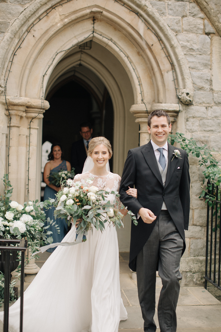
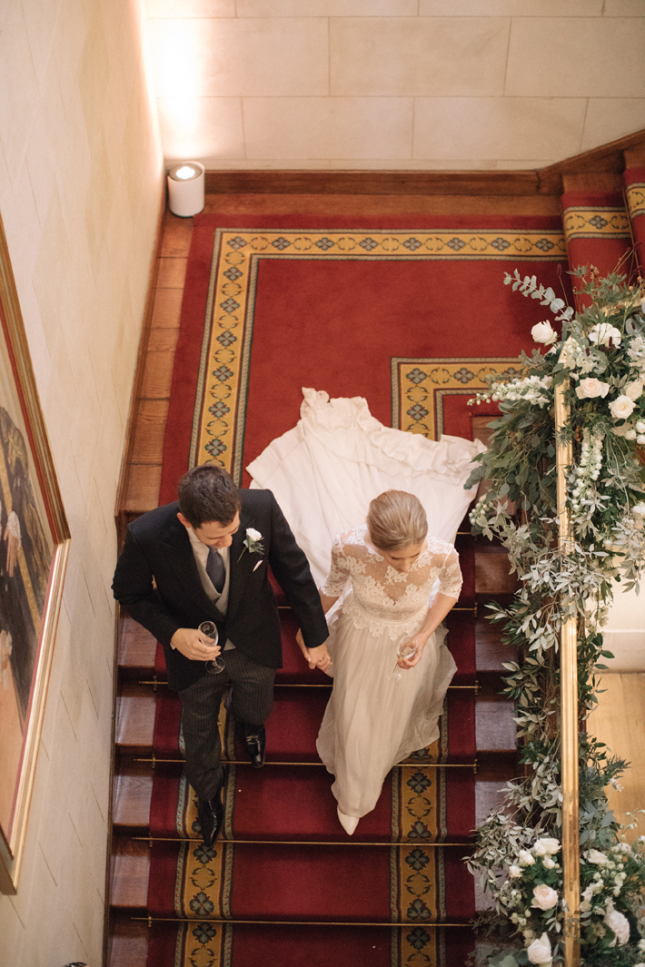
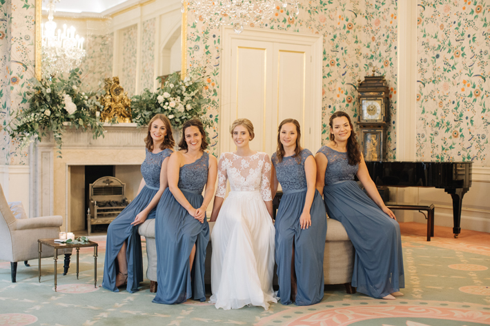
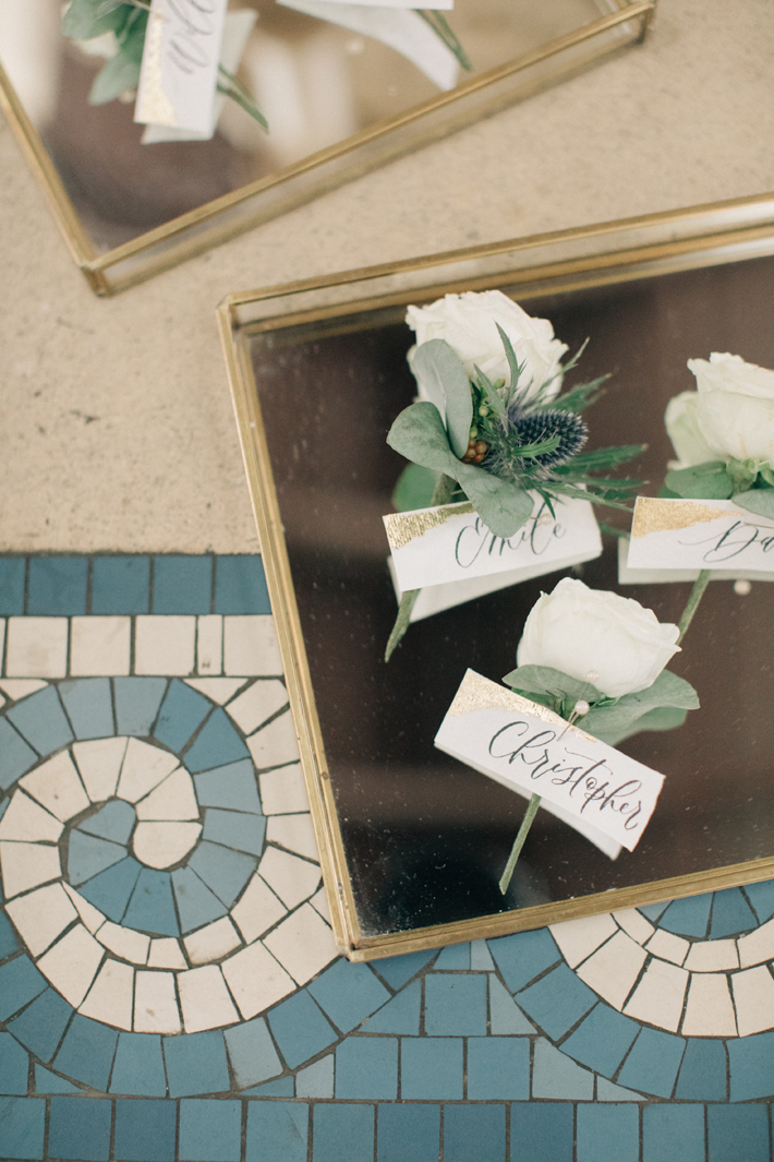
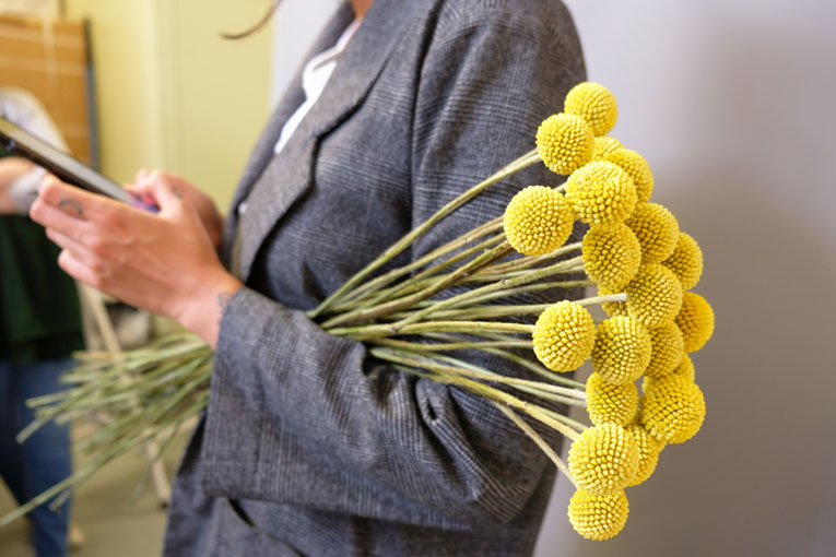
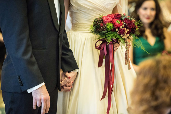
We worked with wedding planner extraordinaire Knot and Pop to create a beautiful look for the bridal party, ceremony and reception.  A loose and flowing bouquet for the bride was made from eucalyptus, dill, the most heavenly mix of garden roses and white scabiosa and astrantia, together with thistle, wild blackberries and twigs. The simple, delicate and timeless button holes for the gentlemen were made from the roses and thistle for Emile. With the cool tones of blue found in the thistle highlighting the stunning bridesmaids’ dresses and the tiles of the St John’s Church, the look for the ceremony was one of pure elegance.

The venue:

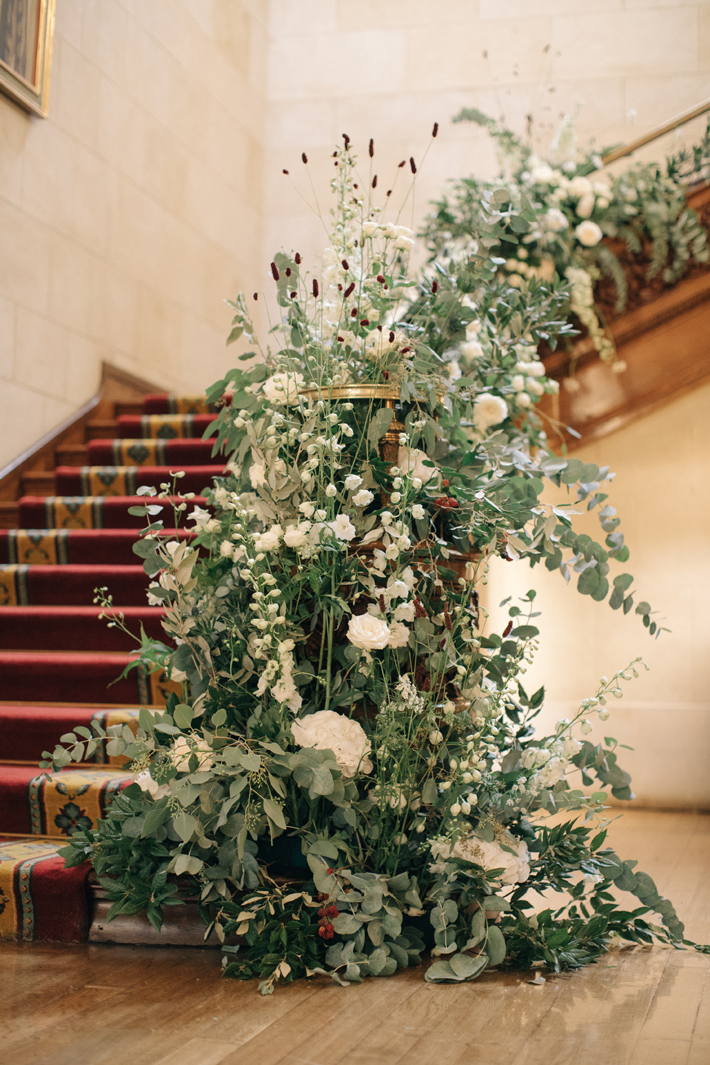
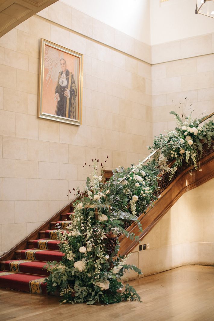
For Merchant Taylors’ Hall we created a feature entrance design to look as if it were growing around the formal grand stair-case. Simple white delphinium, hydrangeas, grass-like red sanguisorba, garden roses, blackberries, eucalyptus, olive and ruscus all combined to compliment this stunning historical hall.

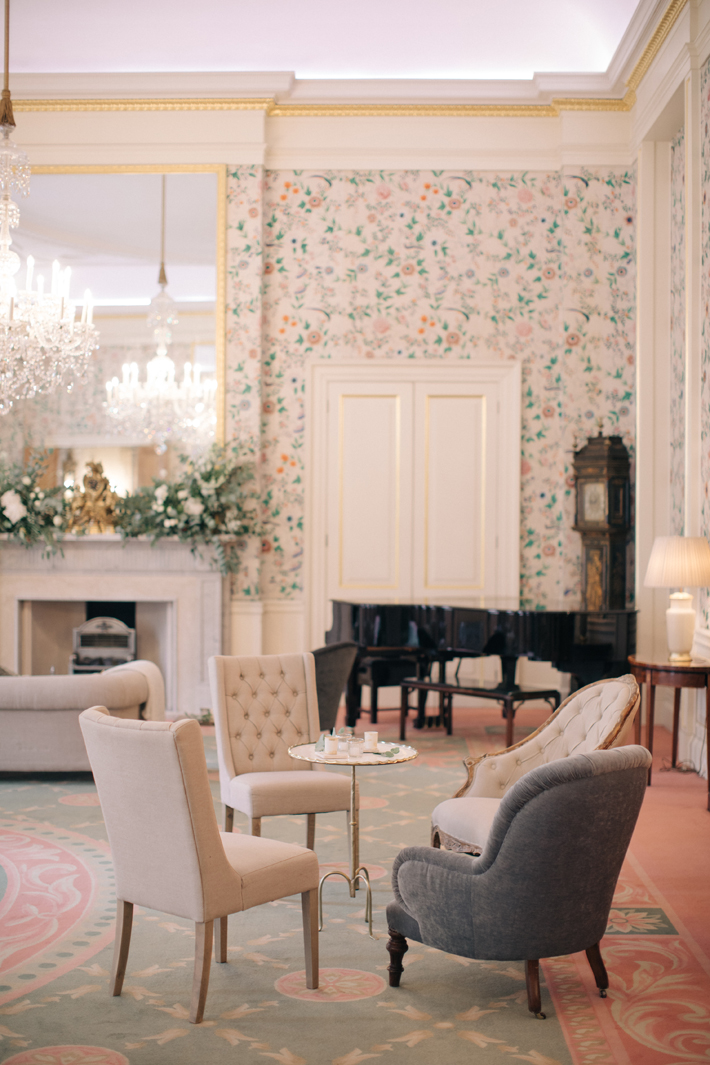
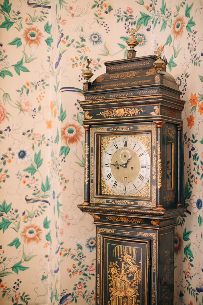
The Parlour, with its 18th Century original Chinese wallpaper, was simply dressed with a rambling, but not over-the-top, mantel design of matching flowers which perfectly complimented the collection of elegant furniture.

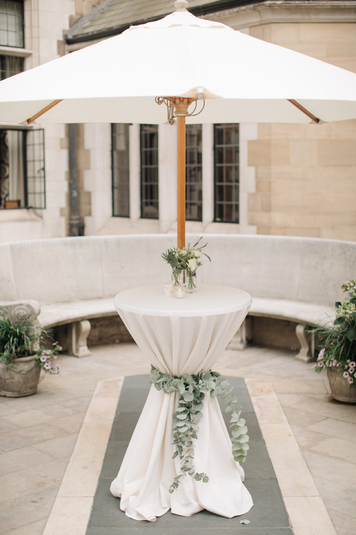
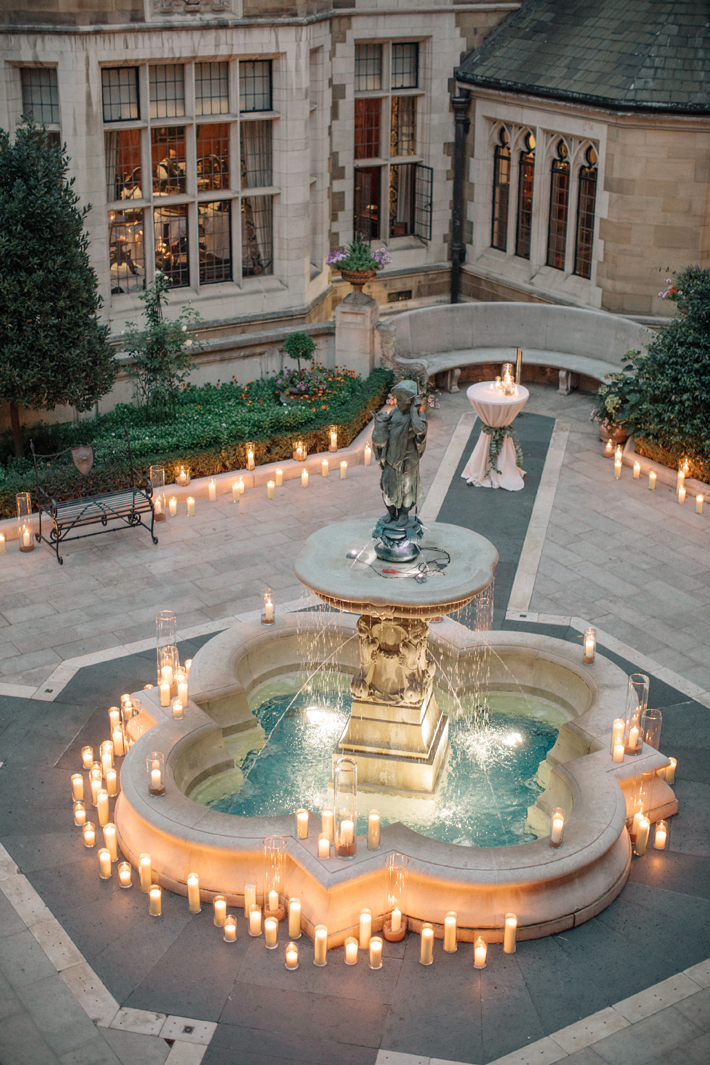
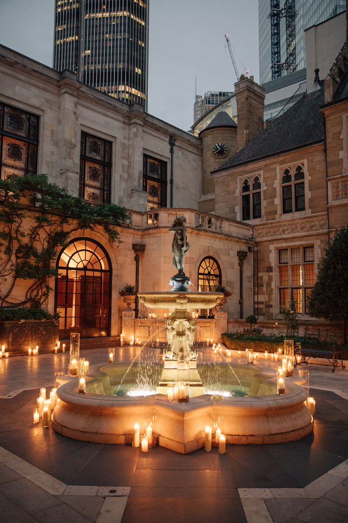
The courtyard, a hidden gem within the City of London, was beautifully set with white dressed drinks tables tied with swags of foliage and dressed with a smattering of key flowers.  Later in the evening the courtyard became alive with the dancing, flickering flames and shadows from candles which combined to create an atmospheric and befittingly romantic space.

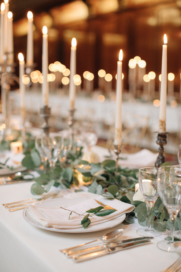
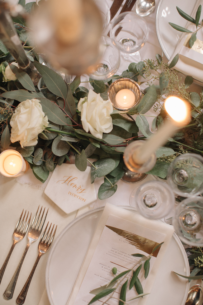
Rambling eucalyptus and olive garlands were laid along the stunning guest tables in the Great Hall, interspersed with blown roses, blue thistle and deep red juicy blackberries. The nodding seed-like heads of sanguisorba and scabiosa were entwined amongst lots and lots of candlesticks and perfectly set tapered candles.

No detail was missed from the perfectly positioned tables, the stunning dining chairs and exquisite place settings which were styled by Susie at Knot and Pop.  And as for that reference to the beautiful art of Kintsugi? Well, everything that Susie touched that day, definitely received a dusting of gold!

All stunning images courtesy of M&J Photography

Christmas styling … why you don’t need to throw loads of flowers at it!

In case you’ve not noticed, soon it will be Christmas; that most wonderful time of the year! A time to relax, be merry, deck the halls! With social media awash with images of the perfect Christmas, from opulent flower walls to entire buildings covered in decoration, you may be forgiven for thinking that to create a Wow, you must GO BIG!

Of course, insta-images of 12 foot high Christmas trees swamped in bows, candles and glitz create a real impact, but, as a rule, at Hybrid we abide by the “less is more” adage; we believe that the essence of Christmas can still be captured using a few, well chosen, beautifully styled flowers rather than a tonne of sparkly birch trees. 

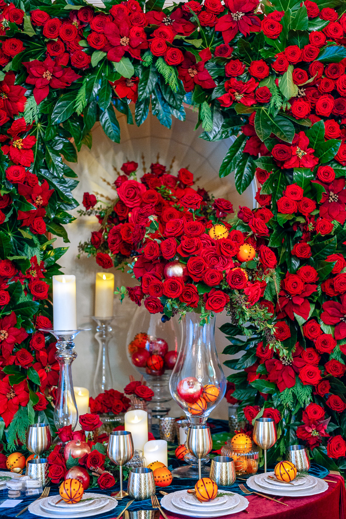
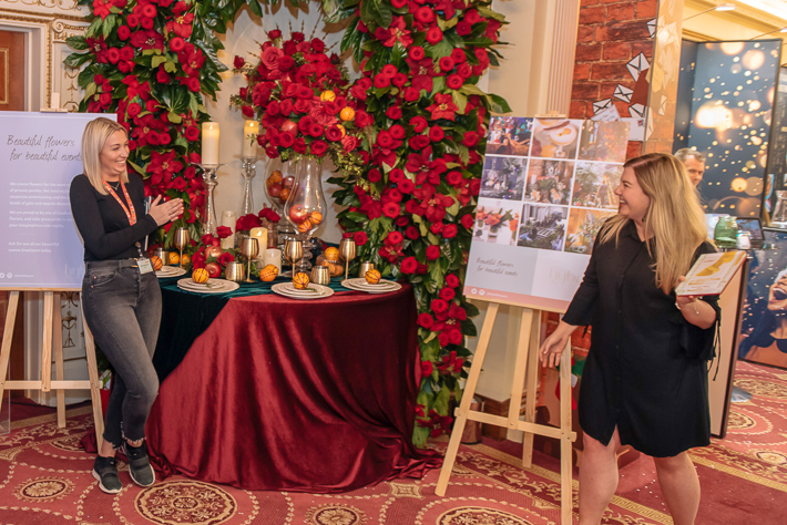
For our designs at this year’s London Christmas Party Show we were asked to create a design within an alcove at the largest Livery Hall in London, Plaisterers’ Hall, which backs on to the remains of the original Roman London Wall. In this unique venue, we wanted to create a lush Christmas atmosphere without going too over the top; we wanted the warmth, the magic and the feel of Christmas but didn’t want to chuck glitter at everything.

The essence of Christmas style:

To achieve this, we decided to go back to basics and asked ourselves what is the essence of Christmas? What are the most Christmassy colours, scents, textures around, and which little touches can we add to our design to make people feel the magic of Christmas?
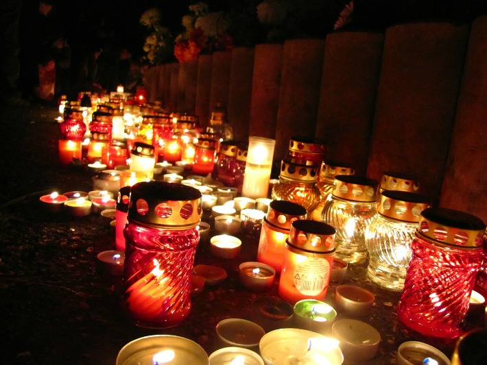
We challenged ourselves to create a timeless design that would be in-keeping with a Christmas scene from when the original Plaisterers’ Hall, was built back in 1556, as well as combining the essence and spirit of a contemporary 2018 Christmas. Our solution: a colour scheme of red, amber, gold and emerald green mixed with velvety textures and lots of shiny things.

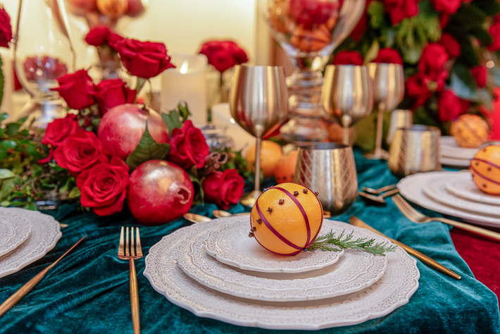
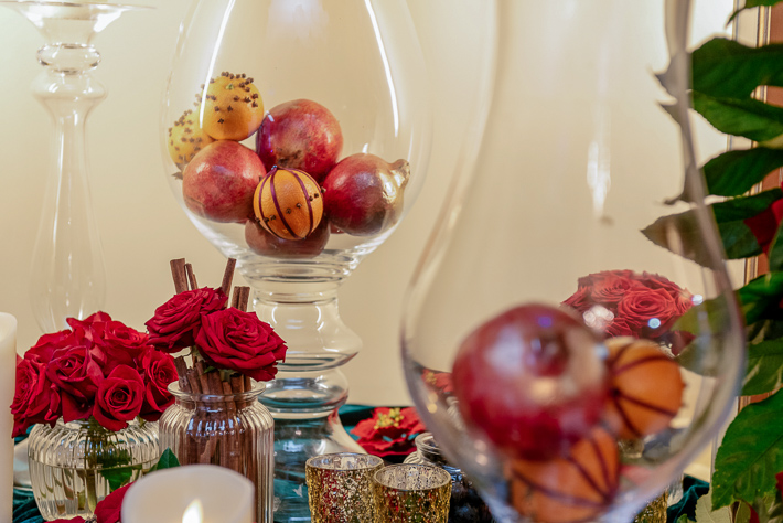
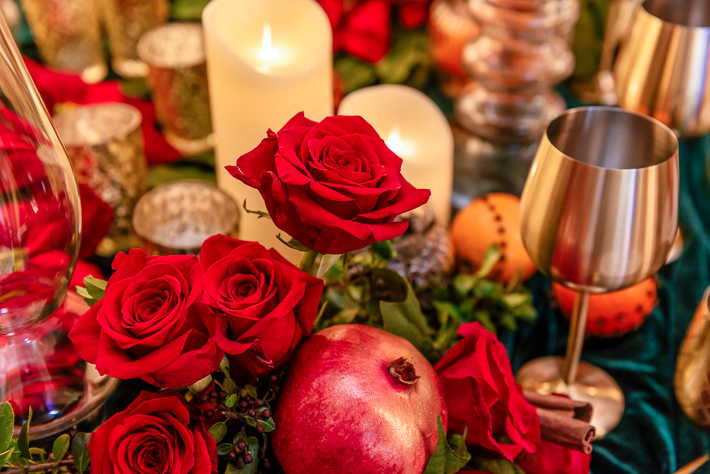
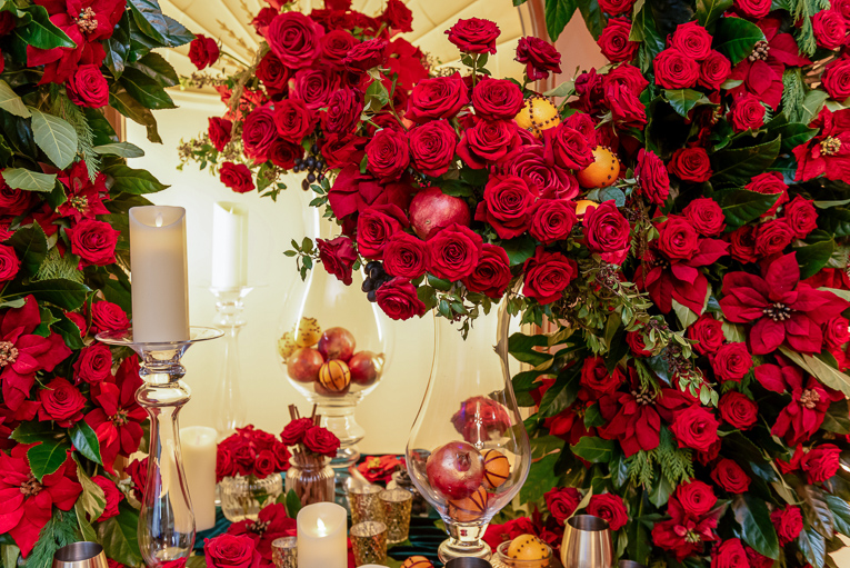
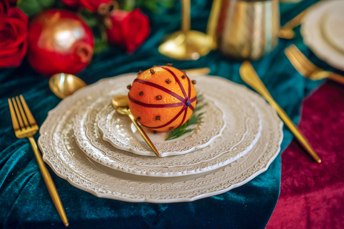
And so we set about creating a bit of an optical illusion within our curved alcove.  Appearing as if a rounded table was set into the wall (when really it was half a table making the most of the deep curved alcove behind) we filled the space with lots of Christmassy details.  We used two different textured velvet cloths sourced from our friends at Borovick Fabrics in Soho and a beautiful lace edged chargers.  We used brushed gold cutlery, tumblers and goblets and added beautiful, rich, warm coloured fruits like pomegranates, oranges and grapes.

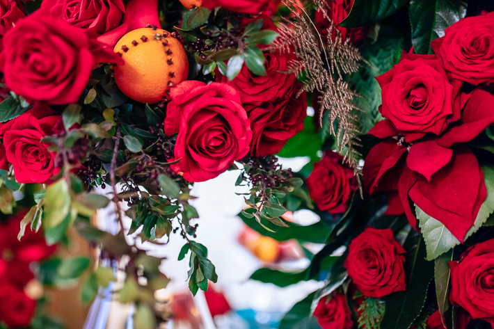
And of course, no Christmas table would be complete without a scattering of cinnamon sticks and candlelight.  Our key flowers were scarlet coloured roses, opened to perfection, combined with traditional poinsettia flowers and glossy green foliages.

Bearing in mind our “less is more” philosophy, the next question we asked ourselves was quantity: we knew these lovely festive details would speak for themselves but what if – What If – we went BIG, just this once? We ‘ummed’ and ‘ahhed’ for all of 5 minutes before deciding that whilst a smattering of Christmas details would hit the festive spot perfectly well, should we not throw caution to the wind and really indulge in the joy of Christmas?

And with that, we were off! We ordered ourselves not one, but two types of velvet red rose, ‘Red Naomi’ and ‘Freedom’ which we set amidst the shiniest, deepest green aralia leaves we could find, contrasted with touches of Cupressus foliage and combined with the most beautiful faux silk poinsettias. There was no holding back as we sprayed pomegranates gold and studded the oranges with different patterns of cloves, finished off with a red ribbon.  And what Christmas table isn’t complete without a full-on floral arch full of red flowers and winter foliage completely surrounding the festive setting?!

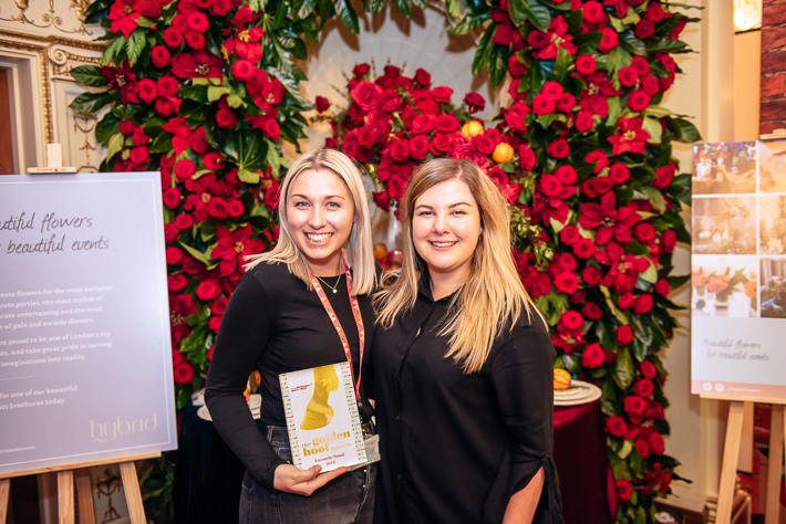
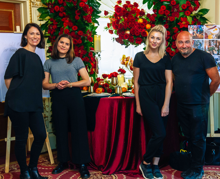
Looking back, we feel a little giddy! Those glass-urns, the goblets, That Arch! All adorned, stuffed, embellished with hundreds of breathtakingly beautiful roses. Was our flirtation with opulence worth it? Well! We think it might have been, especially as we won the award for Best Stand was as voted by the visitors (a delightful surprise).

Our top tips for creating the look:

But truly and honestly, we feel that the same effect can been created with a lot less, our ideas for decorating your own Christmas party without breaking the bank are below:

  1. Red

Use red, sparingly, in the same way as a movie star may use a dash of scarlet lipstick, to create a hint of glamour and colour without drenching the senses. To do this, you must find the most vivid red flowers you can afford, but here, less is definitely more, don’t get too many: roses or poinsettia plants are perfect (you can cut poinsettia flowers and place in vases of water for a more delicate look).

  1. Green

Combine with green shiny and textured foliage.  Deep green glossy leaves, such as evergreen camellia, laurel or aralia leaves from a garden are perfect, and combine these with common or garden stems of conifer (yes, we said conifer!) or, if you are bit posh, stems of rosemary.

  1. Gold

Add a touch of Gold: buy yourself a can of gold spray paint and spray pots, tumblers, little vases or candleholders deep, rich opulent gold (pears also look gorgeous touched, but not completely covered, with gold).

  1. Orange(s)

And last but never least, our most favourite Christmas decoration of all time will always be clove studded oranges.  They. Are. A. Must. Easy to create and heavenly to smell.

Image courtesy of the great guys at Splento 

Day of the Dead… W Hotel Style!

At Hybrid, we like to do our research; we will do whatever it takes to ensure that we fully understand a brief. Often this means looking into the historical significance of flowers or working out which floral scents will complement others in a display, but sometimes things can go a bit weird. A bit spooky. A bit, well, otherworldly. And this is a case in point. As soon as we were given the terribly exciting brief from our friends at W London for a Mexican themed “Day of the Dead and Decadent” party at The Perception we knew that we were going to have fun with this one.

Purely research, you understand…

As luck would have it, our lovely Liliana at Hybrid knows a thing or two about the tradition of the Day of the Dead (El Día De Los Muertos) and she whisked us off to lunch at La Bodega Negra, a wonderful Mexican restaurant in Soho, purely for research purposes you understand. Here we chatted to Liliana and her friend to find out all about the Mexican valued tradition of celebrating and remembering their lost love ones.

Stop thinking Halloween right now!

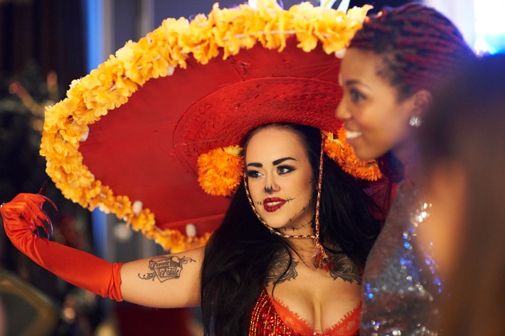
Now, it is important to note that the Day of the Dead is in absolutely no way a scary, ghoul obsessed, ‘Halloween’ type thing; It is more a celebration of life and a demonstration of respect for deceased family members. It just so happens that the Mexican way of expressing this is stylish, glamorous and sassy!

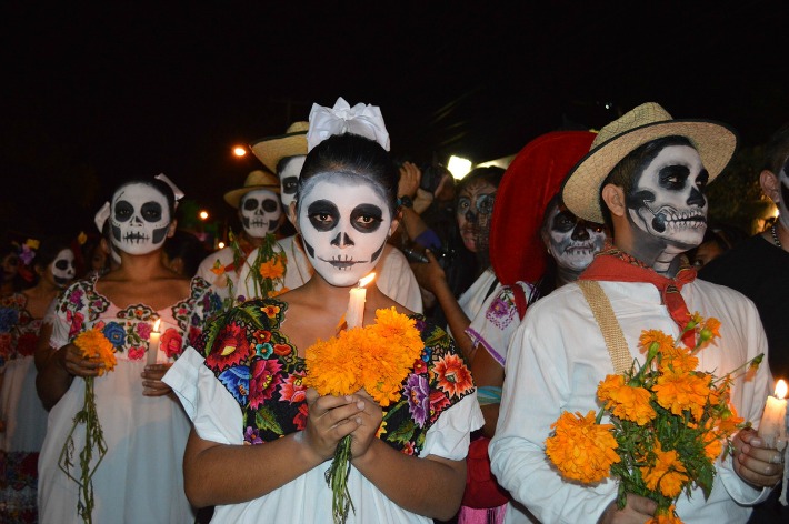
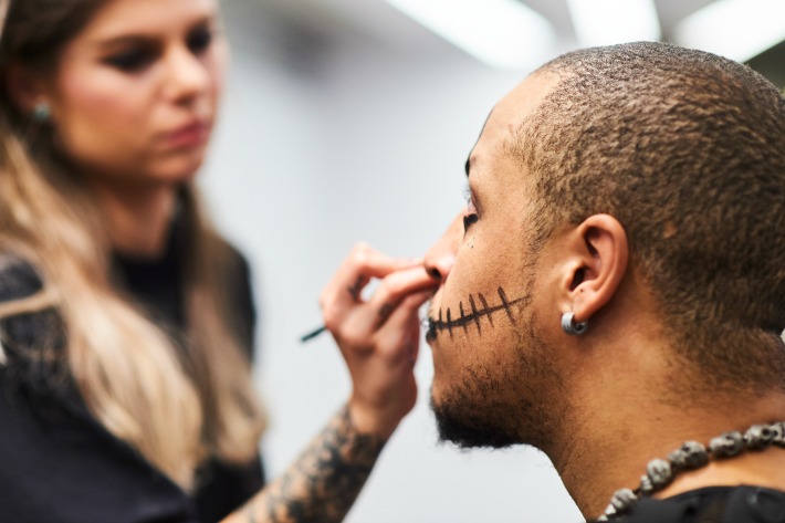
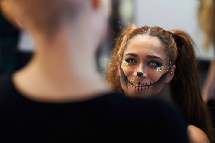
Every year, for a couple of days at the beginning of November, in towns and cities throughout country, Mexicans take part in candlelit parades and processions, throw raucous parties, wear stunning costumes and put on elaborate makeup. They also surround themselves with flowers, in particular the vividly coloured, fluffy petalled marigold, for which which we have a massively soft spot.

That day sitting at La Bodega, we learnt that beautiful, floral ‘altars’ are created every year to welcome the spirits back to the living in an explosion of colour.  In fact, every restaurant in Mexico City will display an altar in celebration of this national holiday. And those beautiful skull decorations that we have all seen? Well they aren’t intended to scare people.

“La Calavera Catrina”, aka the Lady of Death, first appeared as the Aztec Goddess Mictecacihuatl, Queen of the Underworld, protecting the bones of the dead and presiding over death at festivals like the modern day El Día De Los Muertos. More recently, José Guadalupe Posada resurrected the image circa 1920 in an etching called “La Calavera Catrina”. The aim here was more satirical: to make fun of the current trend in Mexico to aspire to be like aristocratic Europeans.

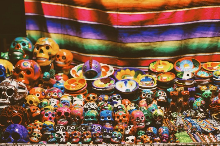
Fast forward to present day and La Calavera Catrina is seen everywhere. Her face appears on all types of goods including food, masks, craft items and, of course, in fashion. Her face has become synonymous with El Día De Los Muertos.

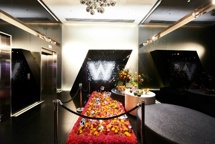
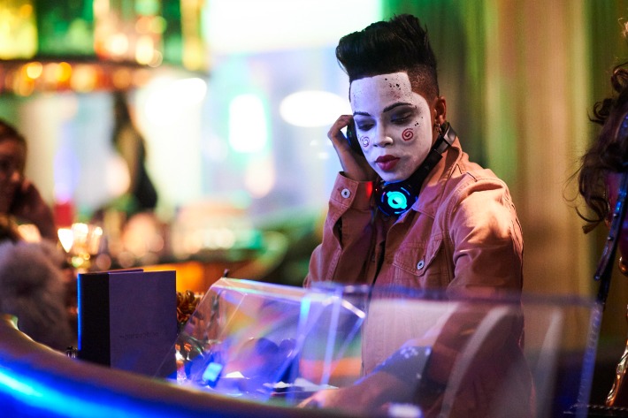
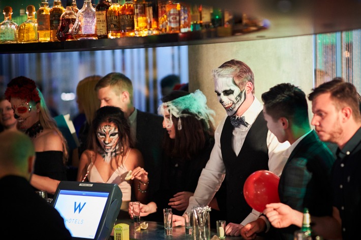
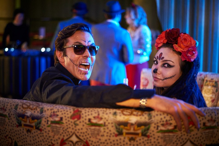
The team at the W London Leicester Square knew exactly what they wanted for their event: a ‘Day of the Dead and Decadent’ party that would ‘see the spirits of Soho take centre stage for two epic nights’.  Guests were to embark on a journey starting at the entrance of the unequivocally trendy hotel on Wardour Street.

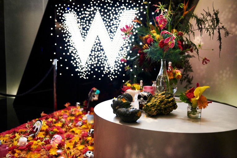
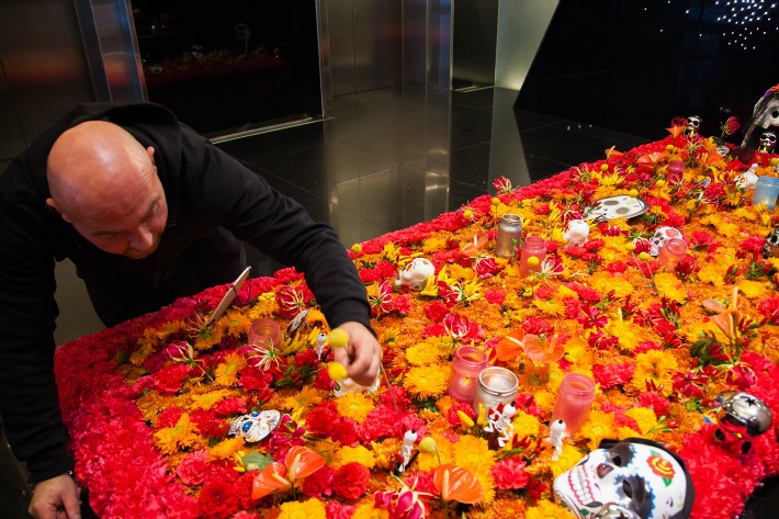
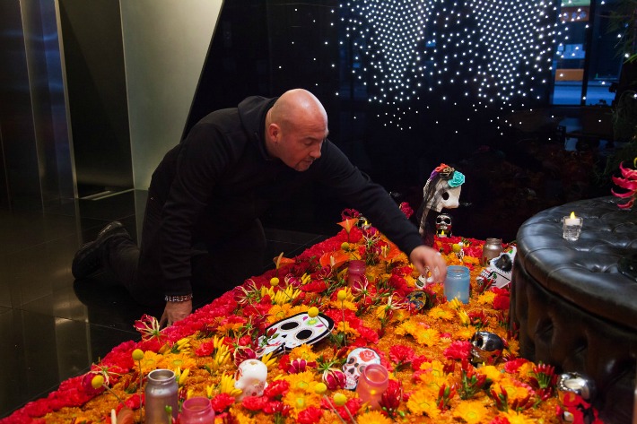
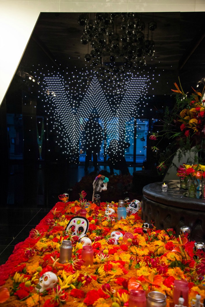
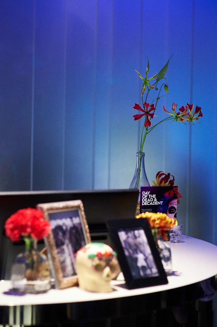
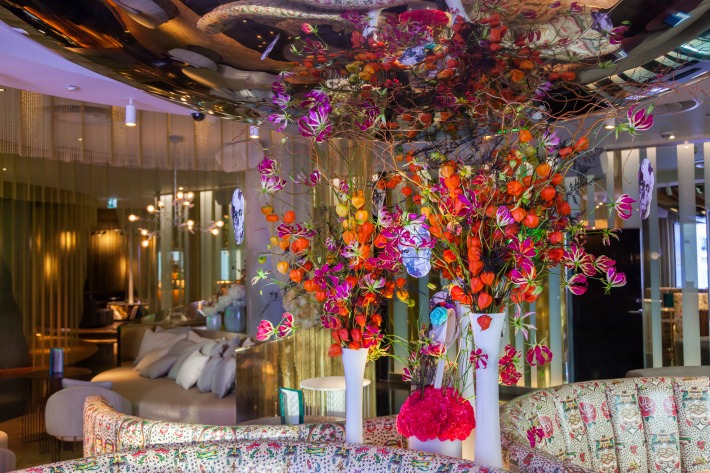
The ground floor of the sleek, black, night-club style lobby was filled with richly coloured flowers, candles and of course, La Calavera Catrina in the form of an altar.  We decided that our beloved marigolds would be the main flower and combined them with amber coloured dahlia, spicy chilis, magenta carnations, anthuriums, glorisoa and craspedia.

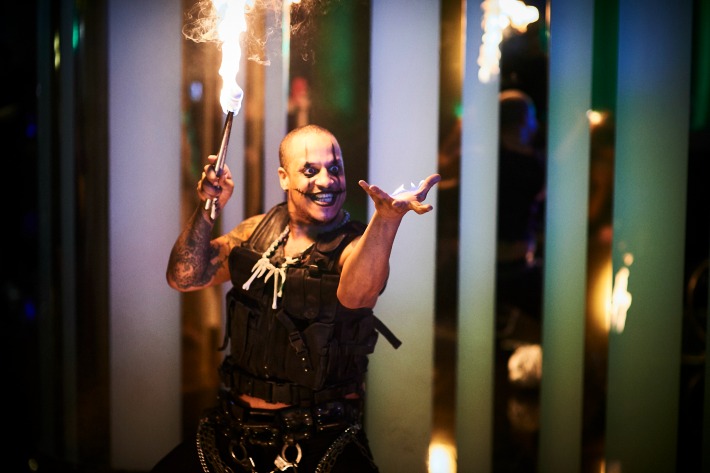
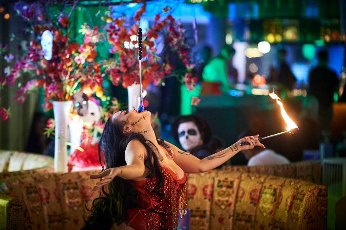
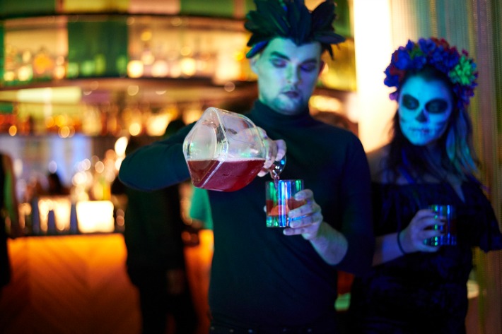
Revellers made their way up to the first floor where the elevator doors opened onto the most exclusive of parties set in one of the most trailblazing hotel interiors in London.  Throughout The Lounge and The Perception Bar guests were entertained by breath-taking acts featuring fire performers whilst exquisitely costumed mixologists served electric cocktails with, naturally, plenty of tequila and live DJ sets to create a truly exhilarating vibe.

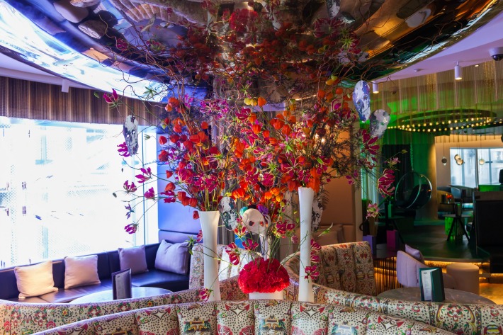
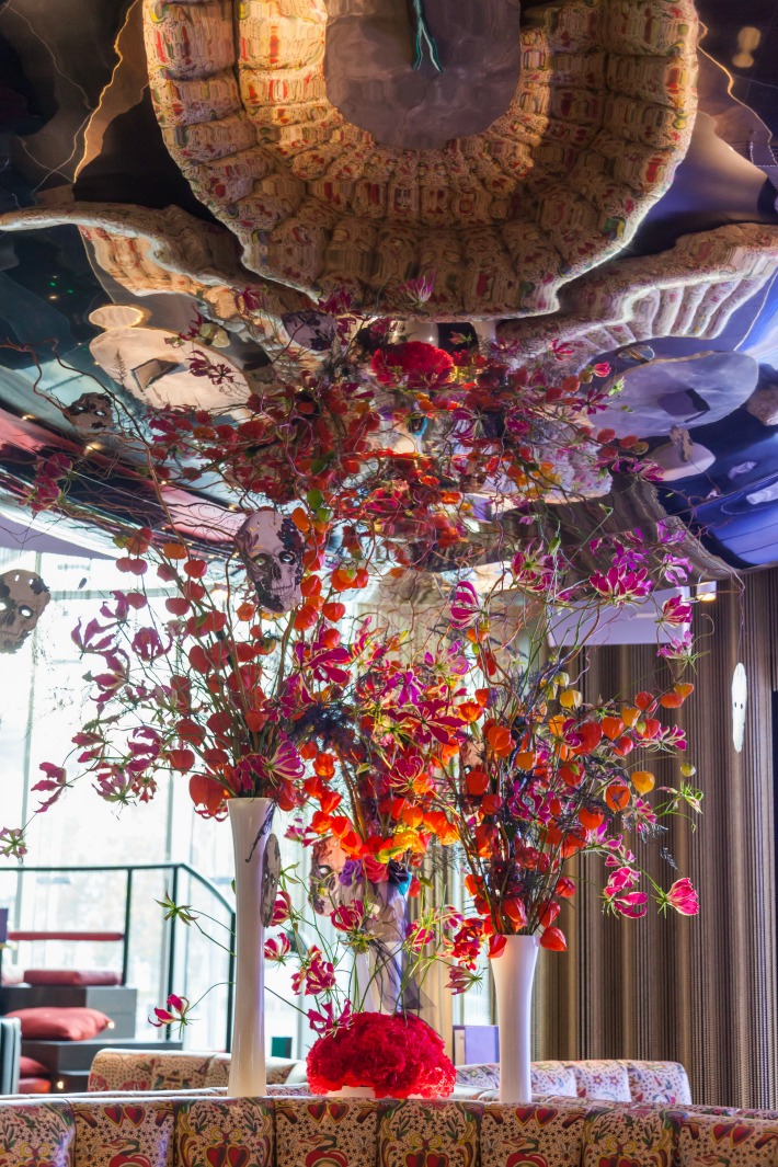
A beautifully decorated leather sofa, hand tattooed by local Frith Street Tattoo (what, you mean you don’t have a bespoke tattooed leather sofa?), was pride of place amidst curved seating areas and centre stage: our piece de resistance of wild, colour-themed florals.  We filled white vases with Chinese lanterns and gloriosa lilies, and black painted asparagus-fern was strung alongside black and white sketches of human skulls.  Elsewhere, token floral offerings were made to the spirits set on tables surrounded with jars of marigolds, callas, chillies and candle-light, vintage photographs and ceramic skulls.

Andrea Dutton Photography

It was a very special party, and one, we hope, that did those departed souls re-visiting the land of the living on El Día De Los Muertos proud.

If you want to experience the wonders of the 2018 Day of the Dead festival for yourself, the V&A are holding their own free event on 2nd of November with live music, dancing and puppets plus an ‘ofrenda’ dedicated to Frida Kahlo.  Alternatively check out Disney’s animation Coco inspired by the Day of the Dead holiday, this movie is full of joy colour and of course marigolds!

With thanks to W London Hotel for party images and Andrea Dutton for installation images.

“Make those flowers clash!” … our vibrant celebrity wedding as featured in Hello!

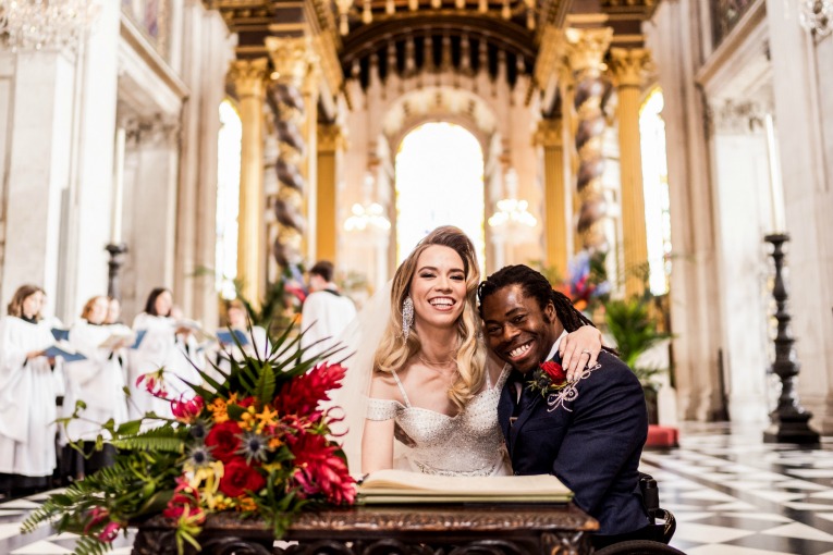
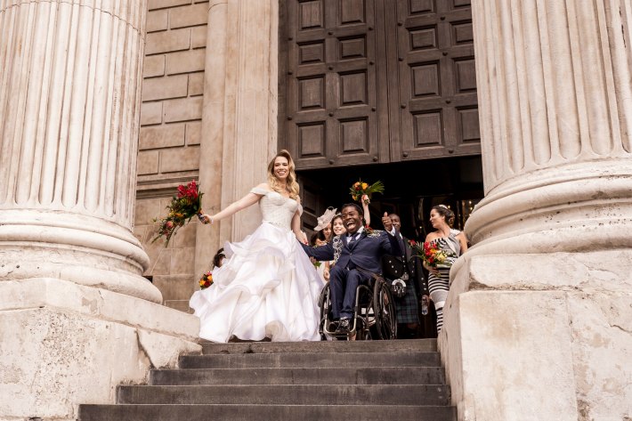
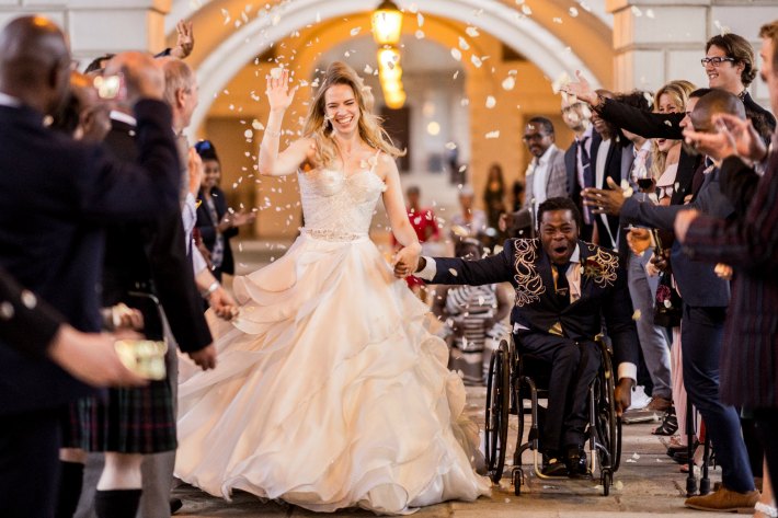
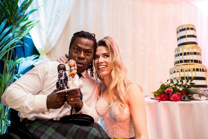
Our first ever meeting with Ade Apepitan MBE’s future wife, Elle Exxe, was at Hybrid HQ in Vauxhall. The incredibly inspiring, self-styled music artist arrived with her wedding planner, the wonderful George Watts AKA “The Wedding Fairy” and proceeded to give us the most exciting floral brief: use any flowers you like, but they must clash!

Elle and Ade wanted to mix their Scottish, English and Nigerian backgrounds.  They didn’t want their wedding flowers to be ‘flowery or pretty’, they wanted them to be bold and they wanted them to be beautiful.  Best of all, we could use any flowers we wanted to create that look!

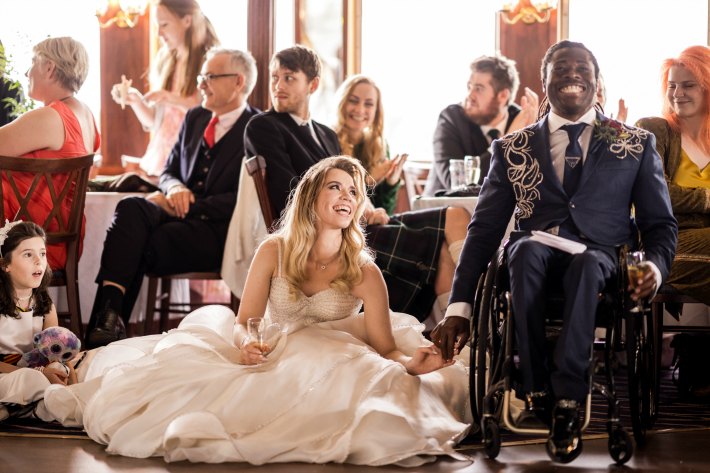
Elle had already decided to use Hybrid even before meeting us (soooo love it when that happens!) and she knew exactly the kind of atmosphere she wanted to create.  She had been planning her wedding for two years with her TV presenter and Paralympian basket-ball player fiancé; it was to be the most exciting, vibrant and full-on happy day.

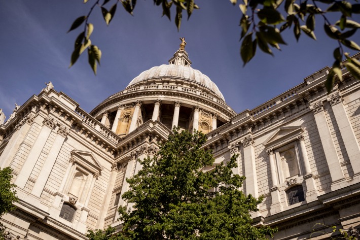
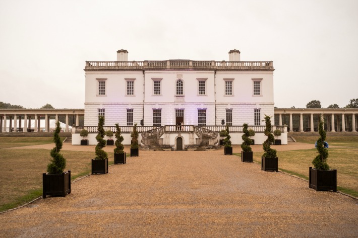
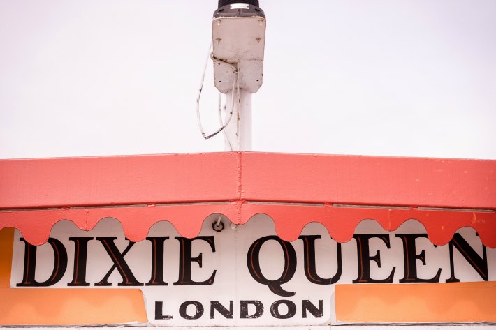
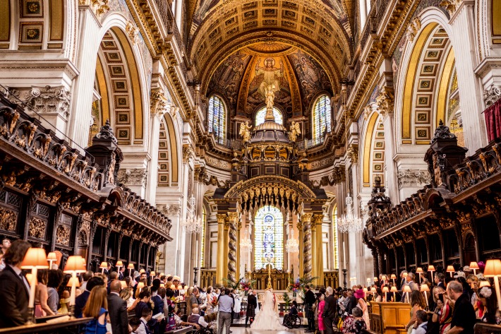
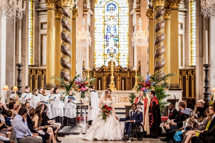
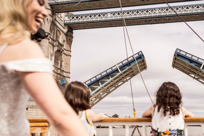
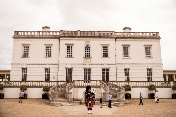
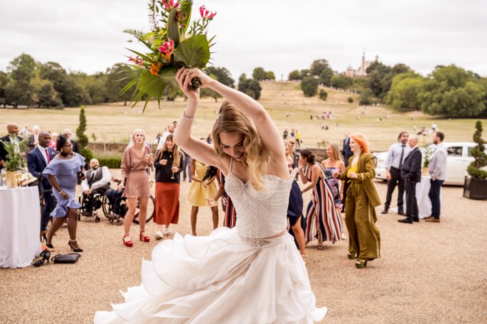
Their wedding ceremony venue was no less than the High Altar at St Paul’s Cathedral, not everyone can marry in this part of the Cathedral and it was only permitted as Ade is a MBE.  As an approved florist for St Paul’s we always feel that tingly sense of excitement whenever a client asks us to work there and the fact that the wedding party would then travel to another of our most adored wedding venues, The Queen’s House, Greenwich via a boat we have had the pleasure of decorating many times, the Dixie Queen was the icing on the (wedding) cake! 170 family and friends from all over the world were invited, including top sports people and personalities from the entertainment business. It was going to be the most exciting day for us at Hybrid and we weren’t even the ones getting married!

Allister Freeman

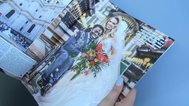
A couple of weeks before the big day George informed us that the wedding was to be covered by Hello! Magazine.  And (as you can imagine) our immediate thoughts on this snippet of information were as follows:

Hmmm, this is no biggie, the flowers are certainly going to look A-MAZING, but…. we must make sure Ade’s button hole looks perfect. We cannot abide magazine pictures of wonky button holes! 

The morning of a wedding is always a very special and memorable time for any florist (let alone bride or groom!).  The day you have working towards has arrived and you finally get to present the first part of your many creations to your clients.

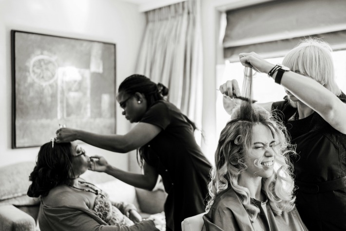
Ade and Elle, stayed at the same City based hotel with a view of St Paul’s.  Whilst their hotel rooms were next to each other, the atmosphere in each couldn’t have felt more different.  Elle’s was a hive of activity, full of hair and makeup artists with friends and bridesmaids all excitedly rushing to and fro. Edinburgh, London and Nigerian accents could be heard whilst I presented the bride and the bridesmaids with their vibrant statement bouquets.

Allister Freeman

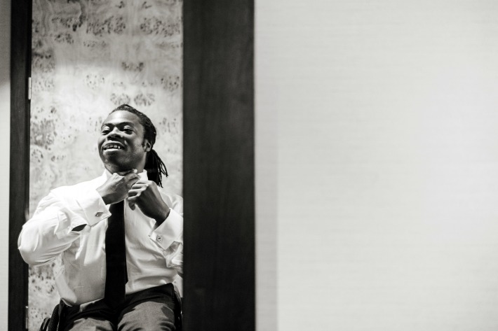
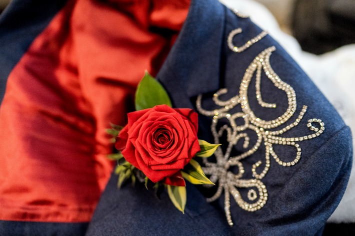
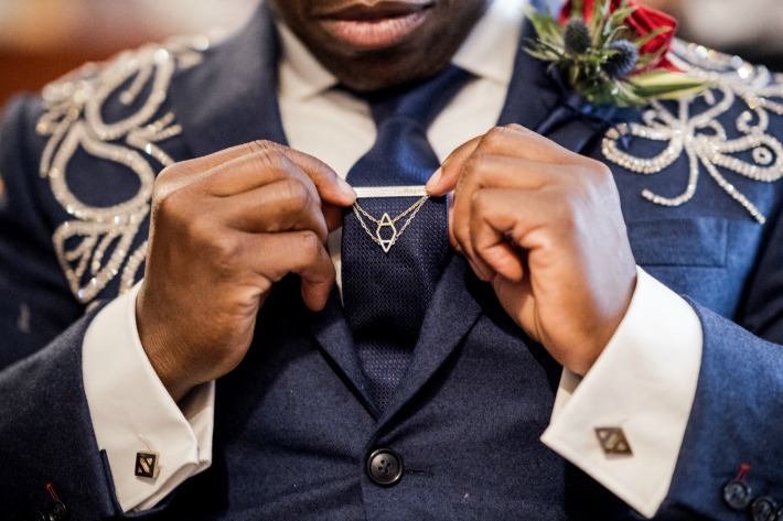
Next door was a different story, Ade was looking relaxed with his sister and looking out over the view in anticipation of the day ahead.  I could tell how excited he was from his chatting: asking how the set-up at St Paul’s Cathedral was going and telling me about the grand-finale firework display over Greenwich Park. All the while I was attaching the most impeccable buttonhole of red roses, thistle, ginger petals and palm fronds to the coolest blue suit with embellished crystals I had ever seen. My overriding thought was:

this button hole is not going to move all day! 

Allister Freeman

The whole wedding day was a delight; we caught glimpses of the couple and their guests as we travelled between venues and stood-by, with silly grins on our faces, as their day unfolded.

And the flowers! Oh the flowers….

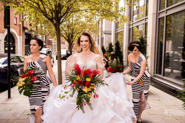
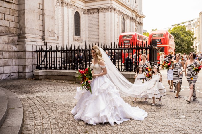
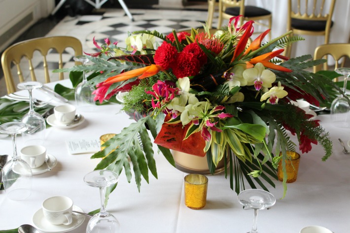
The bridal party carried a mix of tropical gingers, gloriosa lily and roses along with asclepia, orchids and dahlia. We wanted each bouquet to be as vivid as the handmade African-print lined dresses and each pedestal design and pew end in the cathedral to be as colourful as the beautiful stained-glass windows.

The Ceremony

Allister Freeman

The Journey

Allister Freeman

The Reception

Allister Freeman

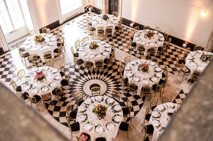
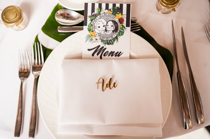
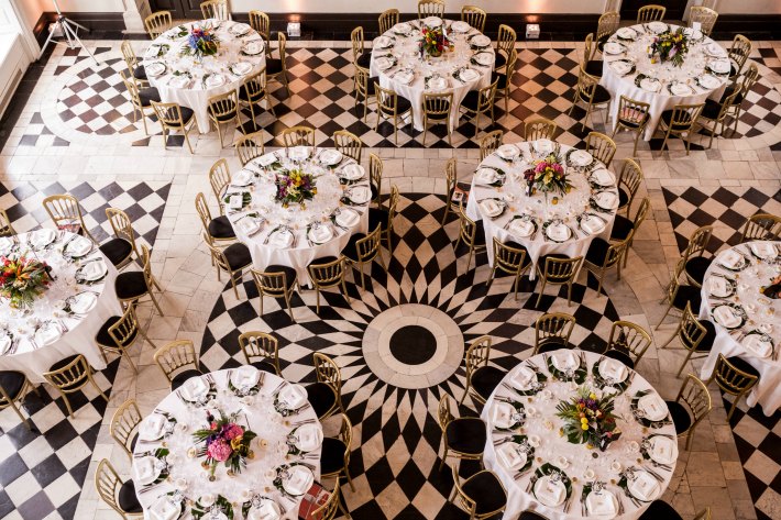
For the wedding breakfast in the Great Hall of the Queen’s House each table displayed a simple gold vase bursting with unique combinations of the most vivid blooms and foliage from all over the world.  Tropical gingers, heliconia and gloriosa. Orchids, protea, anthuriums and asclepia. Croton, kentia, dracaenas, and ferns.  Dahlia, hydrangea, delphinium, and thistle.  Each table centre was different from the next and each place setting decorated with a tropical monstera leaf  and the cutest menu cards we ever did see.

When we look back, it is not only the bright vivid flowers that we remember (did we mention that we could use any flowers we liked, as long as they clashed?) but the wonderful personalities that we worked with on the day.  From chatting with two of the coolest female vergers at St Paul’s Cathedral (who gave their seal of approval for the flowers) to being an added tourist attraction to the inquisitive visitors looking round St Paul’s. The incredible caterers, Party Ingredients and the wonderful events team at Queen’s House were as usual, the perfect pros.   And as for our stars of the day?  Well they were the kindest, happiest and genuinely loveliest couple who truly deserved their very special day.

Allister Freeman

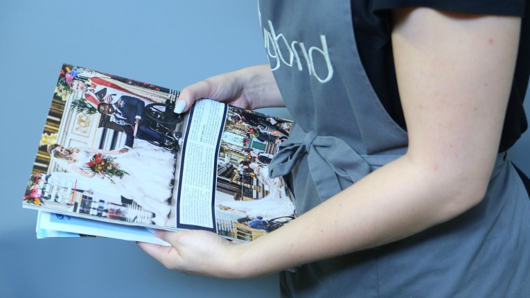
Two weeks later we received our copy of Hello! and were delighted with the coverage and are pleased to say that the button hole stayed put perfectly!

Hybrid Studios

With thanks to the wonderful and highly talented reportage wedding photographer that is Allister Freeman for images. 


Just what is it with florists and green flowers?

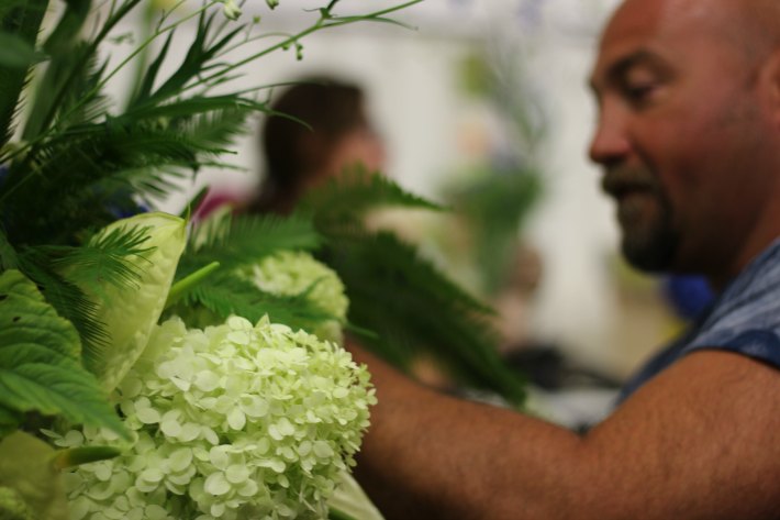
We have come to the conclusion, based on years in the industry and having observed, chatted to and worked with many brilliant experts, that for 9 out of 10 florists, the colour of flower we most like working with is actually green. Not luxurious red, or impertinent pink, or even vibrant yellow, but green! Now, I love my profession, but even I find that a little odd!

Why, when there is so much range in the different variety of flower and a whole rainbow spectrum of colours, do florists get so excited over green flowers? One theory (based on no empirical evidence I must add) is that our green obsession stems (excuse the pun) from the perception that green flowers are special, rare, unique.

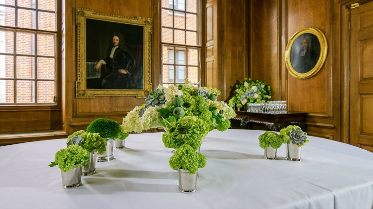
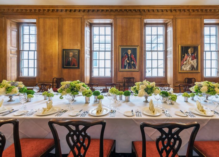
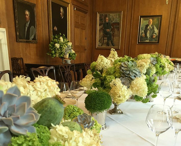
Image taken in the Chapter Rooms, St Paul’s Cathedral

They don’t conform to the idea that flowers must stand out and shout in order to be seen. Green florals can be subtle, shy even; they won’t jump out and hit you in the way that say clashing pink and yellow would.  And we don’t expect them to be the first flowers a client would choose, especially if looking to create a vibrant party design. But to us they are the most elegant flowers of them all.

To a seasoned florist who has seen-them-all, green provides are more calming atmosphere and something a bit different.  More so than white, green can be thought of as the most neutral of all colours in a florist’s palette.  Green hued blooms challenge the observer to see and notice the fascinating detail of a flower: its shape, form, texture and pattern.

We asked our good friend and colour mentor Karen Haller, a colour psychologist, to shed some light on what it is that people have about green:

So why are we are humans drawn to green? There’s a few things going on. It’s the colour that we most attribute to nature. Often, we have green in our lives to reconnect us back to the feeling of being in nature. It’s restful and gives a sense of peace. Like being in a lush green forest.

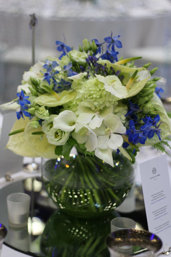
It is also one of the most sophisticated palettes you can work with. If you don’t want to clash with an interior, or if you wish to create an soft and natural creations, then stunning floral designs in shades of green will help you achieve this.   To add a hint of another colour, whilst still retaining the green theme as the star of the show, opt for cool hues such as blues, greys or whites.

But be quick! Summer time is the perfect season to do this!

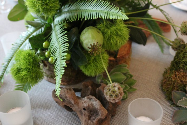
Here are a few of our favourite greens:

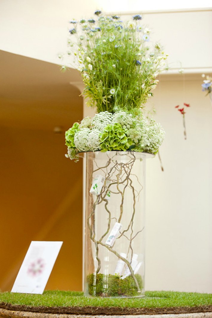
Papaver – these poppy seed heads provide the loveliest rounded shapes in green hues, from grey to blue to jade;

Green Tricks – the fluffiest dianthus ever and perfect for adding a unique texture;

Hypericum – such pretty glossy berries which provide amazing detail amongst other, fluffier green flowers;

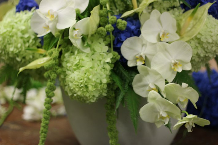
Phalaenposis orchid – the freshest palest greens appear in the faces of one of the toughest varieties of ‘Moth’ orchid.

Hydrangea – one of the largest green flowers available, these provide the perfect element to designs and are probably the most delicate looking of all hydrangeas;

Anthurium – the darling flower of the moment our favourite pale green anthurium is known as ‘Marysia’.

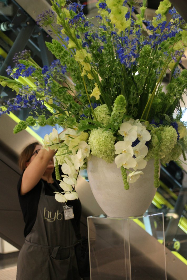
Molucella – this is the most amazingly tall lime-green flower which can be used to provide impact, also known as ‘Bells of Ireland’;

Gladioli – natural and fresh, when all of the pale green florets open on these long stems, the look is always clean and fresh;

And what do you partner with all of these beautiful green floral varieties?  More greenery of course!  In fact, when it comes to foliage, nearly all florists have a rather unhealthy obsession with leaves.  Of course the choice of greenery out there in our green and pleasant land is vast but the impact you can make with foliage is immense.  But that is for another time.

How to scare your guests witless: the ultimate Halloween party

There is only one time in the whole year when you are allowed to completely freak out your clients so you might as well do it properly! And where better to scare your guests witless than at one of the most inspired events venues in the City of London?

Guests who are lucky enough to be invited to a Brewery showcase event should drop everything and jump at the chance to attend because the experience will undoubtedly stay with you forever.  Those who were brave enough to accept their Halloween party invitation at The Brewery last October did so at their own peril.

Now as you know from previous posts, we are strong advocates of amazing events industry talent who come together to create stunning events and totally immersive experiences. Having worked with the Brewery for a number of years, we always eagerly anticipate their upcoming events which continue to impress us with their unique themes and amazing attention to detail.

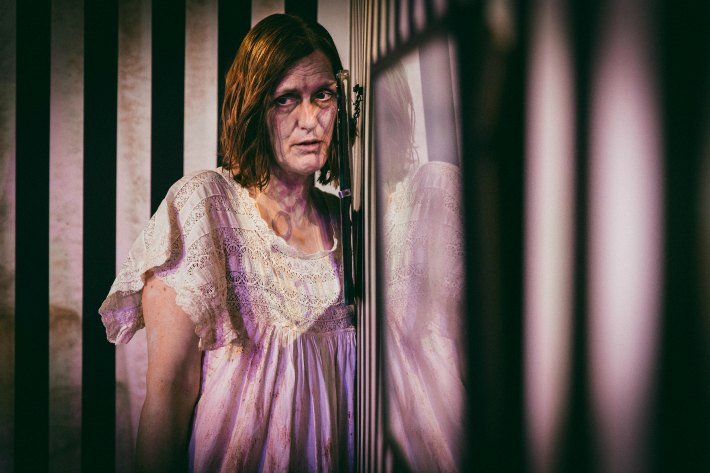
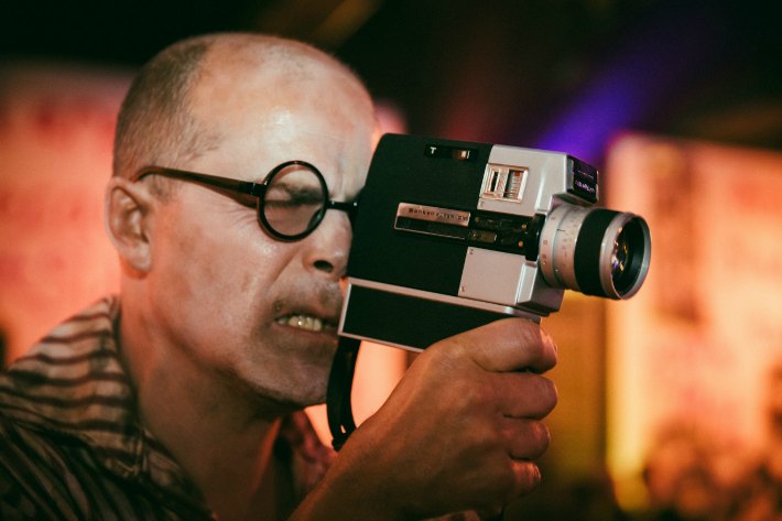
However, we had no idea on that fateful afternoon last October that we would become totally immersed in the downright scary world of House Macabre whilst we were setting up our ‘creepy old lady boudoir’ themed florals.  And that was even before the sun went down and the actors came out!
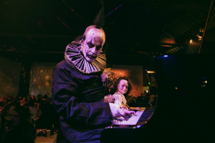
Reminiscing on the theme behind their spellbinding Halloween event, the team at the Brewery conveyed how;

As a Halloween event it was designed to provide a fun but unsettling environment that explores our deepest fears. The showcase had to be nothing like the guests had ever experienced before.  It had to be completely immersive and create a long lasting impression of a standard way beyond expectation levels.

To bring this sensationally scary showcase to life a wealth of frightful features were designed and created, including:

The deathly invitation

The Brewery team are masters of suspense and in the weeks preceding the event itself a standalone ‘House Macabre’ brand and identity were created. Guests were sent a ‘Death’ tarot card in branded stationary, a dedicated countdown clock micro-site was launched, and death certificate invitations were designed to intrigue and excite all who dared to attend.

First on the scene

On the day of the event itself guests were held outside and presented with cards displaying their table number. This simple yet significant finishing touch enabled the Brewery team to create an eerie ambience that would not be disrupted by complicated table plans. Moreover, a list of rules and warnings were displayed upon arrival to heighten guest anticipation and further immerse them within the haunting world of ‘House Macabre’.

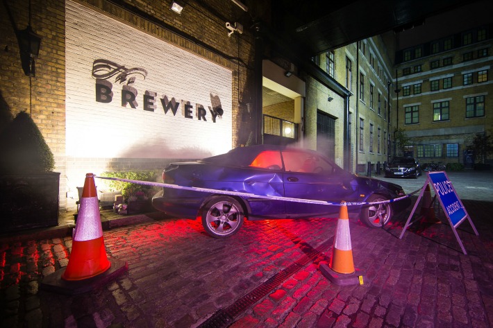
In order to reach their entrance guests had to walk through the scene of a car crash. The Brewery team paid close attention to detail; sourcing the materials for this chaotic car crash scene from a scrap yard and having them specifically transported in for the event. The Brewery team have an excellent eye for detail and explained to us that;

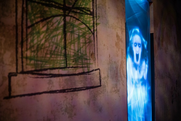
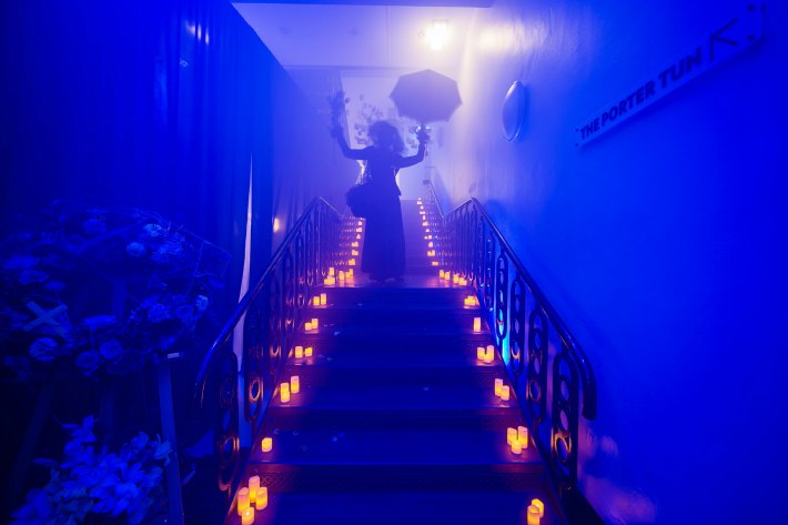
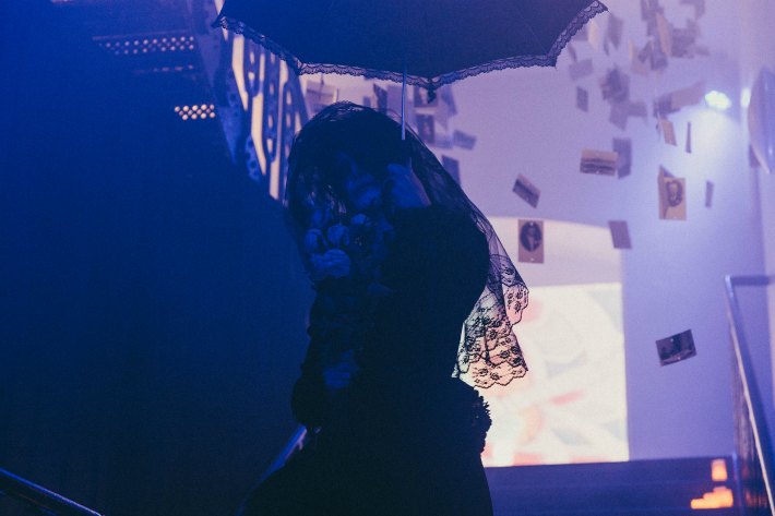
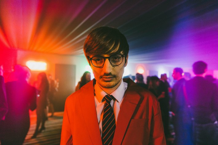
The car crash complete with police man was made to simulate the guest’s death. This then led them through to the scene of their funeral when a wailing mourner led them up the stairs, through smoke and hundreds of old family photos hung from the ceiling, loud videos playing, strobe lighting and self-help audio playing all designed to create a disorientating experience.

Drinks in purgatory

To bring the immersive world of ‘House Macabre’ to life, an entire new space was constructed on the Porter Tun balcony using a temporary ceiling and walls. This area was specifically designed to recreate ‘Purgatory’, with the Brewery team highlighting to us how;

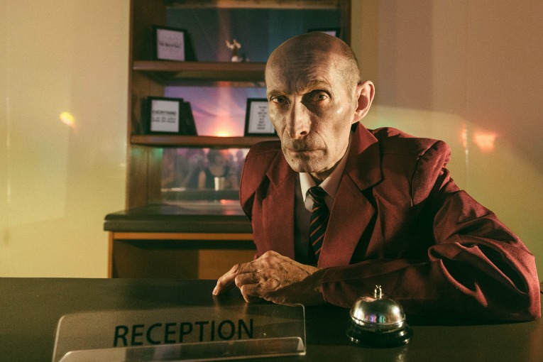
This space was designed to be ‘purgatory’ a tired old waiting room with bored receptionists interacting with guests.

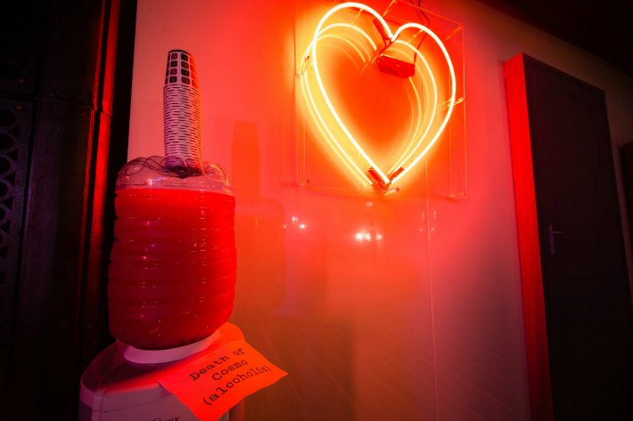
In keeping with the non-traditional nature of their drinks reception area, no drinks were actually served by the Brewery team. Instead, guests had to search nearby cupboards for elusive beers and retrieve cocktails from water coolers.

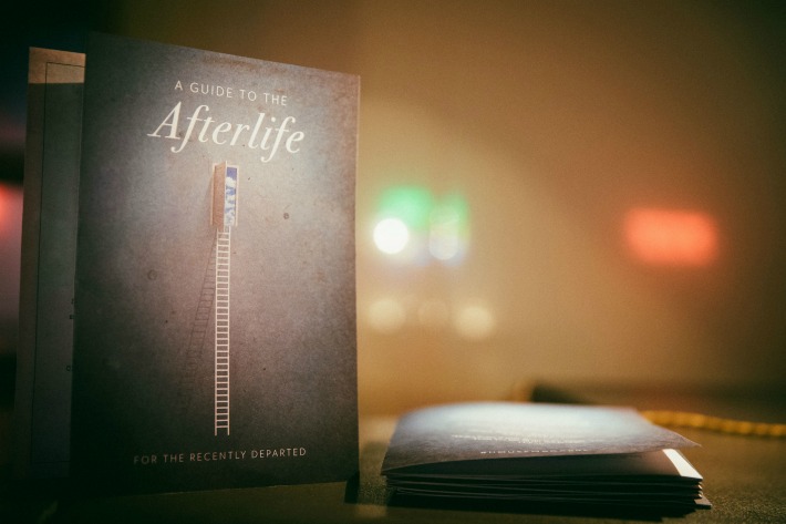
When dinner was due to be served an actor arrived and announced the fate of the guests. The sense of suspense was heightened even further when guests were led towards their ‘fate’ through a secret hidden door. Upon entering ‘Purgatory’ each guest was presented with a Guide To The Afterlife within which the Brewery team had included;

A welcome to the afterlife, a questionnaire to establish which route their afterlife will take, the menu and details about the venue.

Welcome to the afterlife

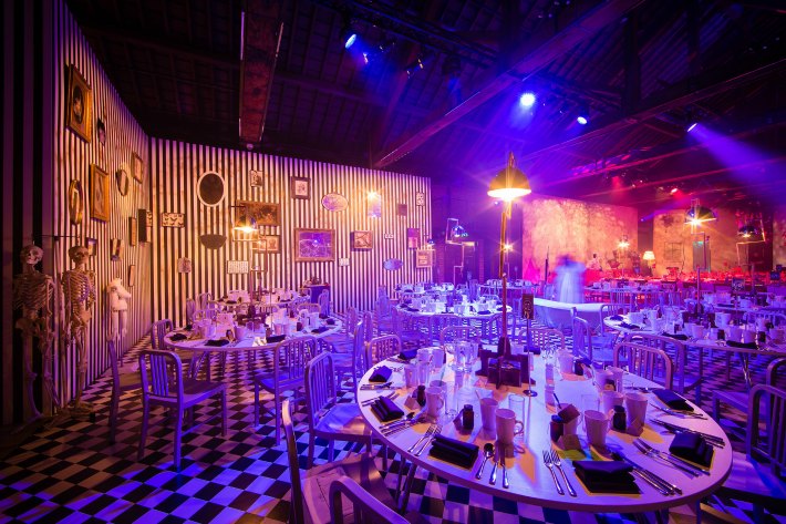
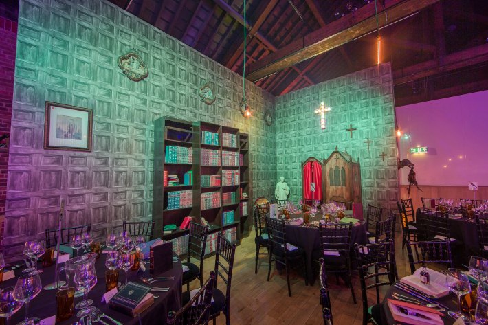
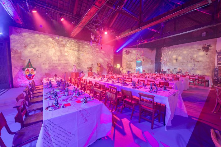
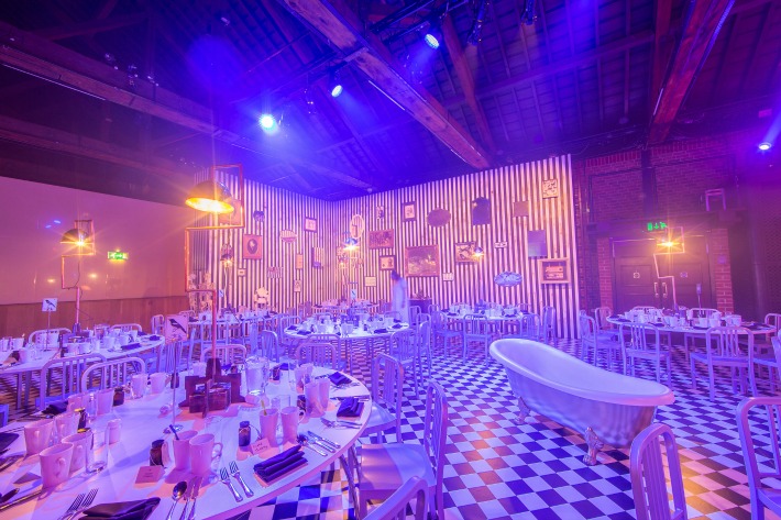
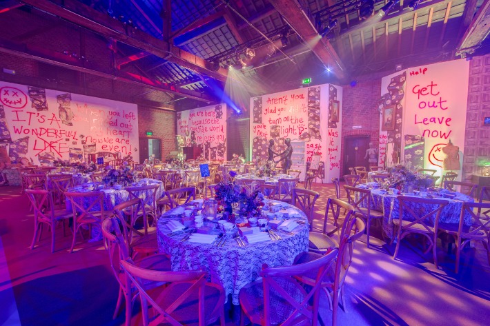
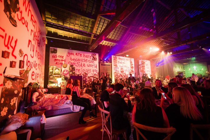
The weird and wonderful world of ‘House Macabre’ was created by transforming The Porter Tun room into four separate dining spaces. Each of these eerie entertaining areas was intended to reflect a different room in the ‘House Macabre’ so they had been meticulously designed with distinctly different set builds, style influences and a key character actor hosting the guests.

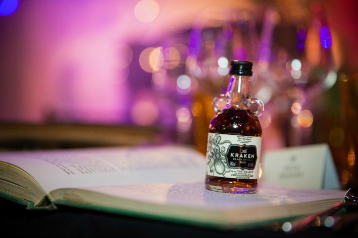
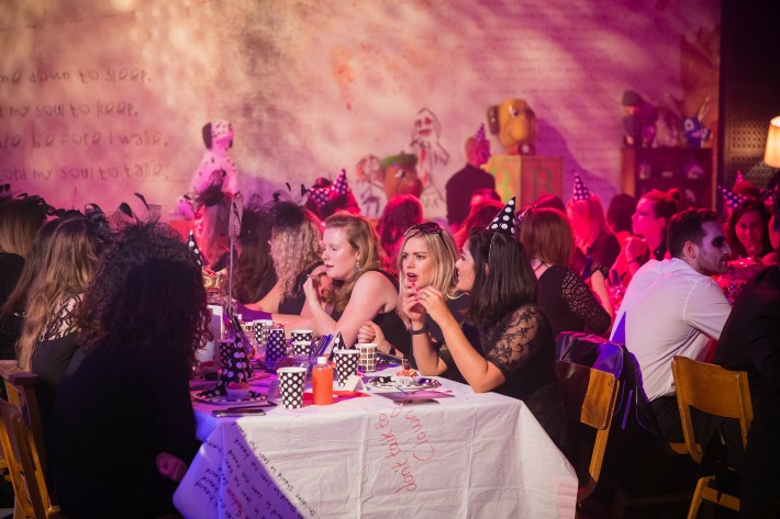
The attention to detail extended to the table settings; with each space offering different crockery. In fact, the Nursery guests were eating off paper plates! The Bathroom, complete with its freaky contents, was another particularly frightening feature. Irrespective of the room in which they resided, each guest received a gift. From books with the pages cut out and small bottles of gin inside in the Library, to a box with a severed edible finger in the Bedroom, no guest was left empty-handed!

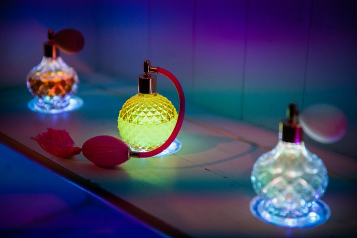
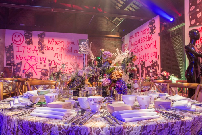
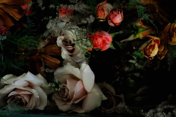
The Bedroom was our home for the afternoon.  We were tasked with creating old and decayed boudoir-style table centres that would look as if they had been abandoned in the centre of each guest table. It is not often that we have to wait for our flowers to die before we can use them but it’s fair to say that this was a one-of-a-kind experience.  October is the perfect time for muted colours, old dusty looking grasses combined with dried seed heads, and beige coloured blown open roses so with these style influences in mind we were able to create some beautifully decayed looking designs that were set onto old black doilies and covered in cobwebs.

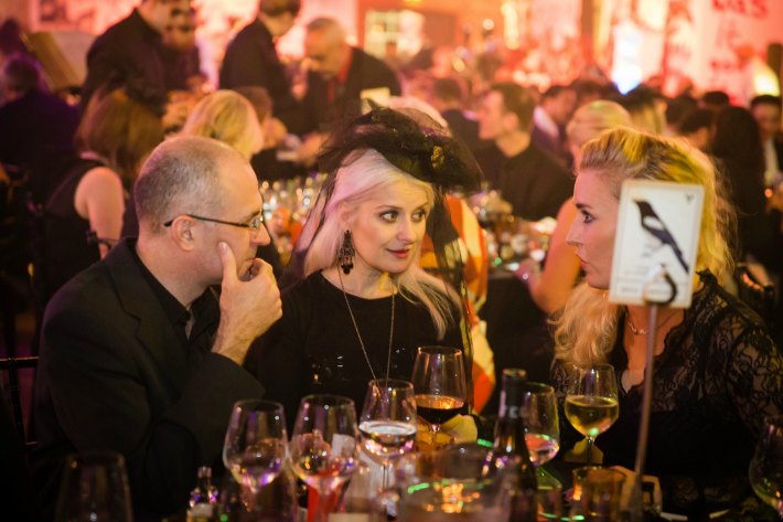
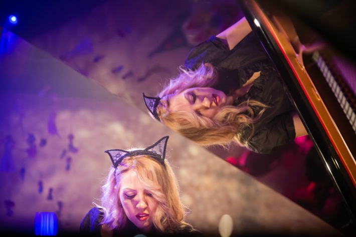
The Brewery’s unforgettable ‘House Macabre’ event demonstrates how a powerful event theme can transform an ordinary space into an entirely new world. Immersive actors had been provided with scripts to help them interact with guests and fulfil their ghoulish roles. Unscripted extras were present to invoke unease and suspense. A live pianist provided haunting background music from a raised round stage in the centre of the room by playing macabre versions of popular songs.

All of these freaky finishing touches, combined with the space’s lighting, catering, floral event designs and set decorations, truly transformed the Porter Tun room into the ‘House Macabre’ and provided all who attended with an eerie experience that we will never forget!
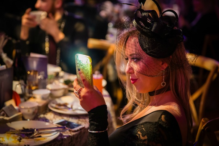
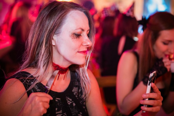
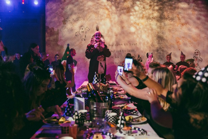
With thanks to the phenomenal team at The Brewery.  Images courtesy of The Brewery.