Why we are all now feeling pretty blue….

We started writing this a few weeks back, before we realised just how much our lives were about to change. When pandemic hit, initially we lost interest in writing, everything seemed a little pointless to be honest.

But then something significant happened, whilst we were watching TV in fact, it was during the ‘Clap for Carers’. We watched as the camera panned across London and we saw our beautiful London icons – London Eye, The Shard and Tower Bridge – all lit up in blue in massive celebration of the NHS. It got us thinking about meaning and symbolism: in times of crisis, the simple things in life can take on a very new meaning.
Way back at the beginning of 2020, the significance of Pantone’s colour of the year – Classic Blue – wasn’t obvious, we were just annoyed that only a few flowers out there actually grow this colour. We didn’t, for a moment, consider that this colour would become synonymous with a pandemic; symbolising the bravery and altruism of our amazing NHS staff working on the front line.

These were our thoughts on the Pantone’s colour of the year pre virus pandemic…

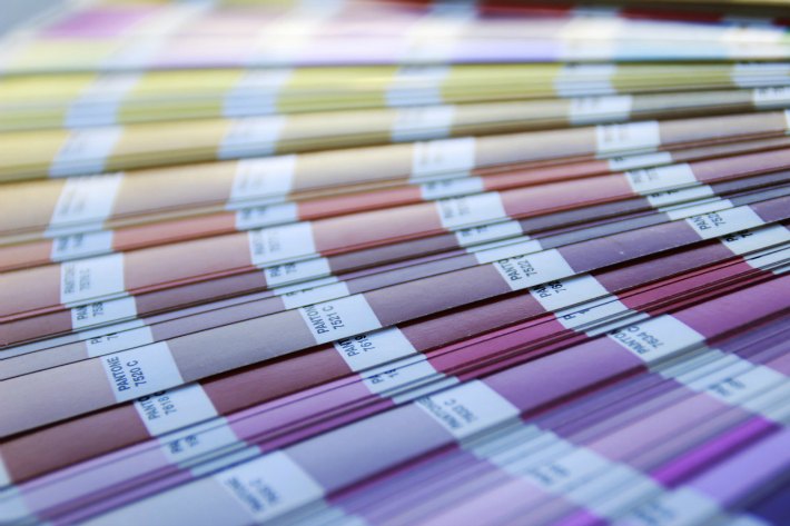
We have written before how each year, Pantone release their ‘Colour of the Year.’ Our first question, as florists, is always “how many flowers can we think of that naturally appear in that colour?”

If we can think of five, we are ecstatic! If we only think of three, we are “moderately satisfied.’

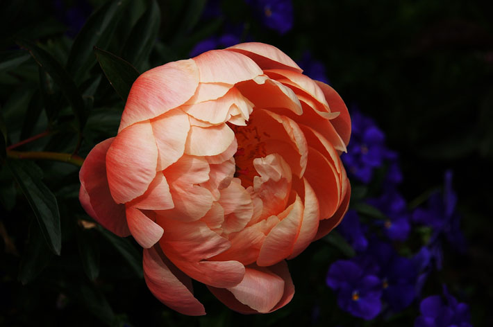
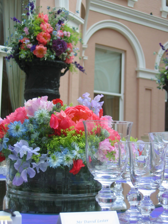
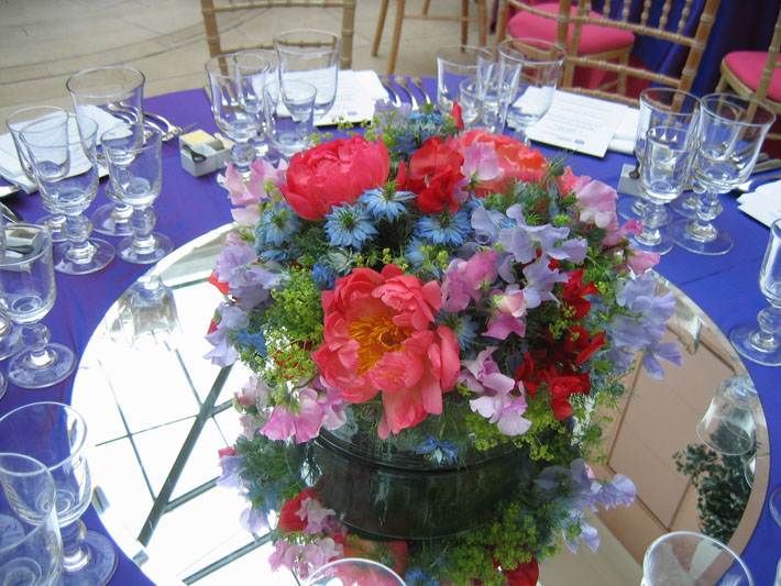
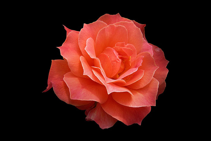
Last year’s ‘Living Coral’ was awesome; we could use peonies, roses, and camellia galore. This year’s ‘Classic Blue’ has influenced some stunning designs in fashion, especially on members of the Royal Family, and it is a universally appealing colour, but sadly, that appeal doesn’t apply to the flower world! We really struggled to find our five flowers.

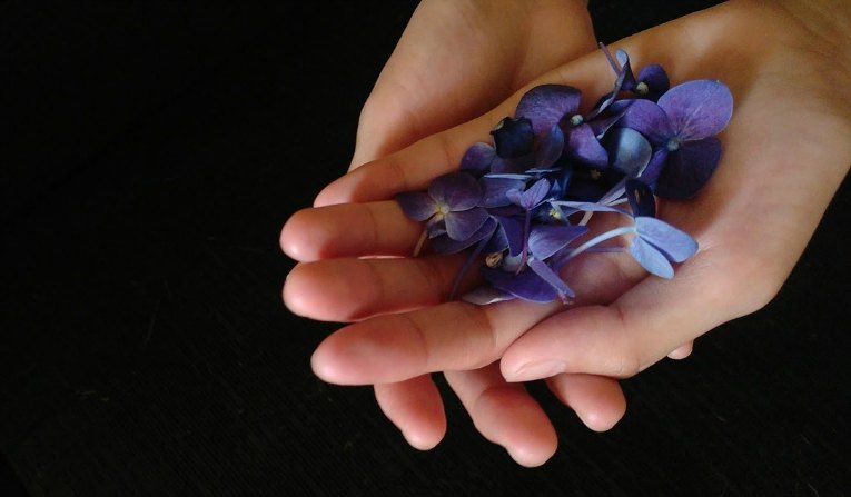
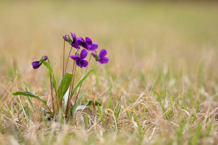
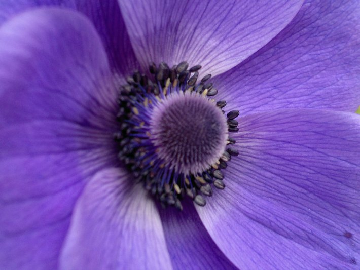
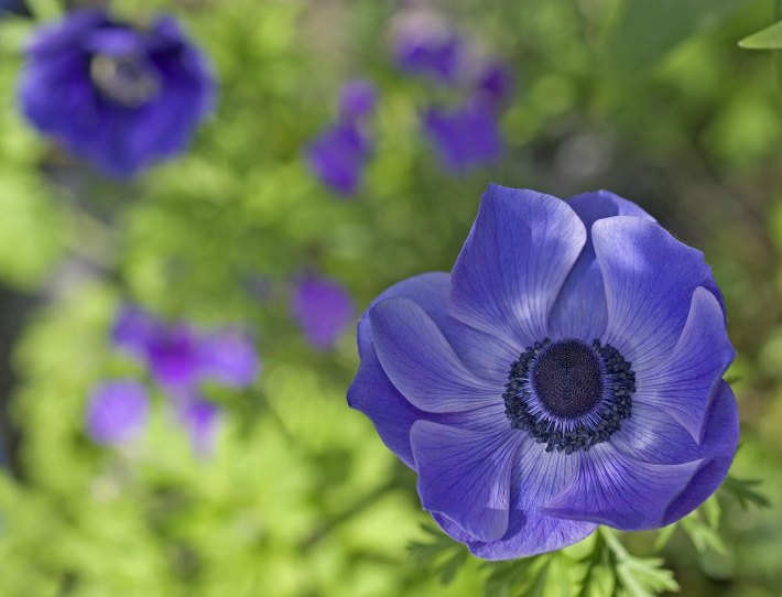
Consider the well-known rhyme: Roses are red, Violets are blue. I’m afraid that drives us mad! You see, violets are not blue! Violets are, well, VIOLET. Similarly, blue anemones and blue hyacinths are purple, not blue. And believe us, we know this because over the years, many of our corporate clients have used a variation of ‘Classic Blue’ in their branding, asking us to echo this colour at corporate events or within their weekly flowers. But there are only a few….
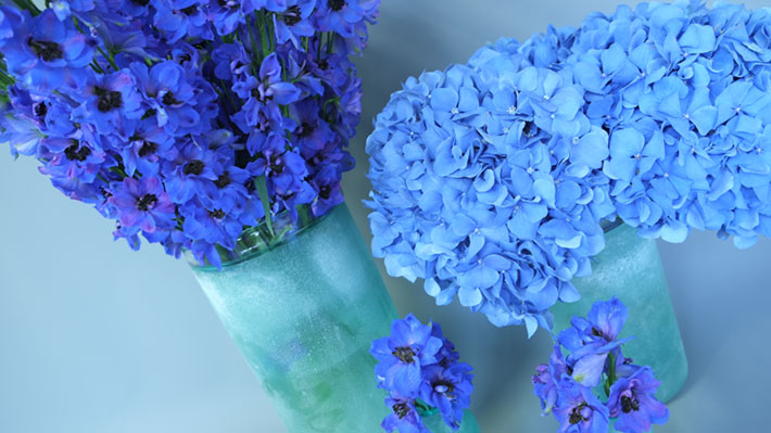
Now, Classic Blue is a lovely colour; magical, unique, otherworldly almost. It evokes images of deep lakes, evening skies and Mediterranean seas. It is both calming and meditative, yet also alluring, intriguing. It is the colour of summer and, indeed, trying to find classic blue flowers in any other season is daunting. Having given it a lot of thought, we list below the three ‘Classic Blue’ flowers that are both readily available to the luxury event florist and guaranteed to have a real wow factor:

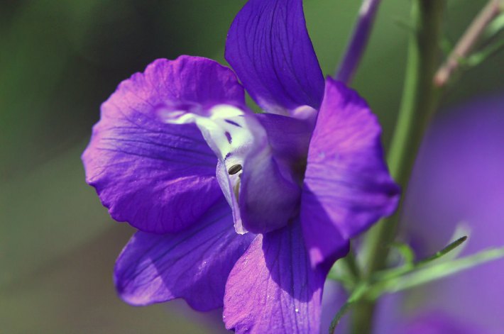
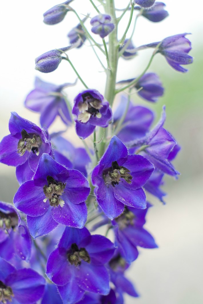
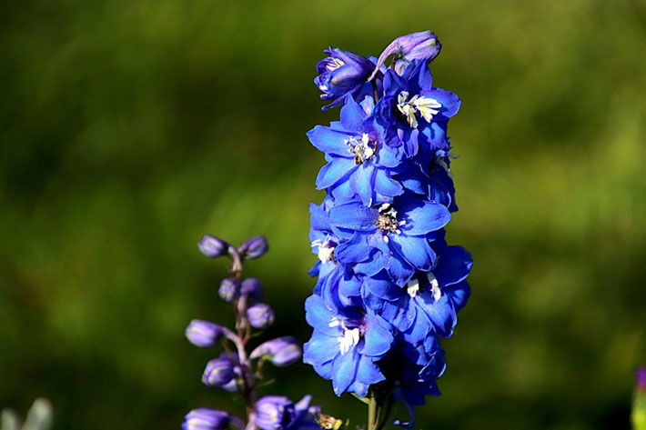
Delphinium

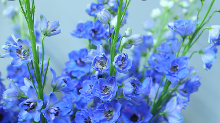
These truly stunning spikes of colour appear in white, pink, peach and purple, but are at their most striking when in a stunning deep blue. Often used in tall arrangements on pedestals, bars and stages, these beautiful specimens are used to create a fountain of vivid blue flowers.

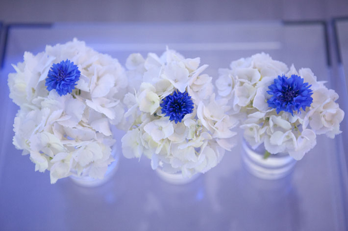
Cornflower

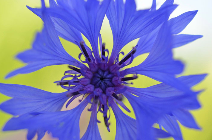
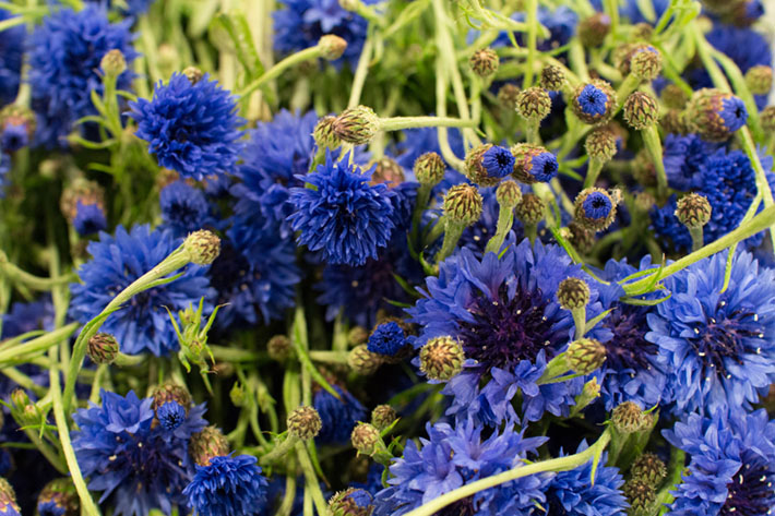
The blue of the cornflower is a colour so striking you could lose yourself! Powerfully intense, these little fluffy petalled blooms are perfect as part of a table-scape. The Dutch painter Johannes Vermeer loved the hue, and the most coveted of all sapphires is named after it. The flower is tiny, so use as part of a rambling collection down the centre of long tables or nestle within larger contrasting flowers to form a dome shape for occasional tables and dining tables.

Hydrangea

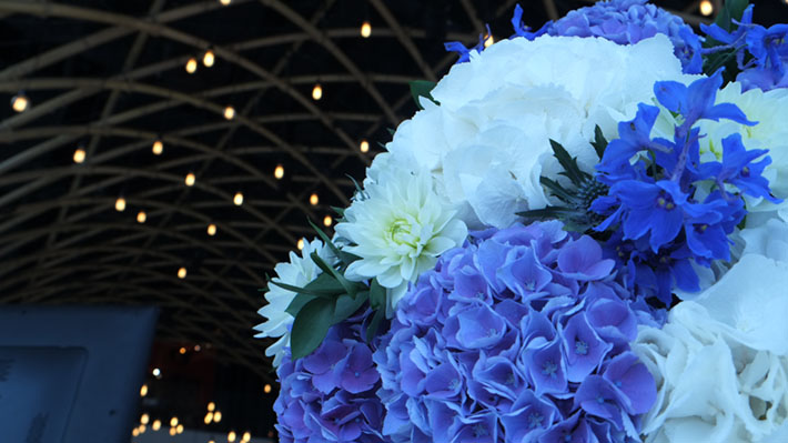
Hydrangea come in several shades of blue from the palest powder, to the most intense. To make sure we get the right colour for our events, we always ask for Chelsea Blue as in our experience, describing the colour needed to a Chelsea Football fan will get the message across pretty well! At least, we’ve never been let down when ordering this particular colour. These lovely large blooms are perfect for both pedestal designs and as rounded table centre pieces.
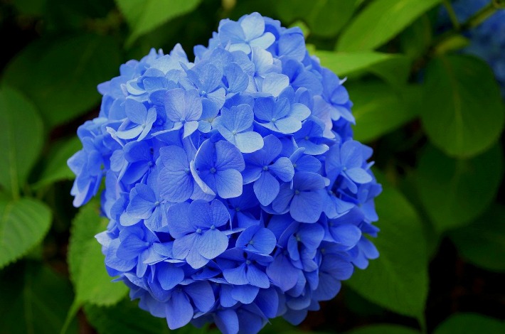
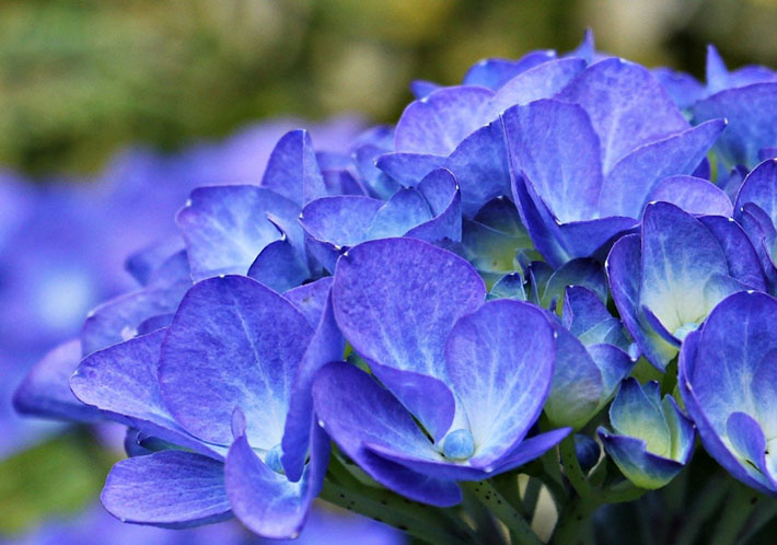
And there we have it. Three stunning varieties of true-blue flowers. We were ‘moderately satisfied’ with this year’s colour theme.

But that was then…..

This is now; spring time and in the midst of a pandemic virus. But there are 2 flowers that have taken on significant meaning for us, which we had overlooked until now:

Nigella (Love in a Mist)

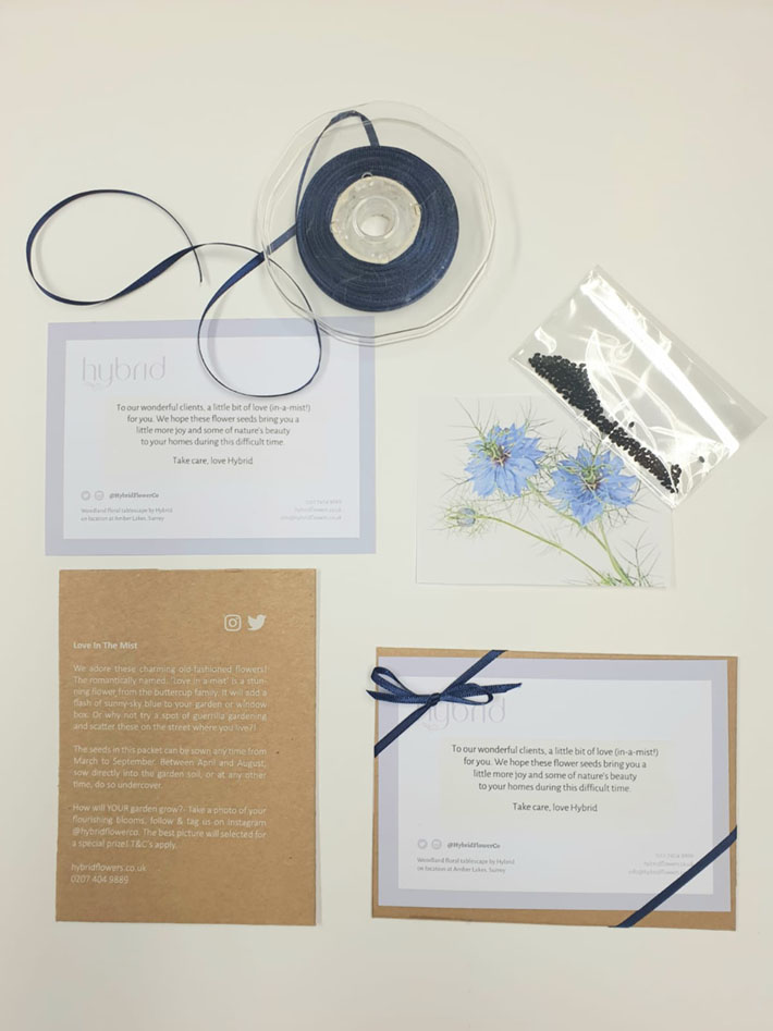
When many of our clients in central London nervously started to plan working from home, we wanted to send them some love, and something interactive they could do at home (we’re nice like that!). So, we sent them some seeds to grow- blue Nigella seeds to be precise.
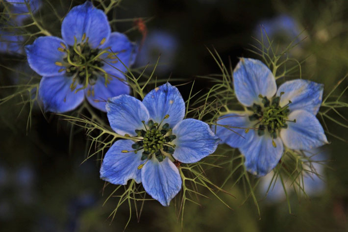
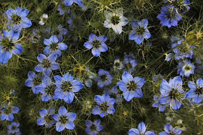
We wrote on the card:

“To our wonderful clients, a little bit of love (in-a-mist!) for you. We hope these flower seeds bring you a little more joy and some of nature’s beauty to your homes during this difficult time.
Take care, love Hybrid”

Myosotis (Forget-me-Not)

Sometimes, a flower arrives at our studio that causes a commotion. Its sheer gloriousness is enough to make us stop in wonder and gets us thinking, what would be the best way to photograph it for our monthly photo shoot.

Sadly, we couldn’t pose for March’s shoot before current events caught up with us. But had we done so, we think Forget-me-Nots would have stolen the show. They are the colour of the amazing blue skies that we have been so lucky to see recently and, of course, the colour of our beloved NHS.
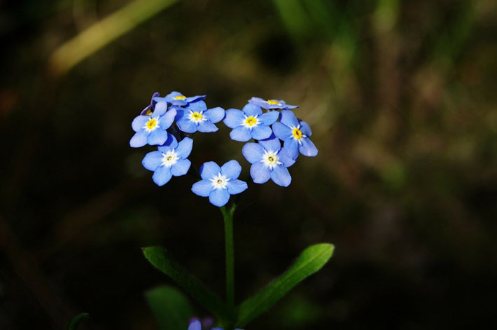
One day, when all this is over, maybe there will be a flower that comes to symbolise the seismic change the world has been through. If so, we think it should be blue in colour and represent the spring, we think it should be called ‘Forget – me – not’.
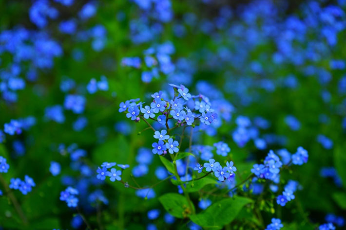
And for those of us in the UK this Classic Blue hue has even more meaning as it represents the NHS.

We wrote on our Instagram:

Thank you to every NHS worker for doing your absolute best, we will never ever forget all that you are doing and if we could send you all the Forget-me-Nots in the world, we would.

And this is why, for the UK at least, Pantone’s Colour of the Year was a pretty good choice. And why we are proud to be feeling pretty blue.
Our top 3 flowers in Pantone’s Colour of the Year 2019 – Living Coral

As floral designers we get rather excited each year when Pantone release their Colour of the Year however, we much prefer it if the colour is what we at Hybrid consider to be a ‘floral’ colour! For us, a ‘floral’ colour must be the colour of at least five naturally occurring, truly beautiful flowers.

This year’s Pantone Colour of the Year ‘Living Coral’, and last year’s ‘Ultra Violet’, were colourful music to our floral ears (but we have to admit we did have a bit of trouble with turquoise one particular year!).

Here are two little known facts about Living Coral that we really wouldn’t expect you to know:  firstly, it is our Caroline’s all-time favourite colour, referred to in our studio as ‘Caroline’s colour’ and secondly, it is definitely not our Alan’s fave!

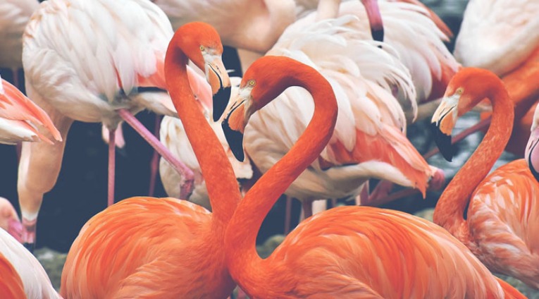
Perhaps Alan’s aversion to coral has something to do with the ambiguous nature of the colour, sitting, as it does, somewhere between pink and orange which, for Alan, just doesn’t quite work. Despite being a very natural colour found in things such as well… living coral and flamingos for example it is always greeted with a sense of wonder and bewilderment; just how can nature produce something so vibrant, intense and downright bizarre!? And this is where I suspect his dislike of the colour may lie… for you see there is a commonly held misconception amongst Alan’s friends that he loves flamingos. Indeed, he has amassed quite a collection of kitsch representations of the leggy coral-coloured bird over the years.  But we can now reveal, for the avoidance of any doubt, that our Alan is not a fan of them at all (sorry to break it to you, Alan’s pals!).

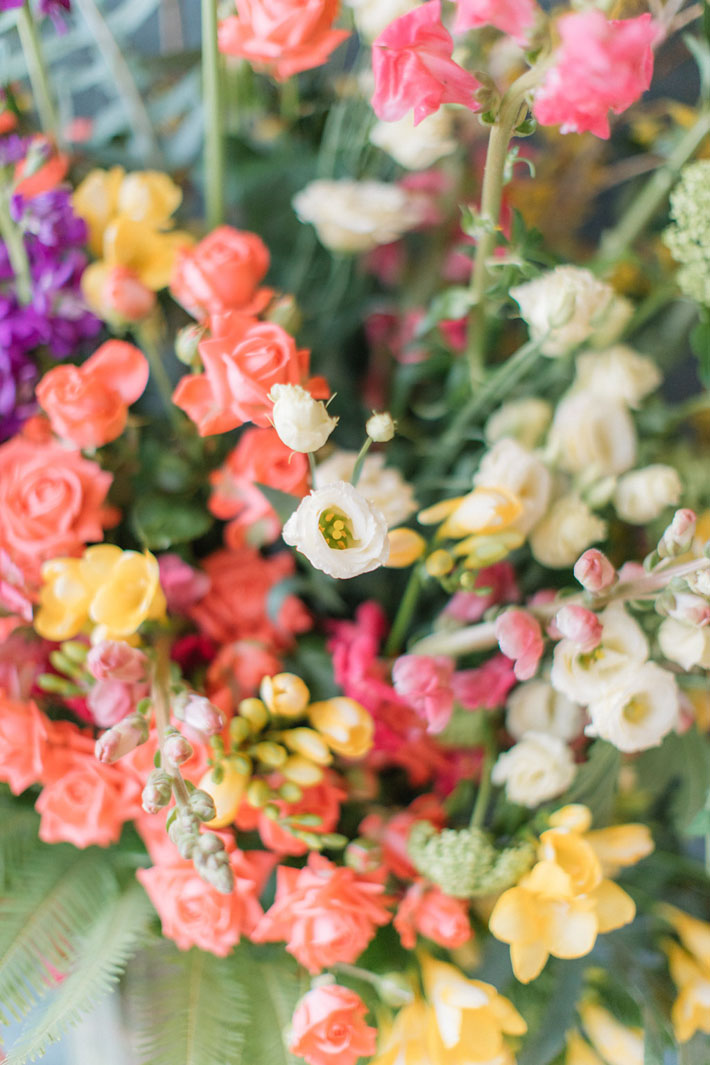
For the majority of us at Hybrid Living Coral is a glorious colour, full of warmth and fun, perfect for both spring and summer florals.  We can clearly see it becoming ‘A Thing’ in the floral world this year quite simply because coral coloured flower varieties are utterly beautiful, versatile and unique.  A coral coloured sweet pea for example or even a flamingo coloured tulip will always be held aloft and admired by the florists in our studio. 

According to our good friend Karen Haller, a leading international authority in the field of applied colour psychology:

Coral is a hue that is a beautiful mix of orange and pink. You’ll be familiar with other variations with names such as apricot, peach and salmon where the orange is quite soft, almost pastel with the addition of soft warm pink. Looking at the psychology of this colour it’s a mix of orange’s fun, playful side and the soft pink’s nurturing side – when it comes to romantic colours, this is quite a sensual hue.

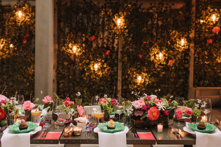
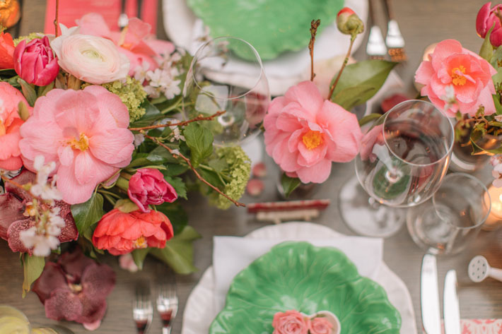
Living Coral looks fabulous with bold blue, pink and purple colours for a rich jewel-like palette, and it looks amazingly fresh with lime green.  And if you really want to push the boat out, why not combine coral with butter yellows and lilac tones and for a more eccentric colour scheme (in a good way of course!)?

In the same way that last year we incorporated intense violet coloured hydrangeas and anemones into party designs, and in doing so developed a renewed appreciation for Ultra Violet, we will continue to immerse ourselves in Living Coral as the year progresses and maybe even convert our Alan! We cannot wait to create even more giant vase designs full of yellow, lilac and coral coloured blooms for the ultimate bonkers party-style and we know exactly who we are going to ask to make them!

Here are our top 3 Living Coral Coloured flowers:

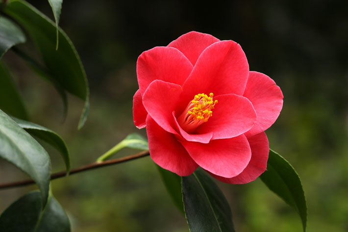
1. Camellia: 

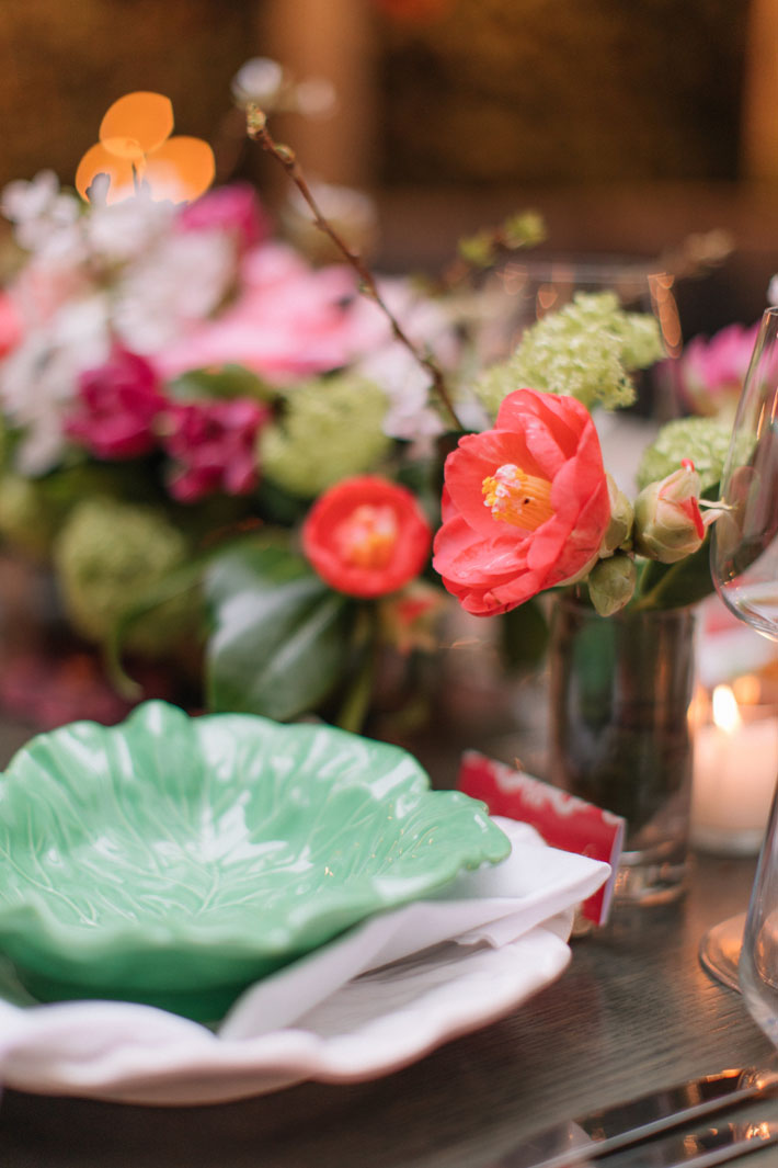
Coral coloured camellias start out an intensely orangey pink and provide a much needed hit of vibrant colour in the months of February and March. They then open and turn a more faded apricot colour which looks beautiful against their glossy green leaves. 

2. Peonies:

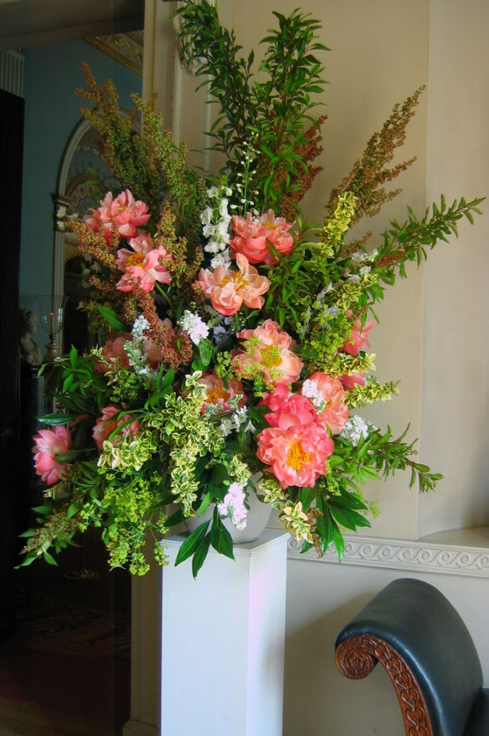
In a similar way to Camellia, the Coral Charm peony is an outstanding variety which starts it’s colour as an intense, almost luminescent, pink and as it opens, turns into a very pale coloured peach.  It’s an absolute marvel of a flower and looks lovely with frothy acid-green Alchemilla Mollis.

3. Roses:

Coral coloured roses just sing with colour.  Whether it is the tight spiraled versions or the more open garden-style roses, these can look utterly vibrant in any party design and look amazing placed next to nearly any other vibrantly coloured summer flower. 

We are already making predictions for next year’s Pantone colour and keeping our fingers crossed it is another floral one that will match some of our all time favourite blooms. 

The top 5 Ultra Violet flowers inspired by Pantone’s Colour of the Year 2018

As a florist with a degree in Communications, there is nothing I enjoy more than interpreting a client’s brief using flowers to convey their message, and I believe that the right combination of flowers in a design can send a powerful and long-lasting message to all those who view it. Put another way: flora themed design can be used to strengthen a brand, create an atmosphere, and enhance an identity.

When used in a stunning display, flowers have the power the unleash forgotten memories and create associations and may cause the onlooker to actually feel different. For example, vibrant orange and pink can make you feel a bit wild, happy and adventurous, whilst that same orange with whites and fresh greens will create a more chilled out vibe, reminiscent of summer days.

We often ask clients to give us three key words to describe the ‘message’ they want to convey. We have received all manner of adjectives from ‘sharp’, ‘professional’ and ‘dynamic’ to ‘glamorous’, ‘sexy’ and ‘shocking’. To our design team these three words are the key to unlocking inspiration, permitting us to unleash our creative edge to ensure the flowers we chose are the most effective at conveying this message.

Every year, Pantone, a company based in New Jersey most commonly known for providing a system for matching colours, releases their colour of the year. For 2018, this colour is Ultra Violet. At Hybrid, we eagerly await news of each year’s colour and spend a lot of time discussing which flowers will best match whichever colour it is.

No surprise then that we have always preferred the more florally inspired years:

2014’s Radiant Orchid was blooming ‘with confidence and magical warmth that intrigues the eye and sparks the imagination’ and gave us scope to develop designs with warm deep pink tones.

2017’s Greenery was a ‘refreshing and revitalising shade… symbolic of new beginnings’ and was perfect for so many foliage inspired designs.

However, this year’s Ultra Violet is without doubt, our all-time favourite!  Violet has the power to anchor and give depth to so many other colours and flower combinations. Whenever a brief dictates ‘vibrant, bold and strong’, we think: violet. Right now, spring and summer give us perfect blooms in ultra violet tones.  Violet is a bold and brazen colour and can be used to create the most amazing statement designs, it can also make colours placed next to it come alive.

Ultra Violet is so important that we feel it warrants further praise and reverence, we asked our friend and colour mentor, Applied Colour Psychology practitioner Karen Haller for her view on this colour:

The ultra-violet ray is the last colour before the invisible and reflects stepping into the unknown. It’s the ideal hue to reflect taking a leap of faith and connecting to our inner self, our intuition and taking our self-awareness beyond our current thinking.

The colour’s vibrant namesake, the violet flower, also brings great joy as it is one of the first flowers to appear each year. This little woodland bloom heralds the start of spring with its deep intense colour, its surely one of the most audacious in the natural world with it’s sensual tone hinting at drama and intrigue.

Aside from the valiant yet petite Violet, here are our top five Ultra Violet flowers:

  1. Anemone

Anemone is a spring bloom of an intense deep purple with a black face.  Although its sold to us as being “blue”, we are buying it for its glorious violet colour.

Tip: their soft, long, delicate stems work beautifully in vases of fresh water on their own or as part of a collection, but don’t try and use them in floral foam if you are making over 15 table designs as your team will never forgive you!

Best mixed with: orange roses and cherry coloured ranunculus.

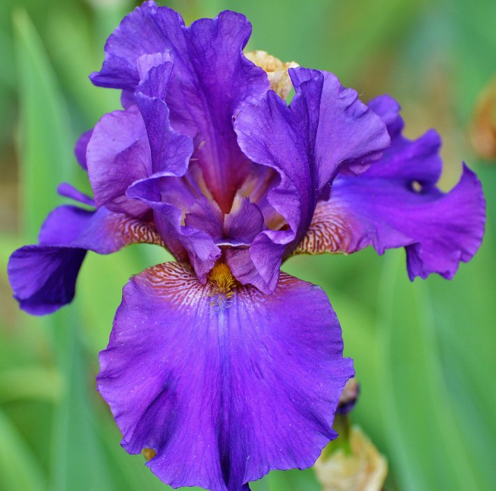
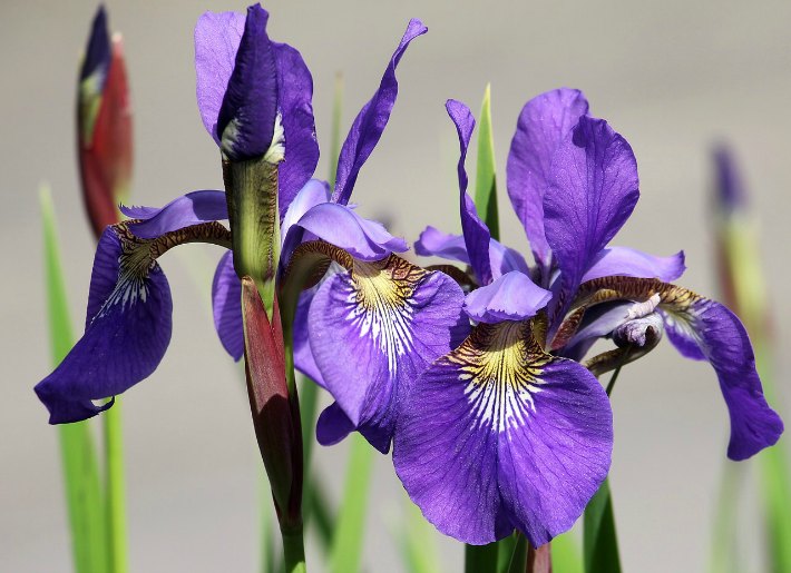
  1. Flag Iris

These shapely tall flowers stand head and shoulders above their smaller cousin, the ‘common or garden’ Iris.  The violet coloured varieties are particularly dramatic and their striking silhouette is simply stunning.

Tip:  don’t cut these stems too short as they are born to be tall, dramatic and glamorous.  Arrange them simply in a beautiful vase with their spear like leaves as the only foliage.

Best mixed with: nothing! Simply place them in front of a plain backdrop to really promote and show-off their shape.

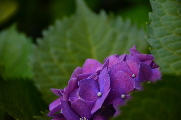
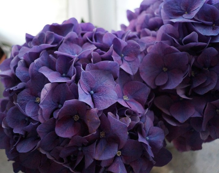
  1. Hydrangeas

As summer arrives, we seek out the violet version of this amazing bloom, each individual vivid floret creates the most striking domed shape.

Tip: these large rounded domes of violet add weight and depth to most floral designs. Use them as a base shape to enhance other stunning summer flowers.

Best mixed with: a blown open cerise coloured peony, or alternatively use bundles of violet hydrangeas in modern vases set amongst matching vases of bold shapely flowers to create impressive colour blocks of flowers.

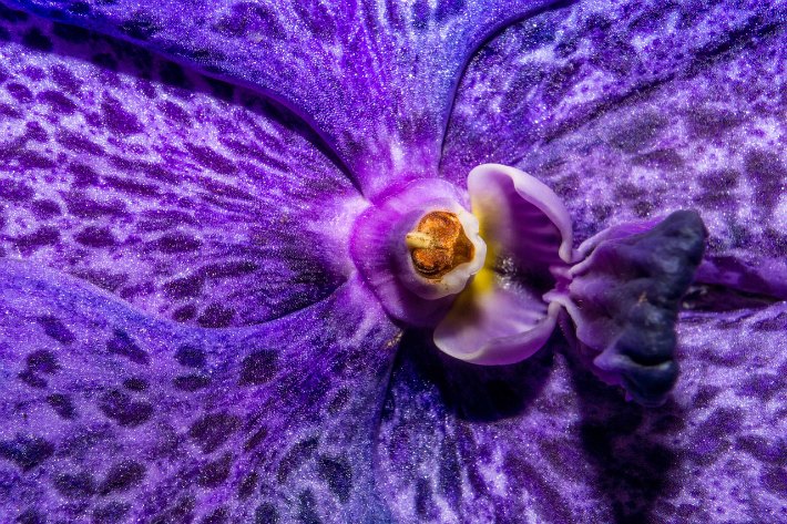
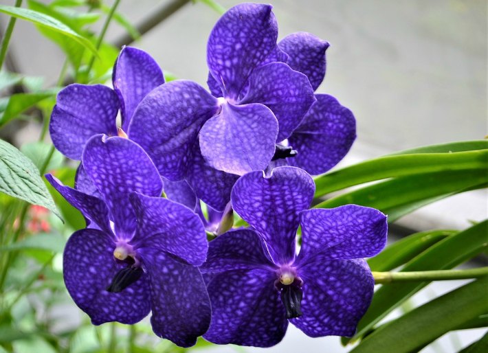
  1. Vanda Orchid

The assortment of violet tones available from vanda orchid growers is breathtaking.  These striking blooms look amazing under a spotlight at events and their reliable long lasting vase life means they are perfect for weekly vase designs in both offices, restaurants and hotels.

Tip: stems of Vanda orchids can be arranged beautifully at the mouth of tall vases and their individual heads can be removed from the stems and submerged in water, placed into individual tubes of water and strung into tall branches.

  1. Delphinium

Each floret of the vibrant purple delphinium has the most amazing violet tones. Packed together, their impact can be phenomenal! This delphinium is probably one of the most striking flowers available to florists and is one of the tallest flowers around in British gardens at summer time.

Tip: use these beautiful stems to make massive fan shapes of colour in large containers atop striking plinth pedestals.  They look equally stunning in modern glassware in high end modern architectural spaces as they do in traditional stone urns placed in within landscaped gardens at summer soirees.

We hope that you will be inspired by the flowers we have showcased here and that if you are looking for a display that is eye-catching, sensuous and bold you remember these Ultra-Violet heroes, especially if the message you’re looking to convey is one that is punchy, deep and mesmorising!

BTW the most uninspiring Pantone colours of the year were for us Turquoise, Emerald and Marsala. A turquoise coloured flower? Anyone?